source magazine (summer 2022)#
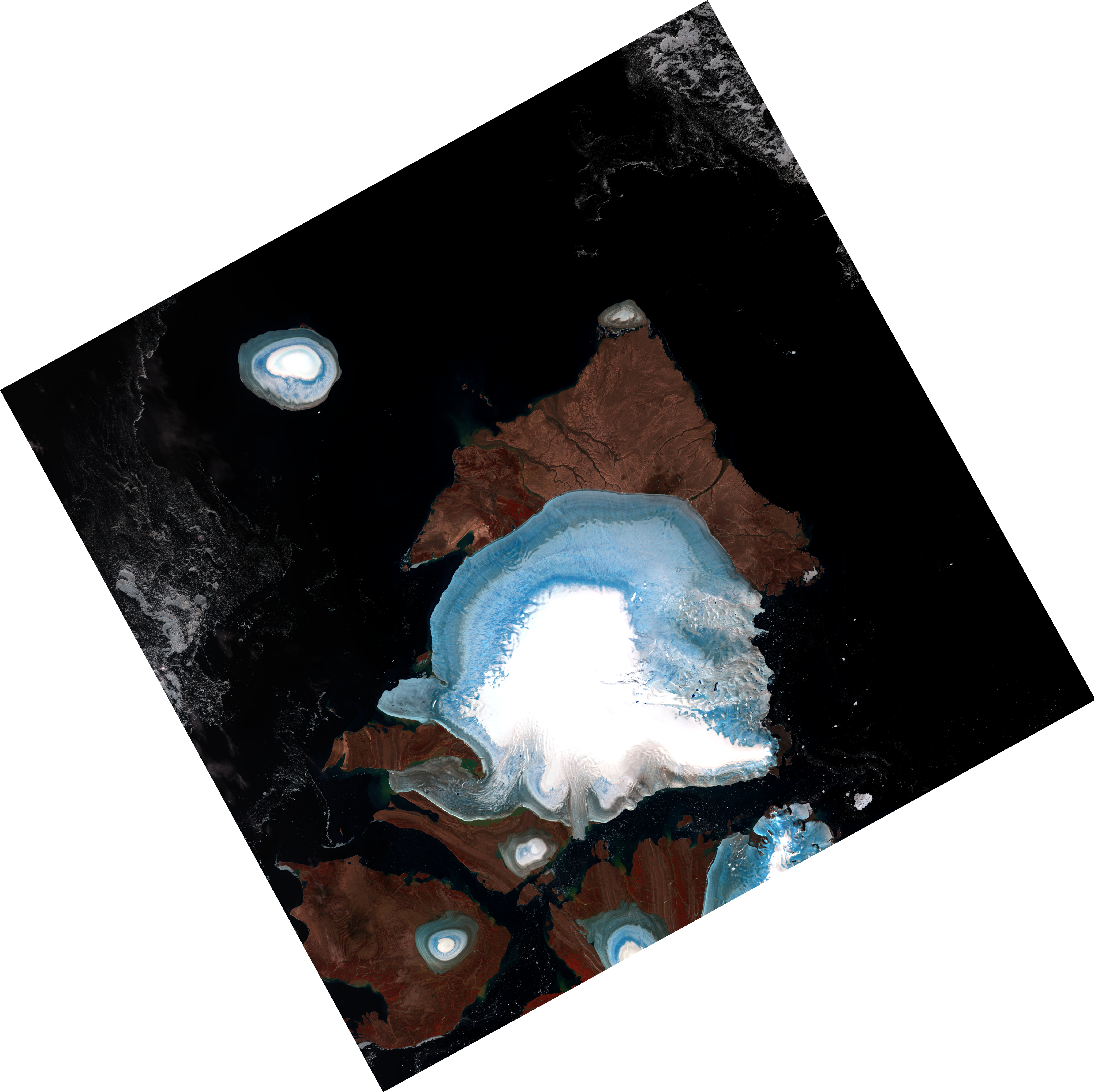
The Landsat 8 image above shows a number of islands and ice caps in Severnaya Zemlya (“northern land”) in the Russian Arctic. It was acquired in August 2020, after a record-breaking Arctic heat wave that saw temperatures exceeding 38°C in Siberia. The image displayed is a so-called “false color composite” made up of the near-infrared, visible red, and visible green bands of the operational land imager (OLI) sensor. Like a 19th-century Romantic painting, the color and texture and contrast in satellite images such as this one tell a fascinating story about the natural world.
The largest of the ice caps in the image is the Academy of Sciences Ice Cap, situated on Komsomolets Island. The brilliant white color in the middle of the ice cap is snow that has fallen during the previous winter, and has not yet fully melted away during the summer melt season. The stunning blue color that rings the snow-covered summit of the ice cap is firn (snow that has survived a full melt season), saturated with meltwater, with linear texture that shows where that water has begun to drain over the surface of the ice. Dark blue dots show where this water has pooled and collected in surface depressions, unable to drain through the impermeable ice.
Further out from this ring of blue we see a more subdued color, where dust and soot from wildfires and industry hundreds and thousands of kilometers away have been deposited on the surface of the glacier over many years. As it accumulates, this dusty covering quickens the melting of the ice, swelling the rivers that radiate away from the ice cap toward the surrounding Kara Sea. This brings us to the striking contrast of the dark ocean surface, set against the bright whites and blues of the ice caps. Here, again, we see the impact of that Arctic heat wave. July 2020 was the smallest July sea ice extent ever recorded in the Arctic, and the straits separating the islands of the archipelago are shown in a deep black, rather than more subtle shades of gray and white.
From images like this, we can estimate the long-term “health” of a glacier. Toward the end of the melt season, the more of a glacier’s area that is covered by snow, the “healthier” it is; typically, if at least 60% of the glacier’s surface is covered by snow at the end of the melt season, it is in good shape. The smaller ice caps in this image, such as the Schmidt Island ice cap in the upper left, appear to be in poor health - very little of their area remains covered by snow. With no snow left on it at all, Molotov Ice Cap at the northern tip of Komsomolets Island will soon fade from the picture altogether.
By itself, this image provides a snapshot of the state of only a few of the glaciers on our planet. From nearly 50 years of Landsat images, we can begin to fit together a much larger story of how these glaciers are changing. This larger story is further enriched by images acquired by declassified spy satellites at the dawn of the satellite era in the middle of the Cold War, millions of archived mapping photographs, and more recent satellite sensors. Together, the individual stories told by these images tells us that the world’s glaciers are melting and retreating, and that this retreat is happening at an increasing rate due to human-induced climate change.
Ultimately, these images only tell us part of the story - what happens next will depend on us.