introduction to google earth engine#
In this practical, you’ll get an introduction to using Google Earth Engine (GEE) for remote sensing analysis. Even if you have no prior experience with programming, you will be able to complete this practical. All of the programming steps have been provided for you in a script, and your task will be to run each step in turn and analyse and interpret the results.
GEE is “a cloud-based platform for planetary-scale geospatial analysis” (Gorelick et al., 20171). With it, users have access to a number of tools, including entire satellite archives, machine-learning algorithms for classification, and computational power far beyond what an average desktop user has access to.
getting started#
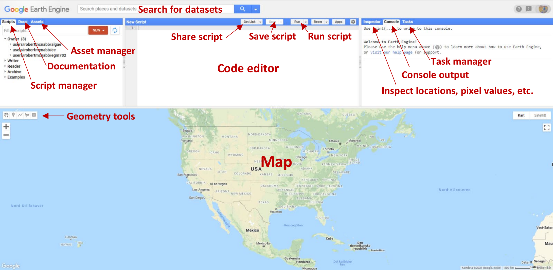
To begin, point your browser to https://code.earthengine.google.com. If you are not already logged in, log in using your GEE account. You should see something like this:
Click the red NEW button in the Script manager, and select Repository. Call the repository egm702,
and then click Create.
To gain access to the EGM702 repository, click this link: https://code.earthengine.google.com/?accept_repo=users/robertmcnabb/egm702
This will give you access to all of the scripts in the repository for each remaining week of the module, including some additional examples of applications that might be useful for your project.
The practical exercises each week are divided into a number of different scripts, labeled in order. For week 3, the scripts are:
01_finding_images.js02_band_maths.js03_pan_sharpening.js04_pca.js
To get started, open the first script (01_finding_images.js) by clicking on it in the Script editor;
alternatively, click on this direct link.
You (and anyone with the link above) are automatically added to this repository as a Reader; that is, you have permission to see all of the scripts in the repository, and to run them. If you want to make changes to each script and save them, you will need to save the script to your own account (as an Owner).
To do this, you first need to make a change to the script in the Editor panel. The easiest way to do this would be to replace “YOUR NAME HERE!” on line 1 with your name.
When you do this, you should see that the Save button activates. Click the Save button, then click Yes to make a copy of the script to your own repository.
You should see the following dialogue:
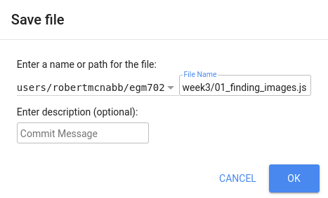
Save the script to your egm702 repository as week3/01_finding_images.js - you should see a week3 folder
appear under this repository in the Script manager.
As you work through the other scripts this week, be sure to save them to your own repository in this way (remembering to update the script names appropriately). This way, you have a record of any changes that you make to the script.
Note
Perhaps most importantly, it will mean that when you add training samples for the classification exercises in Week 5, you don’t have to re-do them each time you re-open your browser window.
part 1 - finding and inspecting images#
Once you have saved the script, you should see something like the following in the code editor:
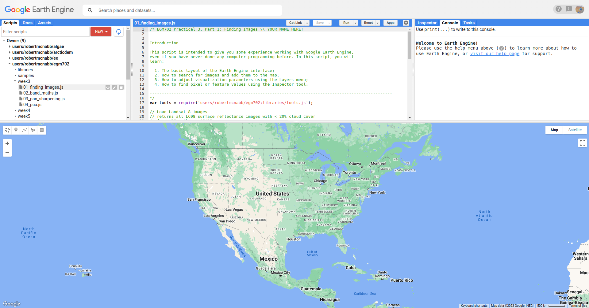
You should also notice that the script begins with a large block of comments (beginning and ending with
/* and */):
/* EGM702 Practical 3, Part 1: Finding Images \\ YOUR NAME HERE!
-----------------------------------------------------------------------------------------------------

Introduction

This script is intended to give you some experience working with Google Earth Engine,
even if you have never done any computer programming before. In this script, you will
learn:

  1. The basic layout of the Earth Engine interface;
  2. How to search for images and add them to the Map;
  3. How to adjust visualization parameters using the Layers menu;
  4. How to find pixel or feature values using the Inspector tool;

-----------------------------------------------------------------------------------------------------
*/
In Javascript (the programming language used in the code editor interface), comments (that is, statements that the
computer won’t process) are denoted by // (two forward slashes) if they are a single line comment.
Multi-line, or block, comments, start with /* and end with */ – anything in between these symbols will not be
interpreted by the computer when the script is run. In the GEE code editor, comments are colored green.
The first line with actual code to pay attention to is on line 17:
var tools = require('users/robertmcnabb/egm702:libraries/tools.js');
This line will import all of the functions and tools contained in the egm702/libraries/tools.js script, which
we will use in most of the remaining exercises.
Note
This setup, where we have different “modules” that we “import” to use in a script, is something that we will cover in more depth in EGM722 with python programming.
If you are interested in developing your GEE skills further, you can have a look at this post by a GEE developer, which shows how you can set up your own “module”.
The next set of lines does the following:
searches through the entire Landsat 8 Collection 2 Surface Reflectance archive,
removes any images with >20% cloud cover,
and returns only those images whose WRS-2 Path/Row matches our current study area around Mt St Helens.
It will then store a list of these images in a variable called lc08 that we can use later on in the script:
// Load Landsat 8 images
// returns all LC08 surface reflectance images with < 20% cloud cover
// from WRS path/row 46/28.
var lc08 = ee.ImageCollection("LANDSAT/LC08/C02/T1_L2") // select Landsat 8 Collection 2 SR
  .filterMetadata('CLOUD_COVER', 'less_than', 20) // select cloud cover < 20%
  .filter(ee.Filter.eq('WRS_PATH', 46)) // select WRS Path 46
  .filter(ee.Filter.eq('WRS_ROW', 28)); // select WRS Row 28
For more information on the WRS-2, see this link: https://landsat.gsfc.nasa.gov/about/worldwide-reference-system.
For more information about Landsat Collection 2 images, see this link: https://www.usgs.gov/landsat-missions/landsat-collection-2
Note
Remember that the purpose of these practicals is to focus more on image analysis and interpretation, and less on the nuts and bolts of programming in GEE.
However, if you are interested in learning more about the coding side of things, you are welcome to check out the amazing new textbook, “Cloud-Based Remote Sensing with Google Earth Engine”, available for free online at https://www.eefabook.org/.
The next set of lines will do the same thing as the first set, but this time using the Landsat 8 Collection 2 Top of Atmosphere (TOA) reflectance archive, rather than the Surface Reflectance products:
// returns all LC08 TOA reflectance images with < 20% cloud cover
// from WRS path/row 46/28.
var lc08_toa = ee.ImageCollection("LANDSAT/LC08/C02/T1_TOA") // select Landsat 8 Collection 2 SR
  .filterMetadata('CLOUD_COVER', 'less_than', 20) // select cloud cover < 20%
  .filter(ee.Filter.eq('WRS_PATH', 46)) // select WRS Path 46
  .filter(ee.Filter.eq('WRS_ROW', 28)); // select WRS Row 28
For a refresher on the difference between Surface Reflectance and TOA reflectance, see here: https://www.usgs.gov/landsat-missions/landsat-collection-2-surface-reflectance
The following set of lines will return the image from the surface reflectance collection that has the lowest cloud cover, selecting only images from 2020. It will also make sure to only select the coastal/visible/NIR/SWIR Landsat band layers (Bands 1-7).
// Find the least cloudy image from 2020, and clip it to the boundary.
var sr_img = ee.Image((lc08)
  .filterDate('2020-01-01', '2020-12-31') // select all images in 2020
  .select(['SR_B[1-7]']) // select bands 1-7
  .sort('CLOUD_COVER') // sort based on cloud cover (lowest - highest)
  .first()); // return the first image in the list - i.e., the lowest cloud cover

// Do the same, but for the TOA collection
var toa_img = ee.Image((lc08_toa)
  .filterDate('2020-01-01', '2020-12-31') // select all images in 2020
  .select(['B[1-7]']) // select bands 1-7
  .sort('CLOUD_COVER') // sort based on cloud cover (lowest - highest)
  .first()); // return the first image in the list - i.e., the lowest cloud cover
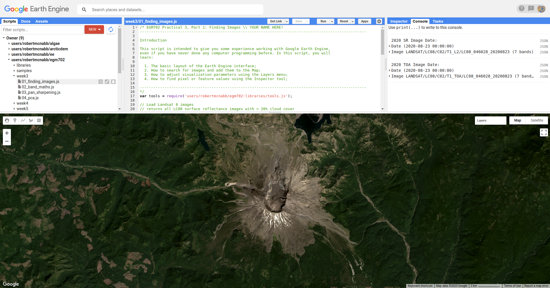
Now, we want to make sure that these images are the same image, just different processing levels (surface reflectance vs. TOA reflectance). To check this, we can print the image names to the Console:
// print the image name/date
print('2020 SR Image Date: ', ee.Date(sr_img.get('SENSING_TIME')), sr_image);
print('2020 TOA Image Date: ', ee.Date(toa_img.get('DATE_ACQUIRED')), toa_image);
The final part of this first section is where we add the images to the map:
// add the best images from each collection to the Map as a true-color composite
Map.addLayer(toa_image, {bands: ['B4', 'B3', 'B2'],
  min: 0.005, max: 0.4, gamma: 1.5}, 'TOA Image');

// add SR image after rescaling DN values
Map.addLayer(tools.oliRescale(sr_img), {bands: ['SR_B4', 'SR_B3', 'SR_B2'],
  min: 0.005, max: 0.4, gamma: 1.5}, 'SR Image');

// center the image on Mt St Helens with a zoom level of 12
Map.setCenter(-122.1886, 46.1998, 12);
We want them to be true-colour composites, so we display them with OLI bands 4,3,2. and we apply a gamma adjustment to help brighten the image slightly.
At this point, you can run the script, either by pressing CTRL + Enter, or by clicking Run at the top of the code editor panel.
Once the script finishes running, you should see this:
When you mouse over the Layers button in the upper right of the Map panel, you should see the two layer
names (TOA Image and SR Image):
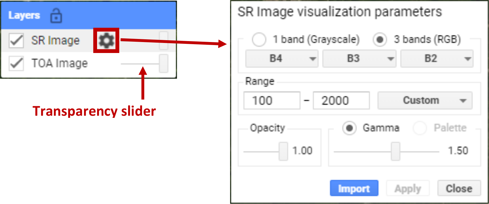
If you click on the gear icon, you can open the visualization parameters for each image and adjust them. You can
also adjust the transparency slider for the different layers displayed here, and by checking/unchecking the box next
to the layer name, you can make either image visible/invisible.
In the Console panel, you should see the following:
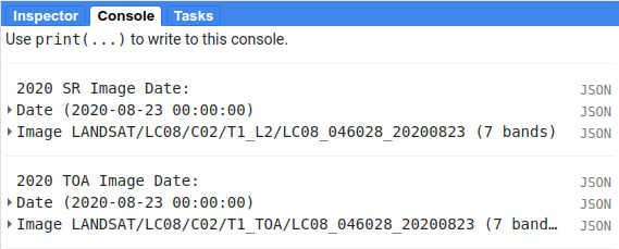
This shows that the 2 images are the same image, just different processing levels (T1_SR vs T1_TOA).
Now, in the Map panel, turn off the SR Image to see the TOA Image underneath.
Question
Describe the difference in appearance that you notice between the two images. Which image appears more “blue”?
Next, click on the Inspector tab, then click anywhere on the Map to get the pixel values for each image displayed on the map at that location:
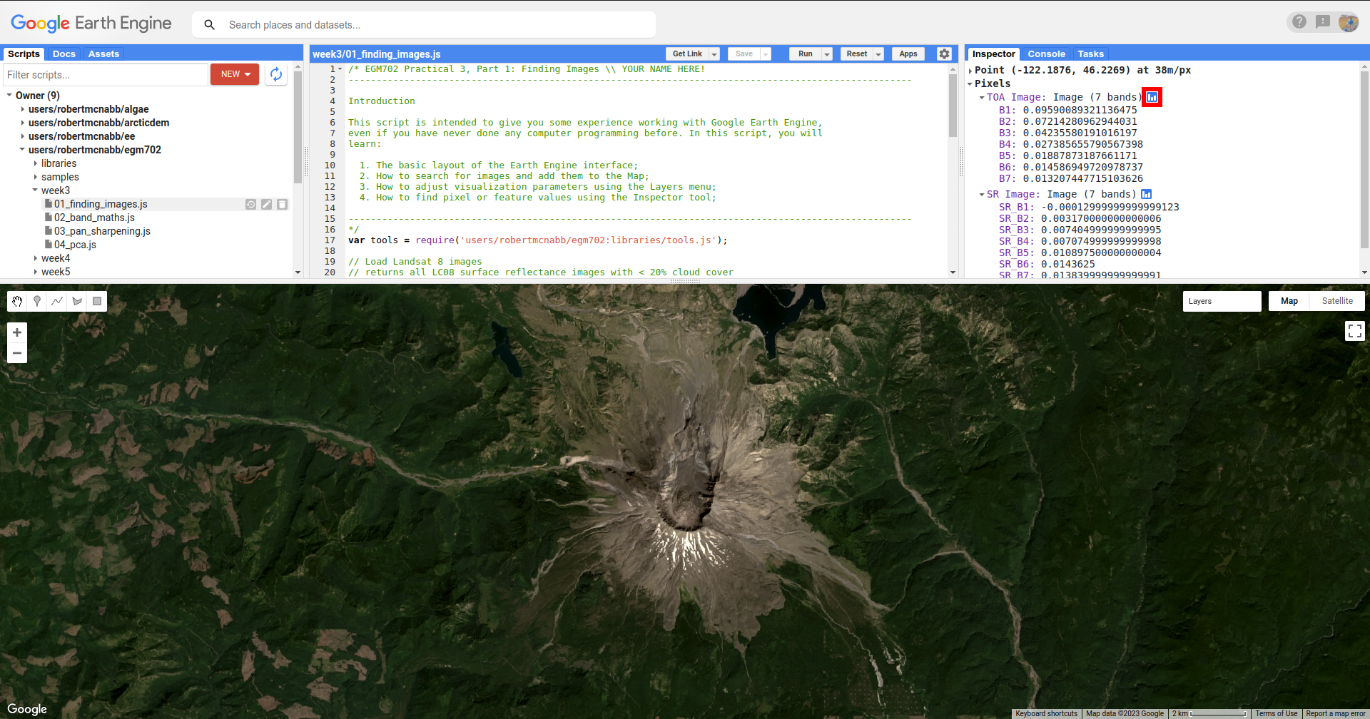
By default, the Inspector tool displays the values in each band as a list, but you can toggle to view a bar
chart by clicking the chart icon (red outline in the above screenshot):
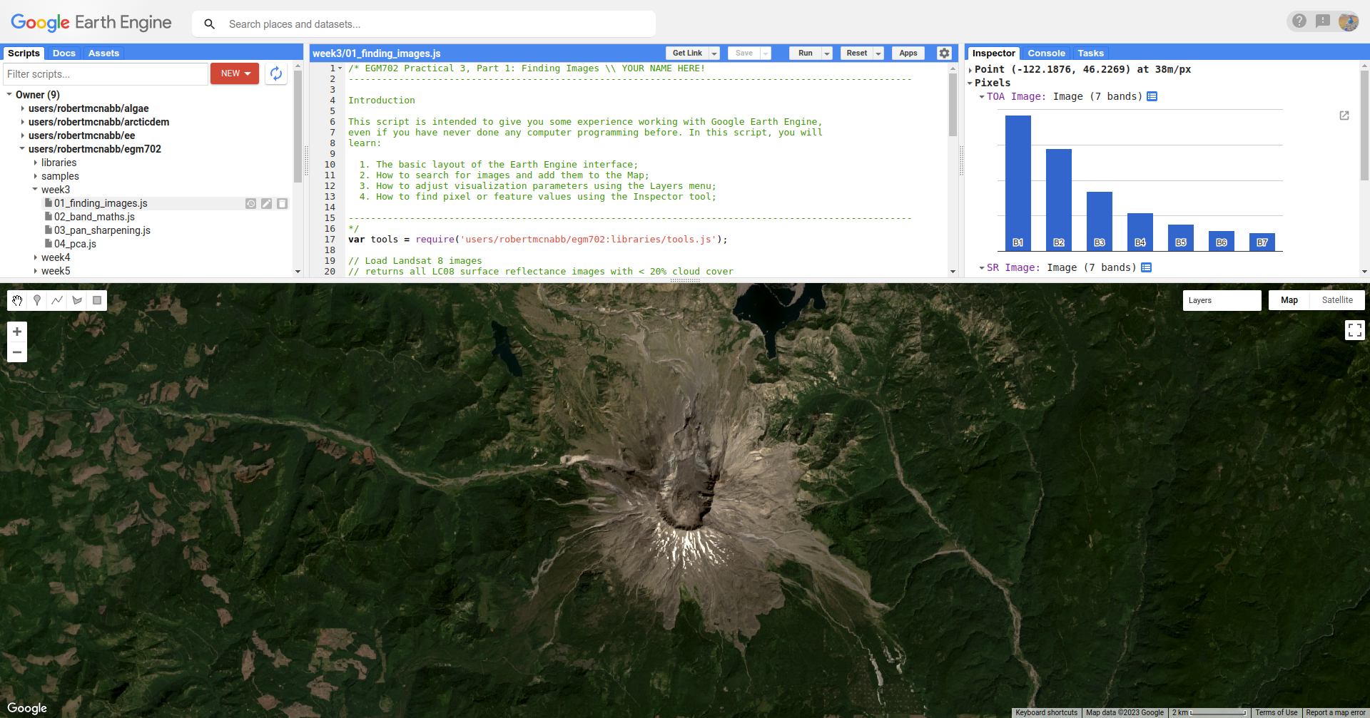
Click on a few different locations and note down the differences between the two images in each band (note
that the TOA image will be displayed first, then the SR image).
Question
In what band(s) do you see the largest difference between the two image?
Using what you have learned about atmospheric scattering, and the wavelengths of the different bands, explain any difference(s) that you see between the TOA reflectance and the surface reflectance images.
Hint
The sensor carried by Landsat 8 (and now Landsat 9) is the Operational Land Imager/Thermal InfraRed Sensor (OLI/TIRS). The table below shows the wavelength ranges for the different bands of the sensor(s), their resolutions, and their names:
sensor |
band |
wavelength (µm) |
name |
resolution (m) |
|---|---|---|---|---|
oli |
1 |
0.43 – 0.45 |
coastal aerosol |
30 |
2 |
0.45 – 0.51 |
blue |
30 |
|
3 |
0.53 – 0.59 |
green |
30 |
|
4 |
0.64 – 0.67 |
red |
30 |
|
5 |
0.85 – 0.88 |
near infrared |
30 |
|
6 |
1.57 – 1.65 |
shortwave infrared 1 |
30 |
|
7 |
2.11 – 2.29 |
shortwave infrared 2 |
30 |
|
8 |
0.50 – 0.68 |
panchromatic |
15 |
|
9 |
1.36 – 1.38 |
cirrus |
30 |
|
tirs |
10 |
10.60 – 11.19 |
thermal infrared 1 |
100 |
11 |
11.50 – 12.51 |
thermal infrared 2 |
100 |
For information about the band designations for the other Landsat sensors, see this page from the USGS: https://www.usgs.gov/faqs/what-are-band-designations-landsat-satellites
Once you’ve looked around the area, move on to the next part.
part 2 - band maths and charts#
Now that we’ve seen a little of how we can search, add, display, and examine images, let’s take a look at some of the different DEMs available within GEE.
Open the script for this part of the practical by clicking on 02_band_maths.js in the Script manager, or using
this direct link.
We’ll start by adding the NASADEM, the ALOS World 3D – 30 m (AW3D30) DEM, and the SRTM:
// add the AW3D30 (ALOS World DEM 30 m)
var alos_dsm = ee.Image("JAXA/ALOS/AW3D30/V2_2")
  .clip(boundary) // clip to the area around mt st helens
  .select('AVE_DSM').rename('elevation');  // select the AVE_DSM band, rename it to elevation

// add the NASADEM
var nasadem = ee.Image("NASA/NASADEM_HGT/001")
  .clip(boundary) // clip to the area around mt st helens
  .select('elevation');  // select the elevation band

// add the SRTM
var srtm = ee.Image("USGS/SRTMGL1_003")
  .clip(boundary) // clip to the area around mt st helens
  .select('elevation'); // select the elevation band
Note that the NASADEM and the SRTM both have a layer called 'elevation', while the AW3D30 has a layer called
'AVE_DSM' – when working with other datasets, it’s a good idea to check what the layer names are in the
data catalog.
For more information on the different DEMs that GEE has available, check the data catalog for “elevation”: https://developers.google.com/earth-engine/datasets/tags/elevation.
To visualize the different layers on the Map, we can produce a hillshade using ee.Terrain.hillshade():
// add each DEM to the map as a hillshade with azimuth of 315 degrees
Map.addLayer(ee.Terrain.hillshade(nasadem, 315), {}, 'NASADEM Hillshade');
Map.addLayer(ee.Terrain.hillshade(alos_dsm, 315), {}, 'ALOS DSM Hillshade');
Map.addLayer(ee.Terrain.hillshade(srtm, 315), {}, 'SRTM Hillshade');
If you check the documentation for
ee.Terrain.hillshade(), you can see that this function takes 3 arguments (inputs):
argument |
type |
details |
|---|---|---|
|
image |
an elevation image, in meters |
|
float, default: 270 |
the illumination azimuth in degrees from north |
|
float, default: 45 |
the illumination elevation in degrees |
Hint
If you are curious about how to use a particular “built-in” function or object (such as ee.Image or
ee.ImageCollection), it’s always a good idea to check the documentation.
The second argument (input) to the function sets the azimuth to use when calculating the hillshade – here, I’ve set them all to be 315 degrees (measured from north). I have left the default sun elevation angle to be 45 degrees, as measured from the horizon.
When you run the script, you should see the following added to the map (after you turn off the elevation difference
layer):
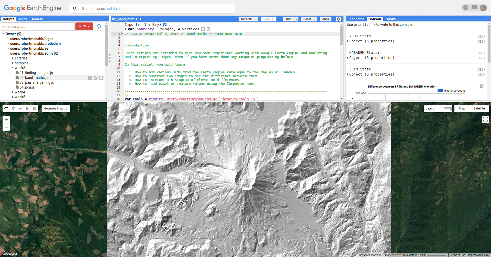
The top layer will be the last one added to the Map; in this case, it’s the SRTM hillshade. Remember that if you’re
not sure which layer you’re seeing, you can always check the Layers menu.
Question
Toggle between the different layers to see the differences – what do you notice about the different DEMs? Do they look the same, or are there significant differences? In particular, think about the following questions:
Which DEM do you think was produced from the highest-resolution sensor? Why?
What surface(s) are represented by the different DEMs? Are they DTMs or DSMs? How can you tell?
The next block of code uses tools.imgStats() to calculate various descriptive statistics for the DEMs: the
maximum/minimum, mean, median, and standard deviation.
// calculate statistics
var alos_stats = tools.imgStats(alos_dsm, boundary, 'elevation');
var nasa_stats = tools.imgStats(nasadem, boundary, 'elevation');
var srtm_stats = tools.imgStats(srtm, boundary, 'elevation');

// print the statistics to the console
print('ALOS Stats:', alos_stats);
print('NASADEM Stats:', nasa_stats);
print('SRTM Stats:', srtm_stats);
The second part of this prints the statistics to the Console. When you run the script, you should see this in the Console:
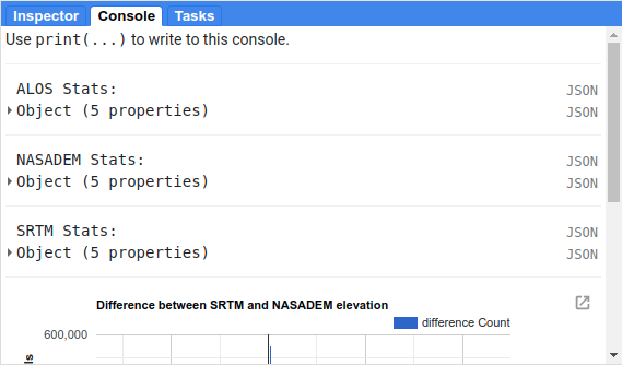
To see the stats for each DEM, click the arrow next to each Object:
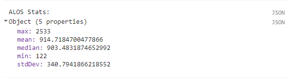
Question
Expand the stats for each of the DEMs by clicking on the arrows. What do you notice about them – which statistics show the largest differences? Why do you think this might be?
In addition to displaying images and calculating statistics, we can also perform different calculations with images,
such as differencing them or calculating ratios. The first line in this section will subtract the NASADEM from the SRTM,
using ee.Image.subtract() (documentation):
// subtract the NASADEM from the SRTM, and cast the output as a floating point (decimal)
var nasa_srtm = srtm.float().subtract(nasadem);
Note
As you might imagine, there are corresponding methods for other arithmetic operations, such as:
addition:
ee.Image.add()(documentation)multiplication:
ee.Image.multiply()(documentation)division:
ee.Image.divide()(documentation)
In addition to the basic arithmetic operations, we will use a number of other examples in the coming weeks.
Just like with the Landsat images we used in part 1, and the hillshades we saw above, we can add this difference to the Map. To help visualize this, I have used a colormap from colorbrewer2.org:
// add the difference to the map, using a colormap from colorbrewer2.org
var colormap = ['d7191c', 'fdae61', 'ffffbf', 'abd9e9', '2c7bb6'];
Map.addLayer(difference, {min:-10, max:10, palette:colormap}, 'elevation difference');
This will display the pixel values on the same sort of Red/Yellow/Blue color scale that we used in Week 2 using the
palette defined as a list of HTML color codes, while also setting the scale to saturate at -10 m difference and
+10 m difference (min and max, respectively).
Question
Pan and scroll around the Map while looking at this difference layer.
What area(s) do you notice the largest differences between the NASADEM and the SRTM?
Are there any systematic differences (i.e., patterns)?
Does it look like the two DEMs have been co-registered? Why or why not?
In addition to the difference map, we can also display a histogram of the differences using the following code:
var hist = ui.Chart.image.histogram({image: nasa_srtm,
  region: boundary,
  scale: 30,
  maxBuckets: 256,
  maxPixels: 1e9})
  .setOptions({
    title: 'Difference between SRTM and NASADEM elevation',
    hAxis: {title: 'elevation difference (m)', titleTextStyle: {italic: false, bold: true}},
    vAxis: {title: 'number of pixels', titleTextStyle: {italic: false, bold: true}}
  });
We then display the chart by printing it to the Console:
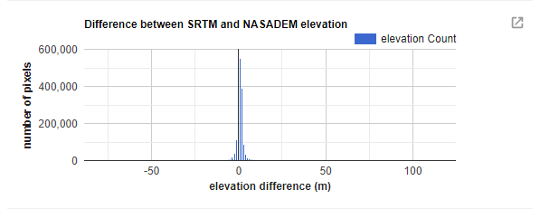
If you click the symbol in the upper right corner of the histogram, it will open in a new browser window. On this
page, you can also download a csv file with the values in the plot, or a Scalable Vector Graphics (SVG) or PNG version
of the chart.
The final two things printed to the Console are the descriptive statistics of the DEM differences
(dH statistics), and the normalized median absolute deviation (NMAD) between the two DEMs. You may need to scroll
down below the chart to see these, but be sure to look at these before answering the following question.
Question
Based on:
the shape of the histogram that you see;
the lecture from Week 2;
Höhle and Höhle (2009)2;
is the standard deviation an appropriate metric to describe the variation in the data? Why or why not?
part 3 - pan-sharpening#
For the third part of this week’s practical, we’ll look at one method of pan-sharpening - that is, using a band or an image with a higher resolution to “sharpen”, or increase the resolution of, another image.
Open the script for this part of the practical by clicking on 03_pan_sharpen.js in the Script manager, or using
this direct link.
The first bit of code that we haven’t seen before is at line 24:
// we'll use surface reflectance bands 4, 3, and 2
var bands = ['SR_B4', 'SR_B3', 'SR_B2'];
With this, we’re creating a List of bands (enclosed in square brackets, [ and ]) that we first use with
ee.Image.select() to create a new image composed of OLI bands 4, 3, and 2, before using ee.Image.rgbToHsv() to
transform this image from red, green, blue (RGB) to hue, saturation, value (HSV) color space:
// use image.rgbToHsv to transfom the SR true-color image from RGB to HSV color space
var img_hsv = sr_img.select(bands).rgbToHsv();
The next few lines are where we actually perform the pan-sharpening via IHS (or, in this case, HSV) fusion:
// create a pan-sharpened image
var pan = ee.Image.cat([
  img_hsv.select('hue'), // get the hue band from the hsv image
  img_hsv.select('saturation'), // get the saturation band from the hsv image
  toa_img.select('B8') // replace "value" with oli panchromatic band
]).hsvToRgb(); // transform the HSV image back to RGB color space
In this, we combine the original hue and saturation bands, with 30 m spatial resolution, with the 15 m panchromatic
band (B8) from the TOA image. Then, we transform the image back to RGB space using ee.Image.hsvToRgb().
Run the script now. When you hover over the Layers menu, you should see the following:
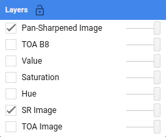
At the moment, only two images are visible: the pan-sharpened image, and the original SR image.
As you pan around the map, looking at the pan-sharpened image, you should notice that it appears somewhat sharper than the original SR image - roads and paths in the forest appear more clearly, and you may notice quite a bit more texture in many areas.
Question
Toggle the pan-sharpened image on and off to view the differences between these two images. What do you notice about the color of the pan-sharpened image, compared to the SR image?
Warning
Because the wavelengths of the panchromatic band do not fully overlap with the wavelengths of bands 4, 3, and 2, and the panchromatic band has not been atmospherically corrected, the values in the red, green, and blue channels of the pan-sharpened image no longer correspond to surface reflectance values.
Remember that you can use these images to aid in visual interpretation, but you should not assume that you can use pan-sharpened images for other kinds of analysis.
Now, take a look at the final block of code in the script:
// export a visualization image to google drive
Export.image.toDrive({
  image: pan.visualize({min:0.005, max:0.4, gamma:1.5}),
  description: 'LC08_046028_20200823_pan',
  scale: 15,
  region: pan.geometry(),
  crs: 'epsg:32610', // use wgs84 utm zone 10N
  maxPixels: 1e13
});
This block of code creates a task to export the pan-sharpened image to a raster called LC08_046028_20200823_pan.tif, using a CRS with EPSG code 32610 (corresponding to WGS84 UTM Zone 10N). You should notice that the Tasks tab is highlighted:
When you click on it, you should see this:
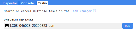
Click RUN to export the file to your Google Drive. In the window that opens up, you can choose a different
folder, resolution, CRS, or place to export it. In general, running the task might take some time, depending on the
size of the image. You can click the ‘Refresh’ button to check the status to see if it’s finished running.
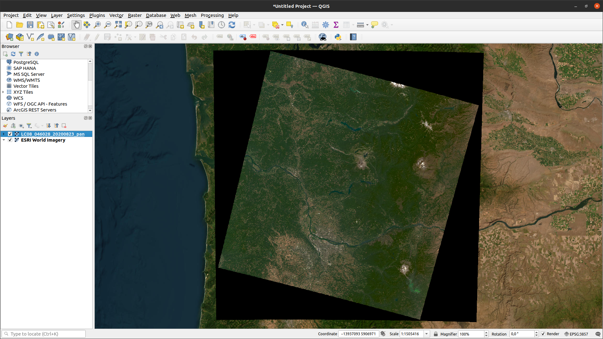
Once the task has finished, you can download the file from your Google Drive, and use it in a GIS program such as QGIS:
Hint
This could make an excellent base image for a study area map that you might use in your presentation and/or report.
Note
In the example above, I have exported the visualization image:
image: pan.visualize({min:0.005, max:0.4, gamma:1.5})
this means that the output raster will be a 3 band, 8-bit image, with pixel values corresponding to the parameter
values supplied to ee.Image.visualize().
If you would rather export the pan-sharpened image with the original values, simply remove
.visualize({min:0.005, max:0.4, gamma:1.5}) from the script and re-run it.
part 4 - pca#
In the final part of this week’s practical, we’ll have a look at principal component analysis (PCA), and see how the different bands of the PCA image compare to the original image bands. As we discussed in the lecture, PCA can help maximize the difference between bands by transforming the image in a way that minimizes the correlation between bands of the image.
Open the script for this part of the practical by clicking on 04_pca.js in the Script manager, or using
this direct link.
You’ll notice that this script appears very short - that’s because the majority of the steps of calculating the PCA
are hidden away in libraries/tools.js, where I’ve used and adapted the code provided in
this example.
We won’t cover the details of this transformation here, but if you are interested in learning some more, this post has a good, short introduction.
Note
When you click Run, it may take a minute for anything to “happen” - be patient.
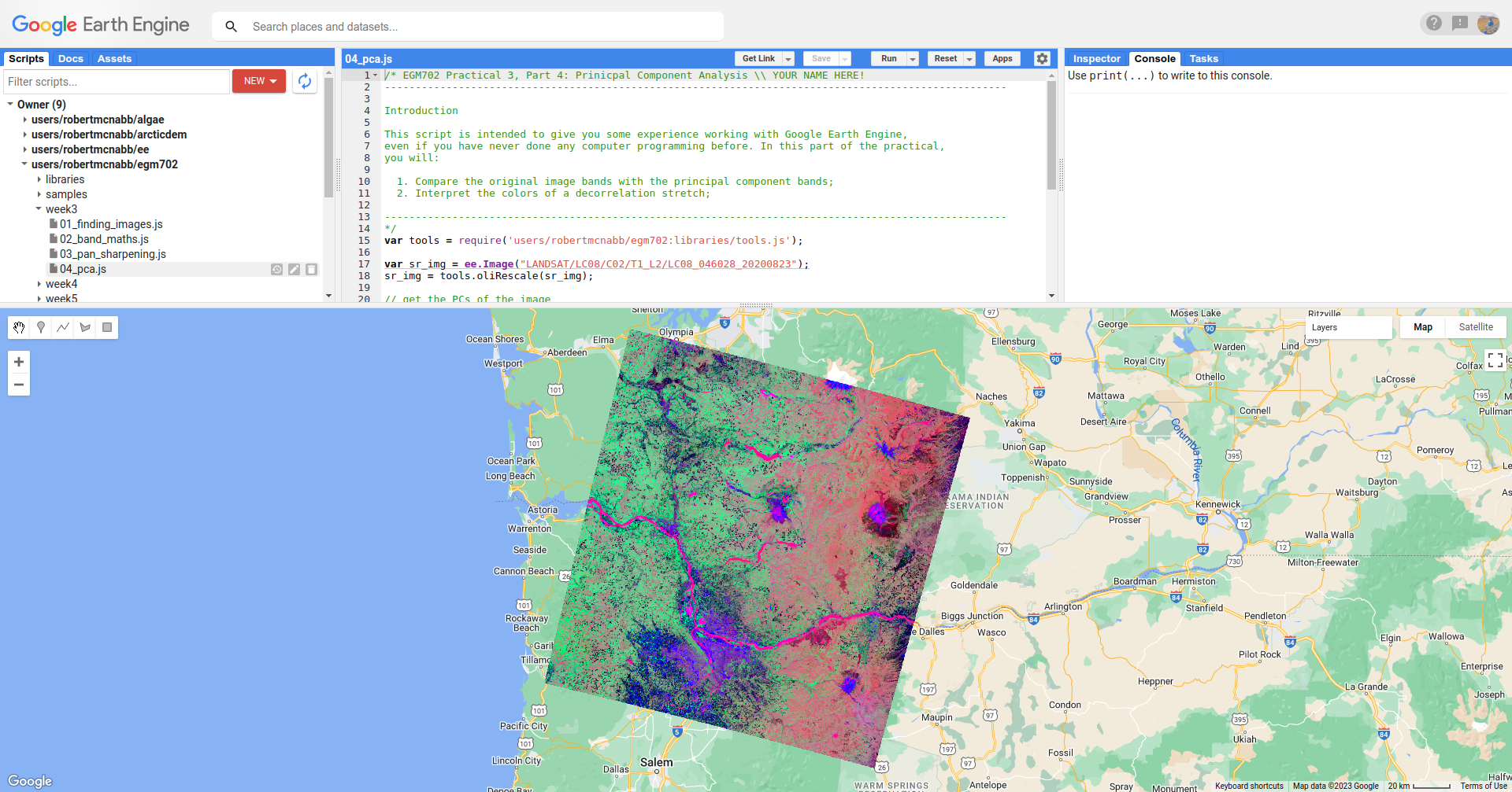
When the script finishes running, you should see the following:
Question
Before zooming in, have a look at the decorrelation stretch as a whole. What features jump out at you?
The decorrelation stretch displays the first three principal components (pc1, pc2, and pc3) in the red,
green, and blue channels of the image; this means that we can interpret the image on the screen as follows:
red/pink: high values in
pc1, lower values inpc2andpc3;green: low values in
pc1andpc3, higher values inpc2;purple: similarly high values in
pc1andpc3, low values inpc2;blue: high values in
pc3, low values inpc1andpc3;black: low values in all three bands;
and so on.
Question
Using the list of color examples above, see if you can identify what surface type corresponds to each example.
Remember that there might be several different surface types that correspond to each color, so feel free to use both the SR image and the background satellite image to help you.
One of the applications of PCA, especially in data science more generally, is for “dimension reduction.” In effect,
most of the “information” about the image is contained in the first principal component, and the amount of information
decreases for each PC band. We can see this by looking at pc7:
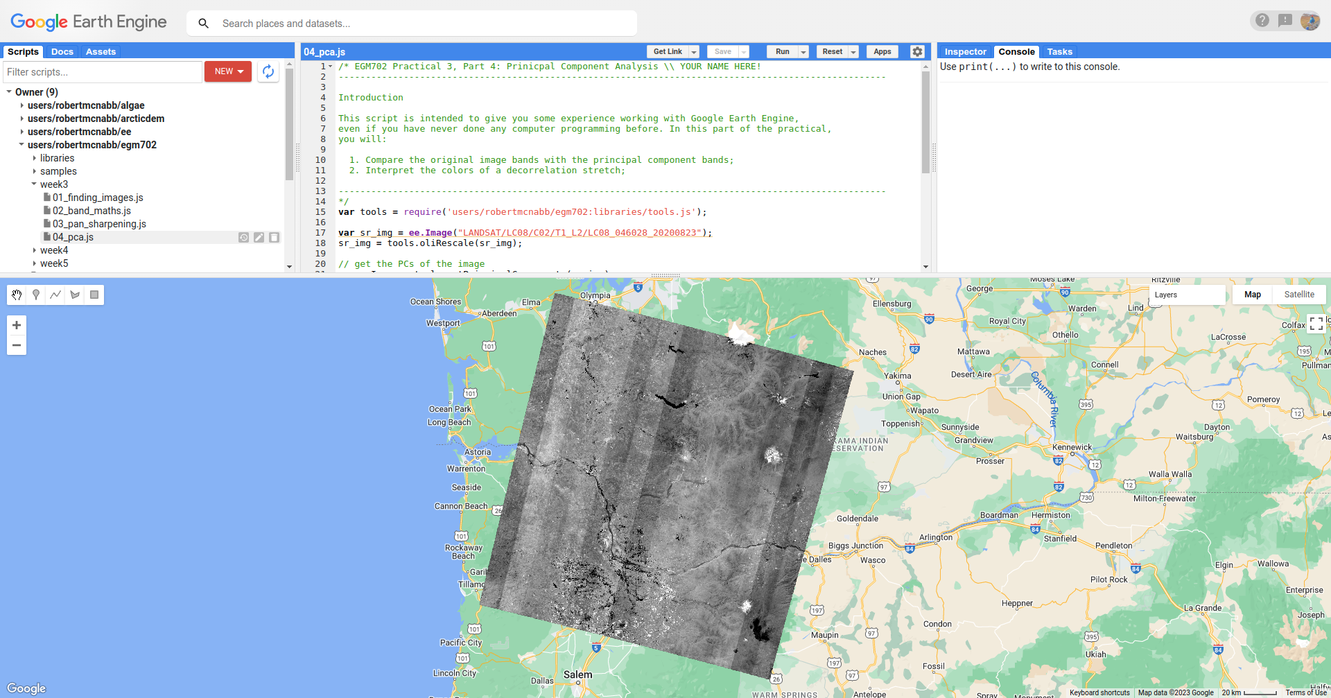
In this image, we can actually see residual sensor noise - the stripes are due to variations in the response of the
detector arrays in the OLI sensor.
In the original image, these variations are very minor (we typically can only see them over very dark pixels such as deep water), but due to the PCA transformation, the noise is enhanced in the final PC band.
Now, look at pc1 by deactivating the other layers in the Layer Menu:
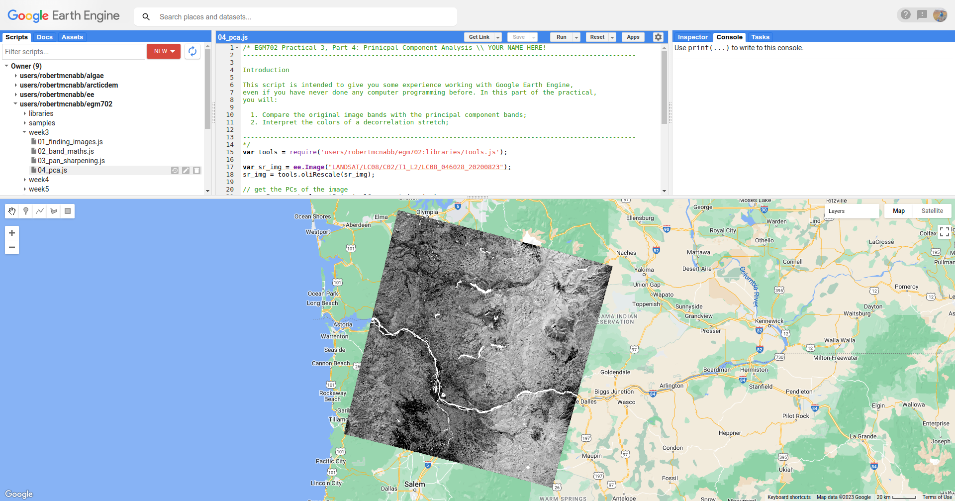
You should notice how the Columbia River stands out as a bright, white ribbon cutting through the middle of the
image, as do a number of other lakes and reservoirs. You should also notice that the eastern (right) part of the image
is quite a bit brighter than the western (left) part.
One of the applications of PCA and decorrelation stretching that we discussed in this week’s lecture was for mineral mapping, since PCA helps accentuate the differences in reflectance of difference surfaces across all bands of the image.
Zooming in on Mt St Helens, you should notice a difference between the North and South flanks of the volcano. If you flip back to the decorrelation stretch, you can see that there is quite a bit of variation in color on the slopes of the volcano itself, owing to the variation in minerals and rock types that make up the volcano.
You should also notice that the short, scrub vegetation that has begun to grow since the 1980 eruption looks quite dark
in pc1, while the older forests that weren’t damaged as part of the eruption (or subsequently logged) appear
brighter. In addition to mineral mapping, this shows that we can use PCA to help highlight differences in vegetation
type.
As a final step, if you want to export the PCA image in order to use it for further analysis in QGIS or ArcGIS, copy and paste the following code snippet to the bottom of the script, then re-run the script:
Export.image.toDrive({
  image: pcImage,
  description: 'LC08_046028_20200823_pca',
  scale: 15,
  region: pcImage.geometry(),
  crs: 'epsg:32610', // use wgs84 utm zone 10N
  maxPixels: 1e13
});
next steps#
Make sure that as you work through the practical, you understand and can answer the questions being asked. If you’re not sure, ask on the discussion board on blackboard.
If you’re looking for additional exercises, you can try the following suggestions (in no particular order):
Using the decorrelation stretch from part 4, and figure 3 (page 3) from this pamphlet, can you identify which color(s) of the decorrelation stretch correspond to which tree species?
notes and references#
- 1
Gorelick, N., M. Hancher, M. Dixon, S. Ilyushchenko, D. Thau, and R. Moore (2017). Google Earth Engine: Planetary-scale geospatial analysis for everyone. Rem. Sens. Env. 202, 18-27. doi: 10.1016/j.rse.2017.06.031
- 2
Höhle, J. & Höhle, M. (2009). Accuracy assessment of digital elevation models by means of robust statistical methods. ISPRS J. Photogramm. Rem. Sens. 64, 398–406. doi: 10.1016/j.isprsjprs.2009.02.003