SAR image interpretation and flood mapping#
For this week’s practical, we’re going to gain some first-hand experience interpreting SAR images with the help of near-contemporaneous Landsat images, as well as additional basemap layers. In particular, you should be able to:
use Sentinel-1 RGB composites to interpret different surface types
identify different surface types using both VV and VH-polarized images
map surface water and flood extent using multiple techniques
change the layer display in QGIS to aid in interpreting difference images
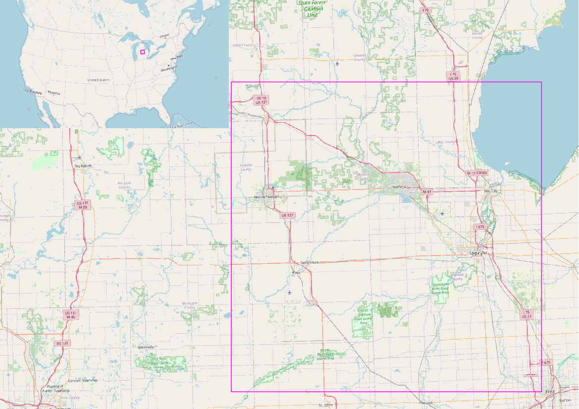
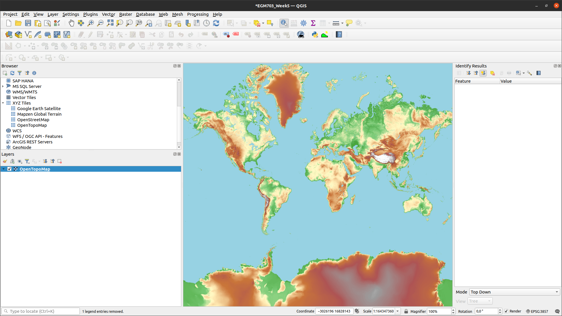
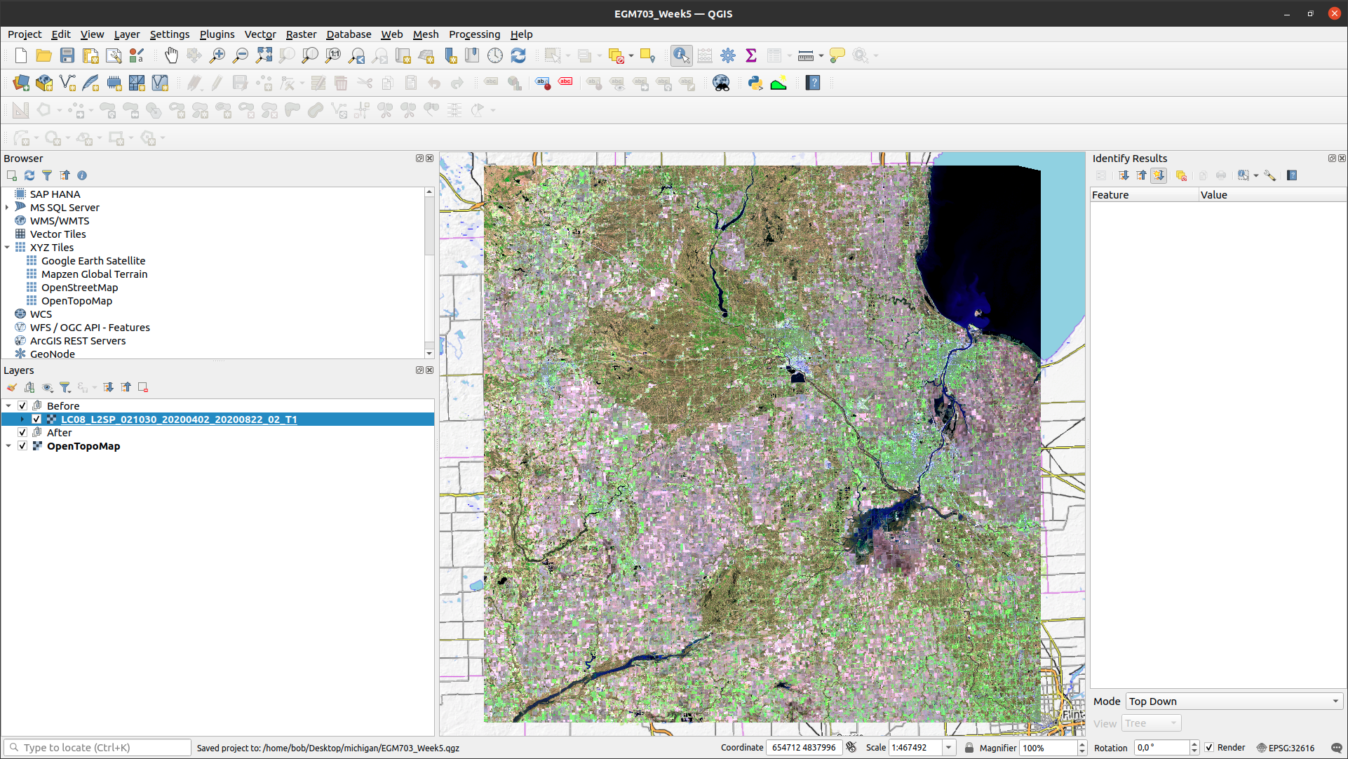
The study area for this is central Michigan, USA, near the head of Saginaw Bay on Lake Huron:
In May 2020, heavy rains over the span of a few days caused intense flooding in the region - something that SAR
in particular is well-suited for observing.
Note
The following instructions were written using QGIS 3.26.3, which is also what the example images show. The instructions should be transferrable to other flavors of QGIS, and even ArcGIS Pro, though there may be some differences in naming/appearance.
If you don’t have access to the module page on Blackboard, you can still follow along with this practical by downloading the images from Earth Explorer. The two Landsat images used for this practical are:
LC08_L2SP_021030_20200402_20200822_02_T1
LC08_L2SP_021030_20200402_20200822_02_T1
And the two Sentinel-1 scenes are:
S1B_IW_SLC__1SDV_20200527T233215_20200527T233243_021774_02953A_4467
S1B_IW_SLC__1SDV_20200515T233214_20200515T233242_021599_02900D_1C91
The Sentinel-1 data used in this tutorial are radiometrically terrain corrected (RTC) products, downloaded from the Alaska Satellite Facility’s Hybrid Pluggable Processing Pipeline (HyP3). In case it was not already clear from the lectures, if you are interested in obtaining analysis-ready SAR images yourself, I highly recommend that you look into using this (totally free!) service.
To submit HyP3 orders, you can use Vertex, ASF’s online data search portal. There is also a python wrapper around the HyP3 application programming interface (API), which means you can write pytho scripts to search for, order, and download your images.
Note
The images provided on Blackboard have been cropped to make them more manageable - the full granules downloaded from Earth Explorer and ASF, respectively, are between 600MB and 1 GB in size.
getting started#
recommended: add a base layer in QGIS#
Note
If you are using ArcGIS Pro, you can change the Basemap from the Map tab – by default, the Topographic
basemap is loaded.
If you are using QGIS, you can add a base map as an XYZ Tile using the following directions. You may already have the OpenStreetMap and Mapzen Global Terrain layers available, but there are many other basemap layers available - see this post on the GIS StackExchange for additional URLs – the procedure will be the same.
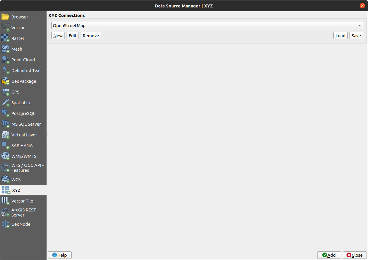
For this example, we’ll add the Open Topomap. Start by opening the Data Source Manager and clicking on XYZ:
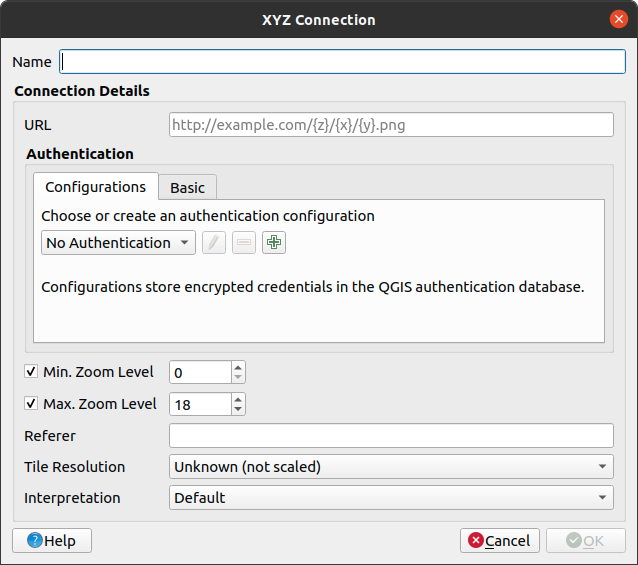
Click on New to open the XYZ Connection dialog:
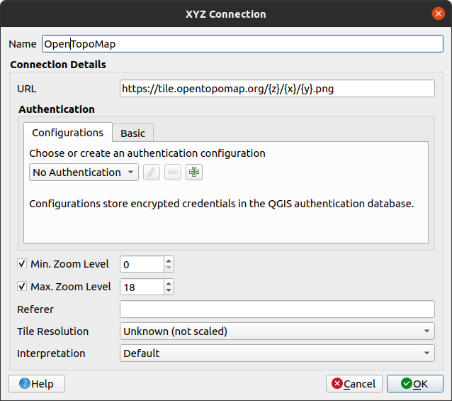
Under “Name”, put OpenTopoMap, and add the following to the URL field:
https://tile.opentopomap.org/{z}/{x}/{y}.png
You can leave the other settings as-is - the dialog should look like this:
You can now add Open Topomap to QGIS as a separate layer by clicking Add from the XYZ Data Manager:

which should load the following layer into the map:
And that’s it! Feel free to use this background, or any of the other ones available out there, to aid you in
your interpretation.
loading the surface reflectance images#
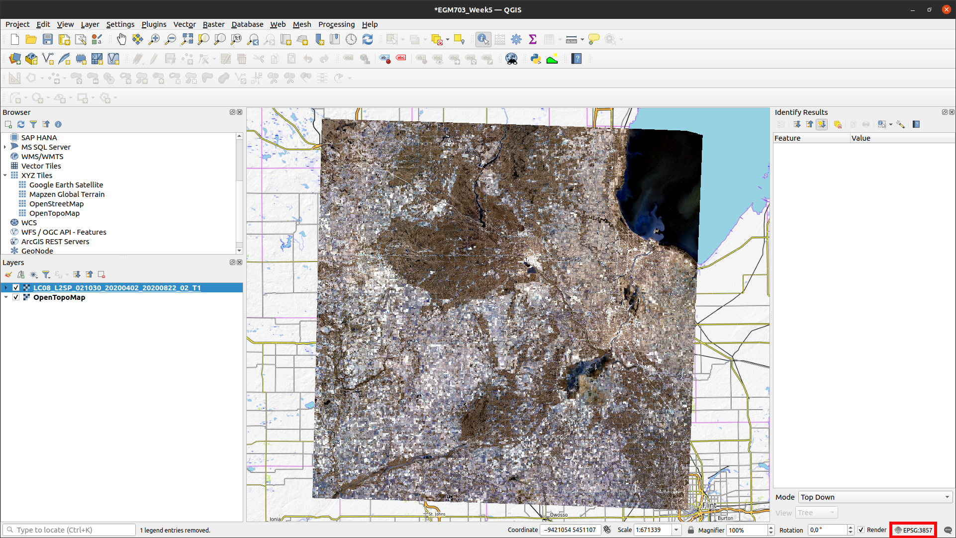
To begin, load the 02 April Landsat image into the map. If you followed the optional instructions above, remember that you can zoom to the image by right-clicking on the layer and selecting Zoom to Layer(s).
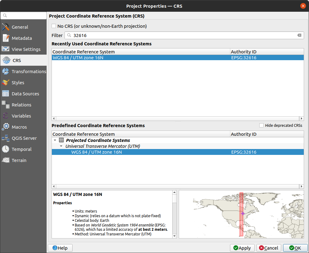
Be sure to check that the project CRS is set to WGS84 UTM Zone 16N (EPSG:32616; red outline above). If it is
set to a different CRS, you can change it by clicking on the CRS button, and selecting the correct CRS from the
following dialog:
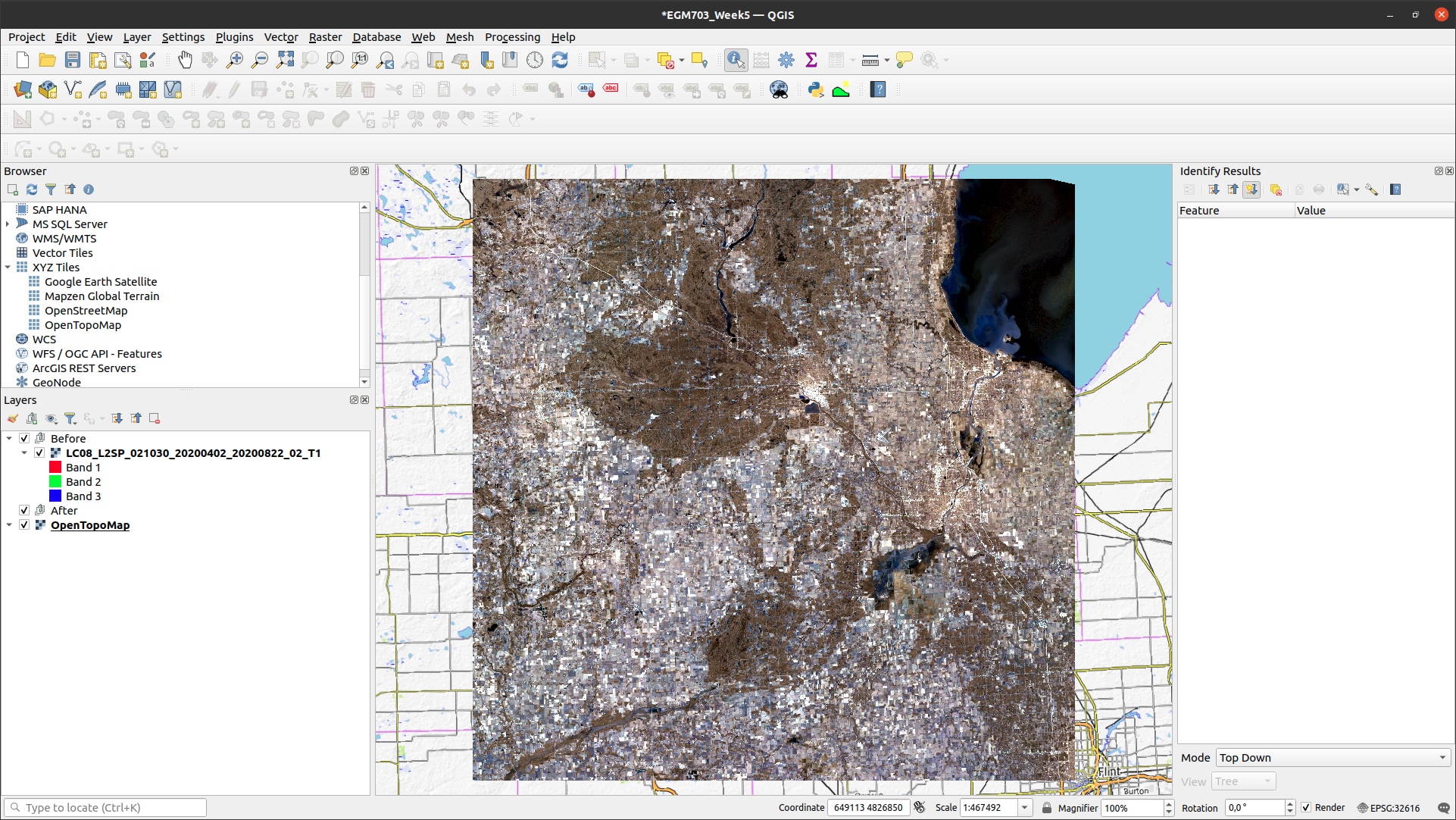
Next, click on the Add Group button (red outline below) to add a group, and rename it (right-click on the group
name, select Rename Group) Before. Add the 02 April Landsat scene to this group, then add a new group and rename
it After:
Note
Check that your After group is not placed inside of your Before group - if it is, you can click + drag
the After group layer entry so that it’s outside of the Before group.
Have a look at the Landsat image - it looks a little strange, because it is loaded as a 123 false color composite (that is, the Red channel corresponds to OLI band 1, the Green channel corresponds to OLI band 2, and the Blue channel corresponds to OLI band 3).
We want to view this as a 654 color composite. Open the Layer Properties (right-click, Properties), then
click on the Symbology tab. We want to view this as a Multiband color image, with Band 6 as the Red channel,
Band 5 as the Green channel, and Band 4 as the Blue channel. Change the band combination to the new setting, t
hen click OK:
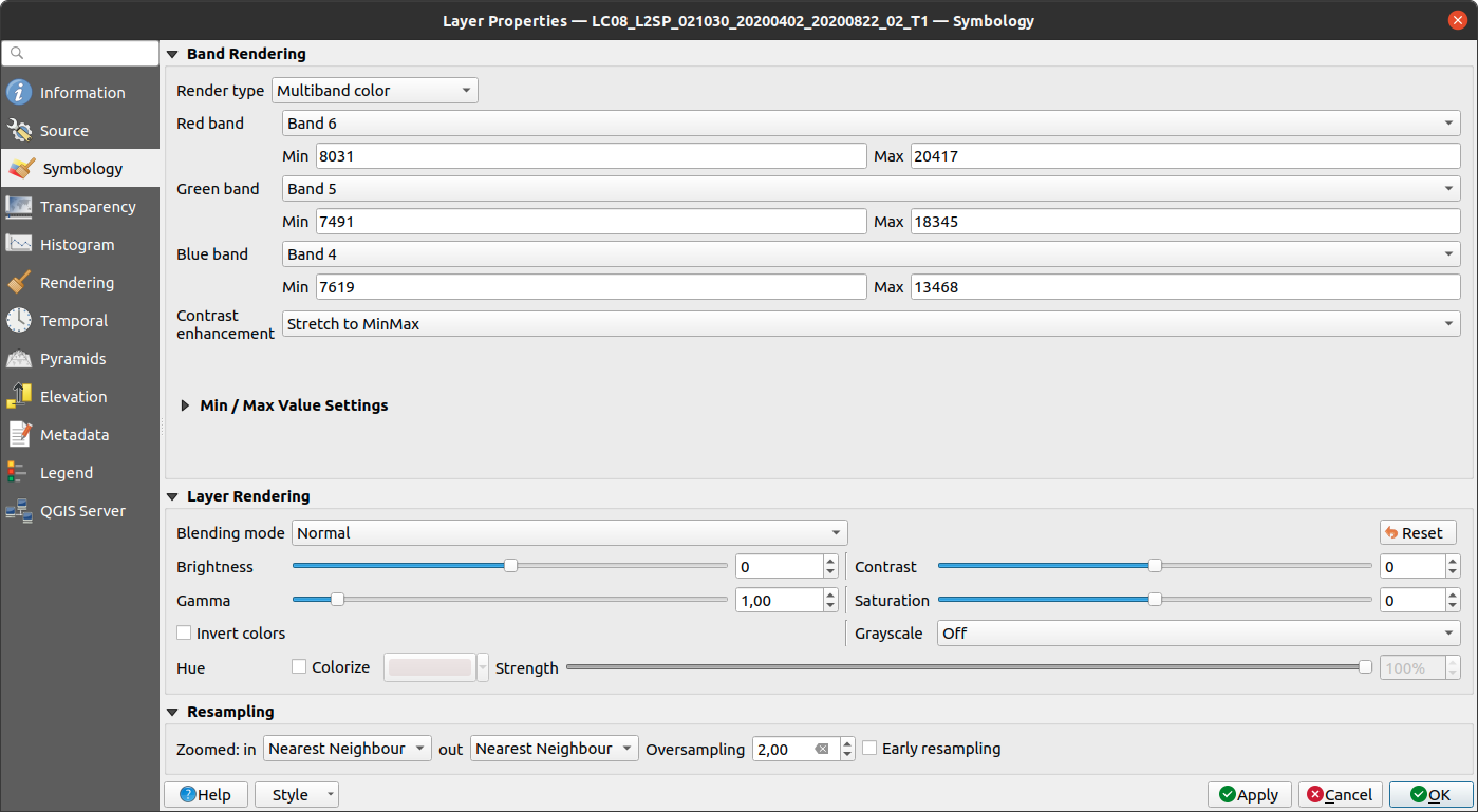
You should see the following image loaded in the Map window:
Now, add the 20 May Landsat image to the Map, place it inside the After group, and make sure that it
is displayed as a 654 color composite.
Note
Once you have changed the symbology for one image, you can copy + paste these settings to another image. Right-click on the image that you want to copy the settings from, and select Styles > Copy Style.
Then, right-click on the image that you want to copy the settings to, and select Styles > Paste Style.
Question
Have a look at the two Landsat images.
What do you notice about the differences in color?
What explanation can you think of for why the images would be so different?
As a hint: think about what color difference jumps out the most between the two images. What OLI band is currently displayed in that color channel? Using your understanding of reflectance and the time of year that these two images were acquired, what might cause such a large change in reflectance in this band?
the dual polarimetry rgb image#
In the 654 false color composite, water appears blue/black, vegetation appears green, and built-up areas appear in shades of pink and purple. Using the basemap, have a look at the city of Midland, Michigan, approximately in the center of the image:
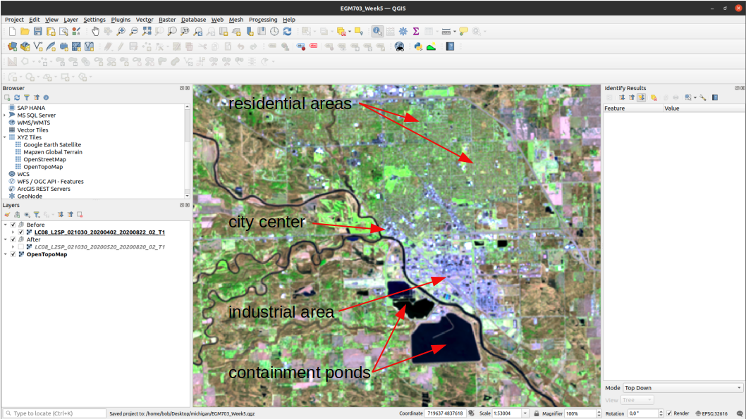
In the Landsat composite zoomed in on Midland, you can see that the northern, residential part of the city is
mostly green, while the more built-up central part of the city is somewhere between purple and gray. In the southern
part of this image, you can see more industrial areas, which have the same sort of color as the central part of the
city.
With a dual polarimetric radar like Sentinel-1, we can create RGB composites, which help with interpreting the backscatter that we see. Load the RGB image for the first Sentinel-1 scene into QGIS:
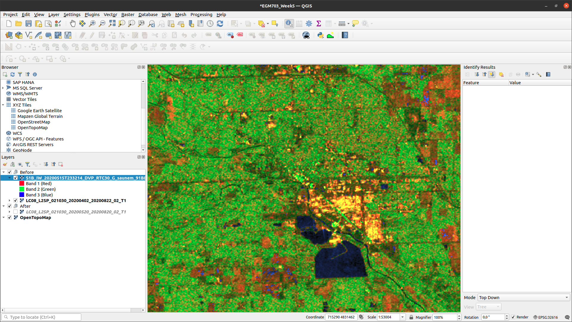
This image is created as part of the HyP3 processing chain, and it can help us interpret what we’re seeing in the
image. From the documentation, we can
interpret the band composition of this image as follows:
Red band: surface scattering with some volume scattering
Green band: volume scattering
Blue band: surface scattering with very low volume scattering
As with the Landsat image, dark colors in all 3 bands indicate surfaces with very low returns, such as calm water or dry sand. Bright green colors indicate that most of the signal returned from the pixel is due to volume scattering, which can be due to surfaces like leafy vegetation. Red colors indicate that surface scattering is more prevalent, which may be due to surfaces like bare soil.
Yellow indicates high values in both the red and green channels, which implies very “bright” surfaces - often, these are large metal structures such as buildings.
Question
Have a look at the two images of Midland (Sentinel-1 RGB and Landsat false color). How do the colors in the Sentinel-1 composite match up with your interpretation of the Landsat image (or, alternatively, the base layers)?
Next, zoom out to view the entire layer (right-click, Zoom to Layer(s)). Using the numbers in the image below, along with the basemap and the Landsat image, see if you can identify what surfaces are present in these areas, and why they appear this way in the RGB image.
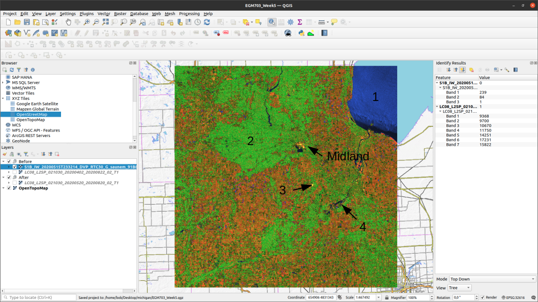
To help clarify, here are descriptions of the features indicated by each number in the image above:
The large blue/black feature in the northeast corner of the image
The large green feature west of Midland
The very bright yellow feature just south of Midland
The large, mostly dark feature just southeast of feature 3.
comparing differences between rgb composites#
Now, load the RGB composite from the second image (27 May):
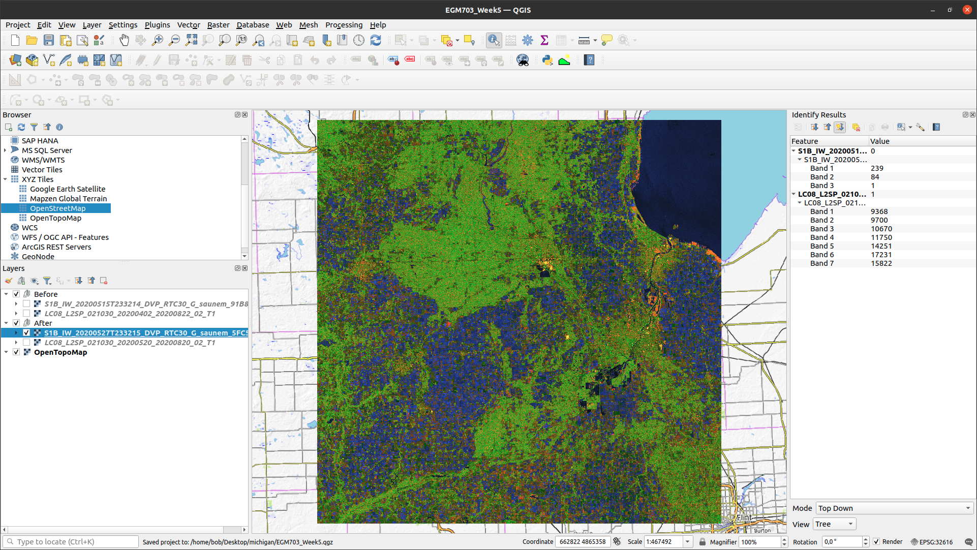
Question
In this image, you should notice that the vast majority of the agricultural land in the image changed from primarily red colors in the 15 May image, to primarily blue colors in the 27 May image. What happened?
As noted in the introduction, between 17-20 May 2020, a record amount of rainfall fell on the region, with some areas seeing more than 10 cm of rain during that time.
The big change that we see in the second RGB image, then, is primarily due to the change in soil moisture between the two images. In the second image, the soil in the fields is saturated, which has (a) caused a pronounced decrease in the backscatter recorded by the sensor, and (b) created a “smoother” (in terms of the radar signal) surface, with surface scattering predominating over volume scattering.
We will come back to this image later, but for now, we will move on to look at the individual bands (the VV and VH files).
examining differences between VV, VH images#
Start by adding the VV band from the 15 May image to the Map:
When you first load this band into QGIS, it appears very dark due to the stretch that’s applied. Open the
Layer Properties (right-click, Properties), then click on the Histogram tab. Click on Compute Histogram
to view the histogram for the layer:
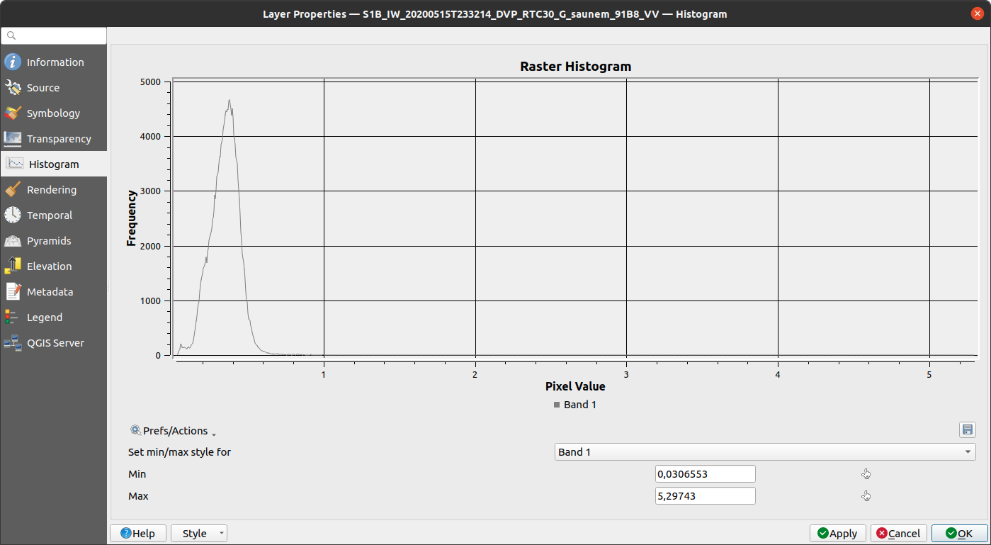
In the above screenshot, you can see that the minimum display value for the image is 0.03, and the maximum is 5.29.
But, the histogram shows us that most of the pixel values fall between 0 and 0.6 or so. To change how the image is
displayed, you can set the Min and Max values via the Histogram tab, or the Symbology tab - either way,
change it so that the pixel values are stretched between 0 and 0.6, then click OK:
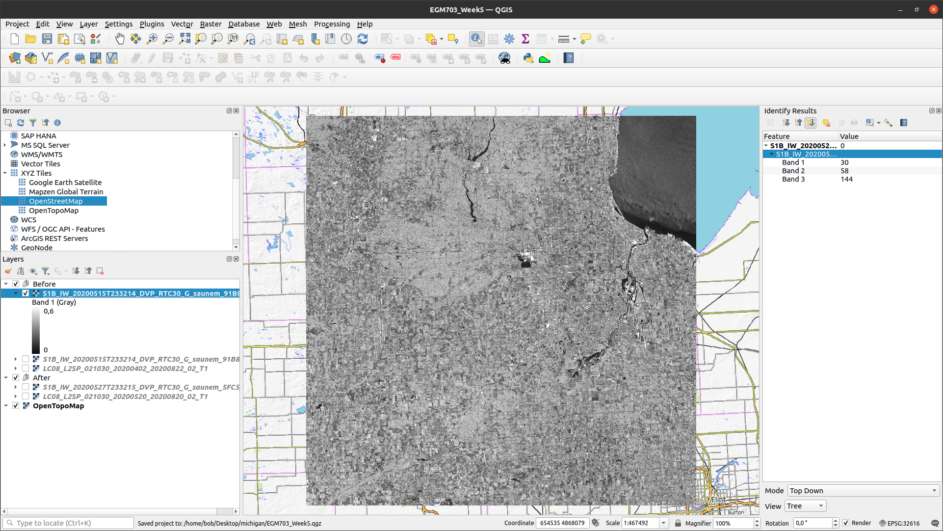
That looks better. In this band, the vertical co-polarization band, remember that the signal that is sent and
the signal that is received by the sensor is vertically polarized (hence, VV).
In the other band, the VH band, the signal sent by the sensor is vertically polarized, but the signal received is horizontally polarized. As covered in lecture and the suggested readings, this “cross-polarization” can tell us a lot about the surface being observed.
Next, add the VH band from the 15 May image to the Map. Just like with the VV band, you should look at the histogram to determine an appropriate min/max range to scale the image to:
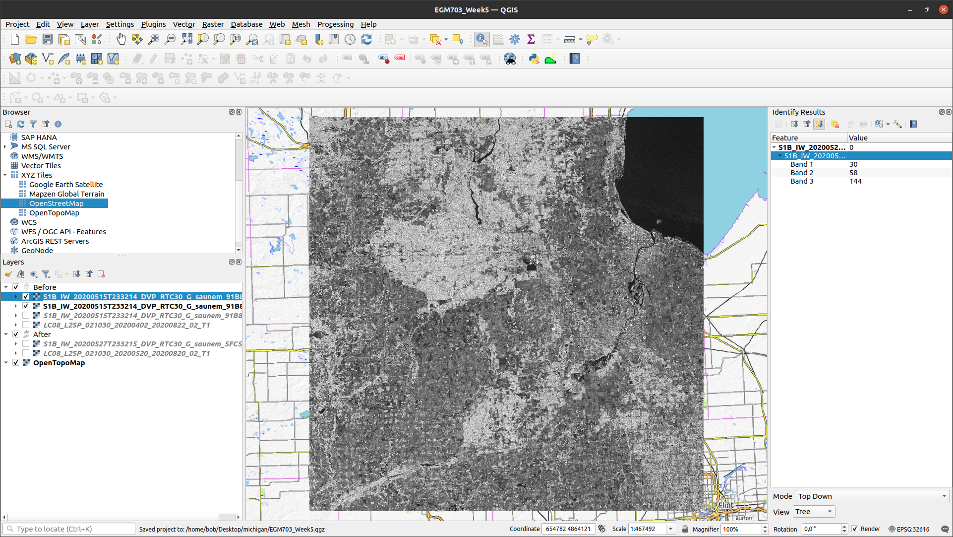
In general, the VV image has a larger range (in the example above, scaled from 0 to 0.6) than the VH image
(scaled from 0 to 0.3), indicating that more energy is recorded by the sensor in the VV band.
Question
Have a look at the two images, and pay attention to the areas that you examined in the RGB images before. What (if any) differences do you notice between the VV and VH bands?
Using your interpretation of the surface types, and your understanding of SAR images, can you explain some of these differences?

Warning
No, seriously. Before scrolling further, look at the question box above and try to think about what you can see in the two images.
See if you can come up with some explanations for why there are differences in the VV and VH bands, based on your interpretation of the Landsat and Sentinel-1 RGB images, then scroll down to see if your explanations/understanding match the given explanations.
wind patterns (#1)#
According to data from the National Oceanic and Atmospheric Administration (NOAA)’s Saginaw Bay Light #1 station, (43°48’36” N, 83°43’12” W), the measured wind speeds at 23:30 UTC on 15 May 2020 was 13.8 m s-1, with gusts to 16.4 m s-1.
Note
Remember that the granule or file name contains information about the acquisition date/time for the image:
S1B_IW_2020515T233214_DVP_RTC30_G_saunem_91B8
The timestamp has the format YYYYMMDDThhmmss, where:
YYYYis the 4-digit year (2020)MMis the 2-digit month (05)DDis the 2-digit day of the month (15)hhis the 2-digit UTC hour (23)mmis the 2-digit UTC minute (32)ssis the 2-digit UTC second (14)
Putting this all together, we see that the image was acquired beginning at 23:32:14 UTC on 15 May, 2020.
In the VH image, Saginaw Bay (the large body of water under label 1 in the image earlier) appears very dark, with \(\sigma^0\) amplitude values below 0.03 or so.
In the VV image, the Bay appears brighter, though still fairly dark, with typical \(\sigma^0\) amplitude values around 0.2 or so.
Wind increases the roughness of the water surface, which increases the backscatter measured by the sensor. The difference between the VV and VH bands is due to even less of the signal being returned with a changed polarization.
forests vs agricultural land (#2)#
The brightest parts of the cross-polarized (VH) image are going to be areas where we have more volume scattering, as volume scatterers tend to reflect more cross-polarized signals than other kinds of scatterers.
The forests indicated by label 2 above stand out starkly in the VH image for this reason. Because of the “double-bounce” reflection off of tree trunks, the forests are still fairly bright in the VV band, though the difference between the forest and the agricultural fields is less pronounced.
All of the agricultural fields, which show up as mostly red in the RGB composite, are darker in the VH band compared to the VV band. Because of the time of year (spring), fields are still mostly bare soil, which tends to act as a rough surface scatterer, rather than a volume scatterer.
urban and industrial areas (#3)#
Urban or industrial areas, like the large factory complex indicated by label 3 in the image above, tend to be made up of lots of corner reflectors such as buildings. This means that buildings show up brightly in both the VV and VH bands.
wetland areas (#4)#
The Shiawassee National Wildlife Refuge, indicated by label 4 in the image above, is an area where the Shiawassee River widens into a large network of wetlands, before joining the Tittabawassee River to form the Saginaw River.
Areas of standing water such as the river itself or the surrounding wetlands appear dark in both the VV and VH bands, though the river itself is darker in the VV band.
There are forests and other vegetation in the refuge that are predominantly volume scatterers, indicated by relatively high backsatter in both the VV and VH bands.
mapping flood extent using SAR#
Now that you’ve spent some time looking at the different images available and working on interpreting what you can see in the SAR images, we can use the before and after SAR images to map the extent of the flooding that remained on 27 May.
Note
When comparing the before/after Landsat images with the before/after Sentinel-1 images, and especially if you attempt to map the flood extent using the Landsat images, you will likely notice that there is more water present in the Landsat image of 20 May than the Sentinel-1 image of 27 May.
This has nothing to do with the way that SAR “detects” surface water - it is entirely to do with the fact that the flooding in the area peaked sometime around 22 May, and by 27 May much of the flood water had receded.
This only illustrates that timing is everything, and that when interpreting events from satellite images, you need to keep in mind that these images are snapshots of a particular point in time.
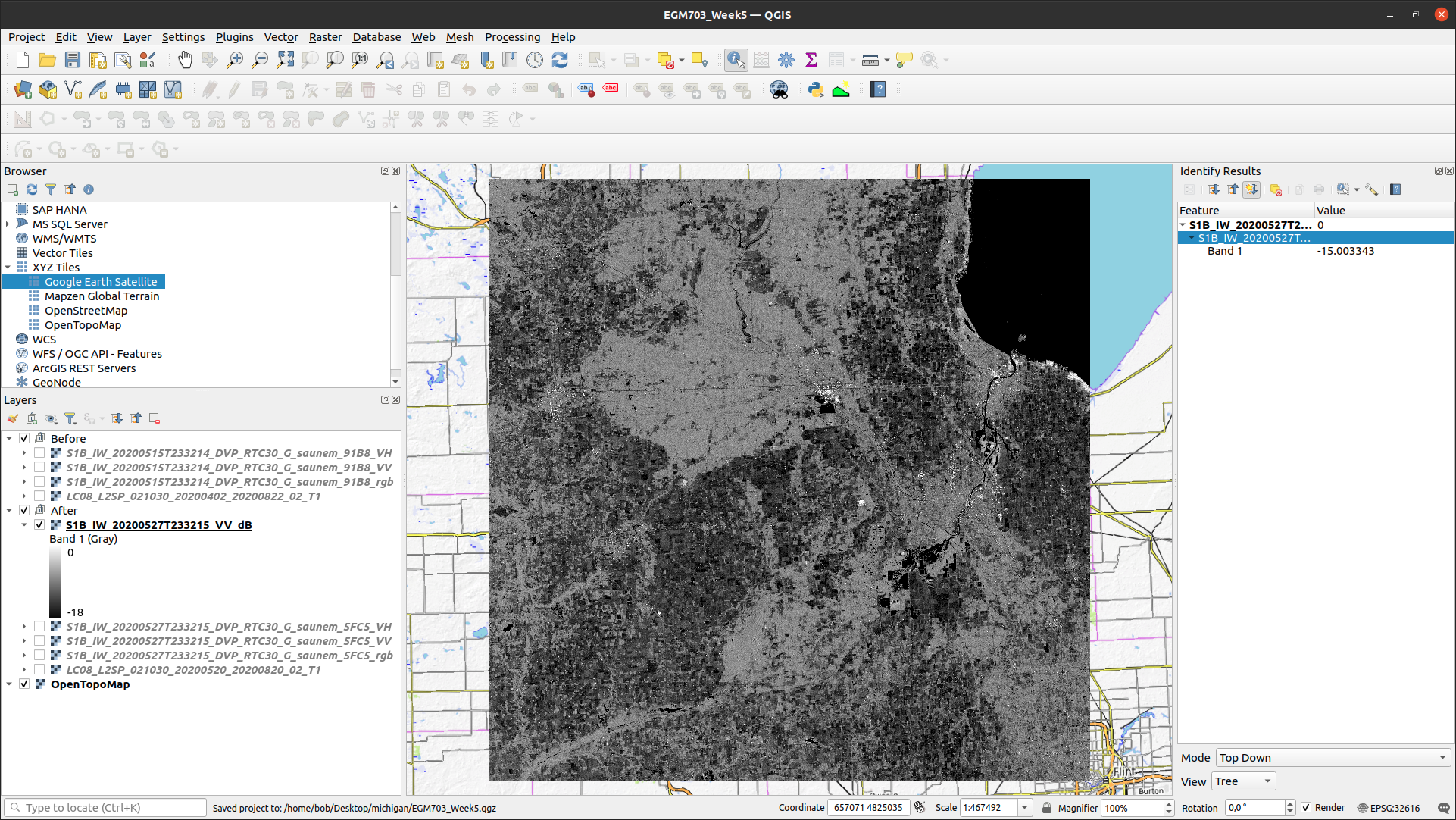
If you have not already done so, load the “After” VV and VH bands into the Map, and adjust the contrast as you did for the “Before” bands:
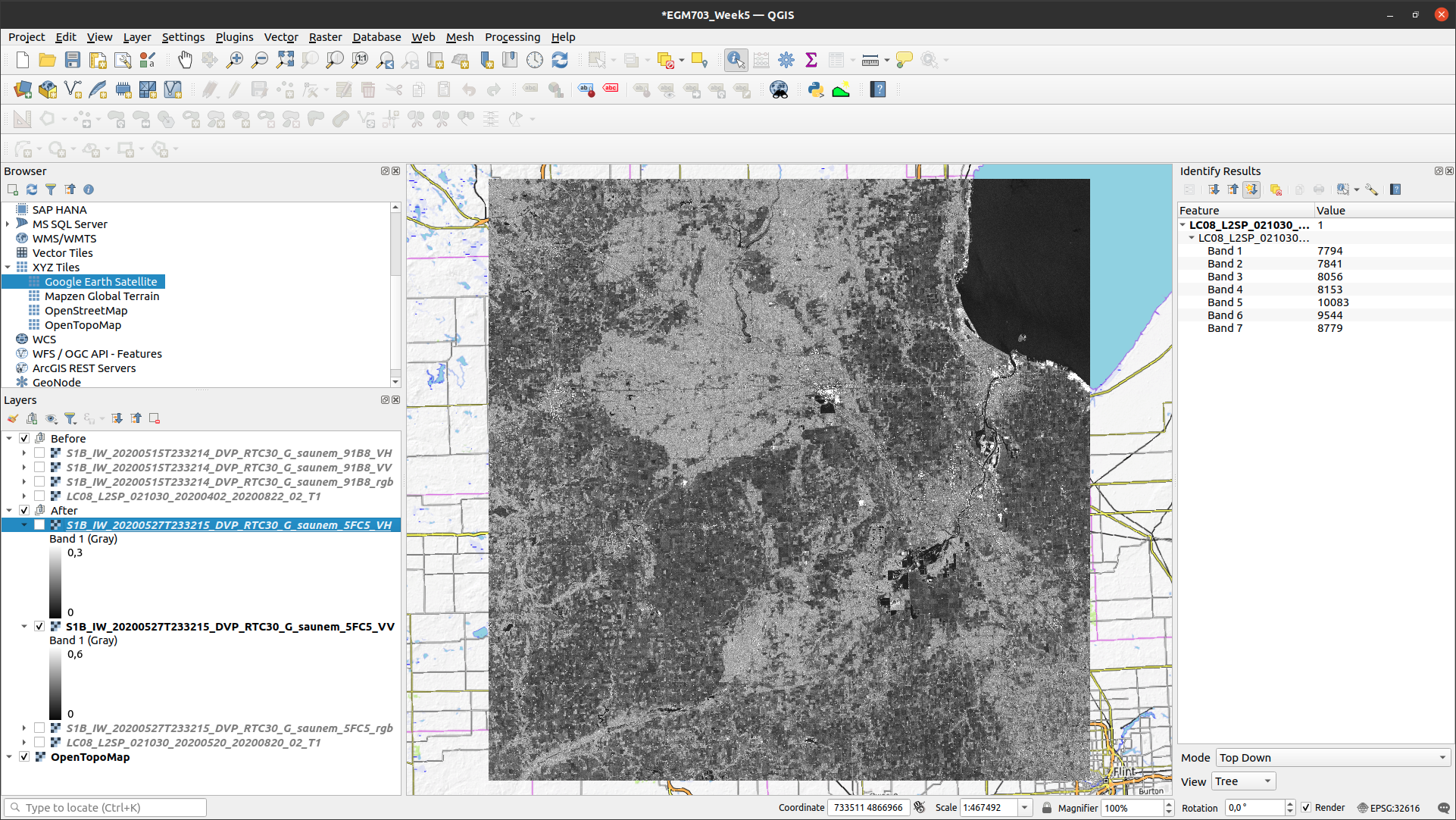
Comparing the before and after VV bands, you should see that the area around the Shiawassee National Wildlife
Refuge (label 4 in the image earlier) is quite a bit darker in the after image - indicating that there may still be
quite a bit of flood water remaining.
There are a few other areas where you can see large changes in backscatter - have a look around to see what other areas you notice, before moving on to the next section.
creating a water mask#
To map water in the image, we will first convert the \(\sigma^0\) amplitude image to a decibel (dB) scale, to help emphasize the differences in values.
The equation that we will use is:
That is, we need to square the amplitude (yielding \(\sigma^0\) in units of power), take the base-10 logarithm of the power, and multiply that result by 10.
In the Raster Calculator, the equation looks like this:
10 * log10 ( "S1B_IW_20200527T233215_DVP_RTC30_G_saunem_5FC5_VV@1" ^ 2 )
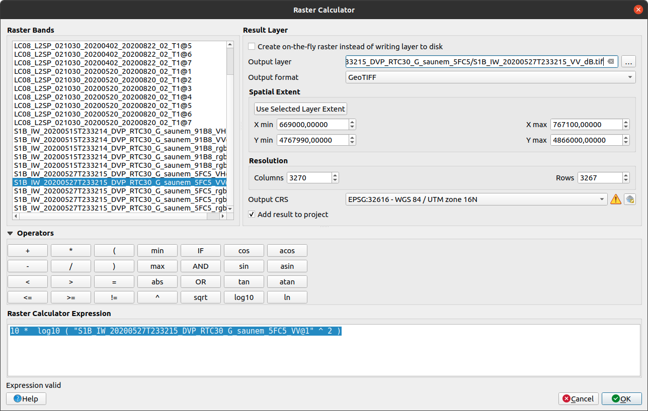
Enter the formula as shown above, make sure to save the output as S1B_IW_20200527T233215_VV_dB.tif, and click
OK. You should see the new band added to the Map. Now, open the Histogram for this layer:
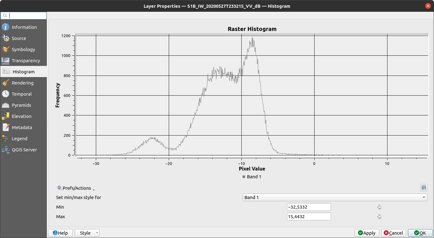
You should see that there are roughly two peaks: the largest is at around -8 dB, with a secondary peak around
-12 dB; the smallest peak, at around -22 dB, is what we’re interested in here.
Change the display properties so that the minimum value displayed is -18 dB (corresponding to the approximate bottom of the “trough” separating the two peaks), and the maximum value displayed is 0 dB, then click OK:
Question
Zoom in on some of the water bodies, such as the retaining ponds south of Midland, or the Shiawassee National Wildlife Refuge, and compare the stretched dB image with what you see in the 20 May Landsat image.
Do the black areas (areas where the dB value < -18) match up with the areas of water that you can see in the Landsat image? Feel free to try different values by changing the “minimum” value in the Symbology tab.
Remember also that you can use the Identify Features tool to see pixel values in locations that you click.
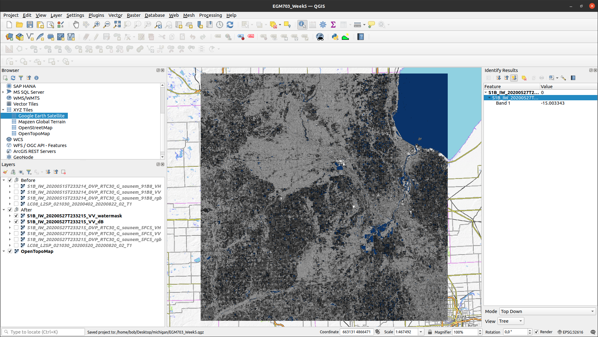
Now that we’ve had a look at the stretched image and examined some different values, open up the Raster Calculator, then enter the following formula:
"S1B_IW_20200527T233215_VV_dB@1" < -18
Save the Output layer to a file called tmp.tif, then press OK:
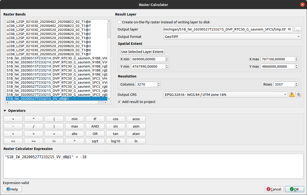
This will create a new raster, tmp.tif, with a “1” in every pixel where S1B_IW_20200527T233215_VV_dB
is less than -18, and a “0” in every pixel where S1B_IW_20200527T233215_VV_dB is greater than or equal to -18.
In other words, we have a “1” where the pixel value is under the chosen threshold, and a “0” where the pixel value is greater than the chosen threshold.
Warning
The threshold choice of -18 dB here is based on the image data. When you are working with other images, the “best” threshold value will not be the same, because it depends in part on the conditions at the time the image was acquired!
This means that you will need to examine each image to determine the threshold value to use. You cannot just assume that this value will be applicable in all cases!
The reason why we have saved this to a temporary file (tmp.tif) is so that we can use Translate to set the
NoData value to 0 for the layer. If we do this, then the output of the Polygonize step will be only polygons where
the VV dB value is less than -18 (i.e., where the temporary file is equal to 1).
Open Translate (Raster > Conversion > Translate (Convert Format)). Select tmp.tif as the
Input layer, and be sure to enter 0 under Assign a specified nodata value to output bands.
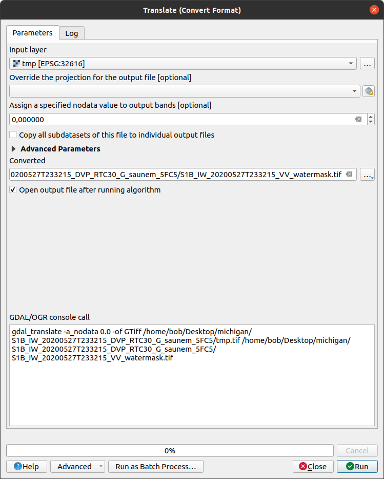
Save the file as S1B_IW_20200527T233215_VV_watermask.tif, then click Run. You should see something like this
(note that I have adjusted the symbology to show pixel values of 1 as blue, rather than white):
Note
You could also set the NoData value directly, using the gdal_edit.py command-line tool:
gdal_edit.py -a_nodata 0 <filename>
To do this, you can open an Anaconda Prompt window from an environment where you have installed the gdal
package (e.g., your EGM703 environment created during Week 2).
Then, navigate to the folder where you have saved your files, and run the above command, substituting
tmp.tif for <filename> in the command.
The final step in creating the water mask is using Polygonize (Raster > Conversion >
Polygonize (Raster to Vector)). In the dialog that opens, select S1B_IW_20200527T233215_VV_watermask as
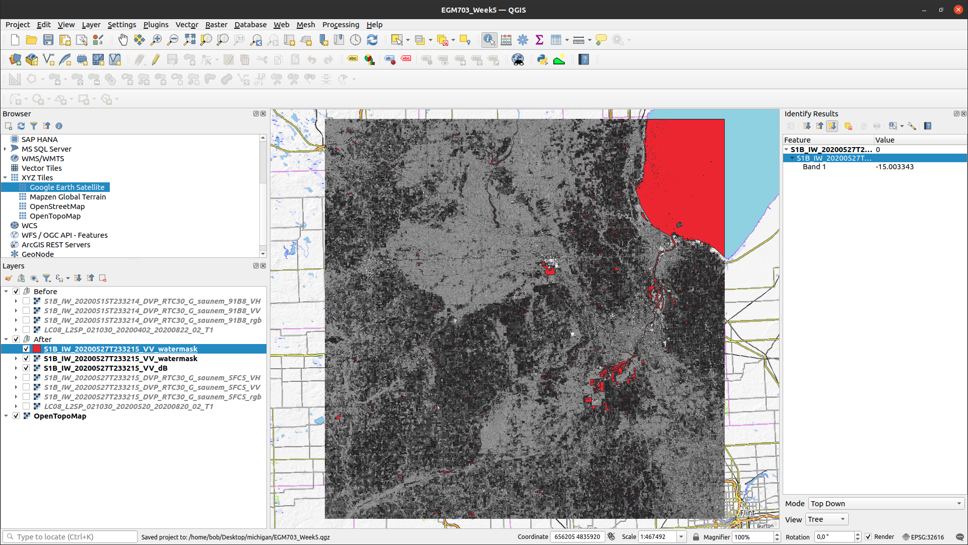
the Input layer, and save the file to S1B_IW_20200527T233215_VV_watermask.gpkg (or .shp if you prefer):
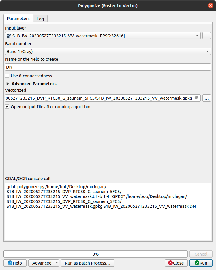
Click Run, and the new vector layer should load into the Map when it finishes processing:
Now, repeat these steps for the “After” VH image:
convert from \(\sigma^0\) amplitude to dB
view the Histogram, select appropriate min/max values, and apply the contrast stretch
use the Raster Calculator to select dark pixels below a threshold value and create a water mask
use Translate to apply the NoData value to the water mask
use Polygonize to create a vector layer of the mapped water extents.
Question
Of the two bands (VV, VH), which band maps the most water? Why do you think this might be?
using the difference between bands#
In addition to using the individual bands to map water, we can also map differences between bands using the Raster Calculator.
Before looking at the differences, though, make sure to convert the “Before” VV and VH bands to dB - this will help accentuate larger differences between the images, and make it easier to spot actual changes (as opposed to noise).
Once you have converted the “Before” VV image, open the Raster Calculator again. The formula to use is:
"S1B_IW_20200527T233215_VV_dB@1" - "S1B_IW_20200515T233214_VV_dB@1"
Save the output as difference_VV.tif, and press OK:
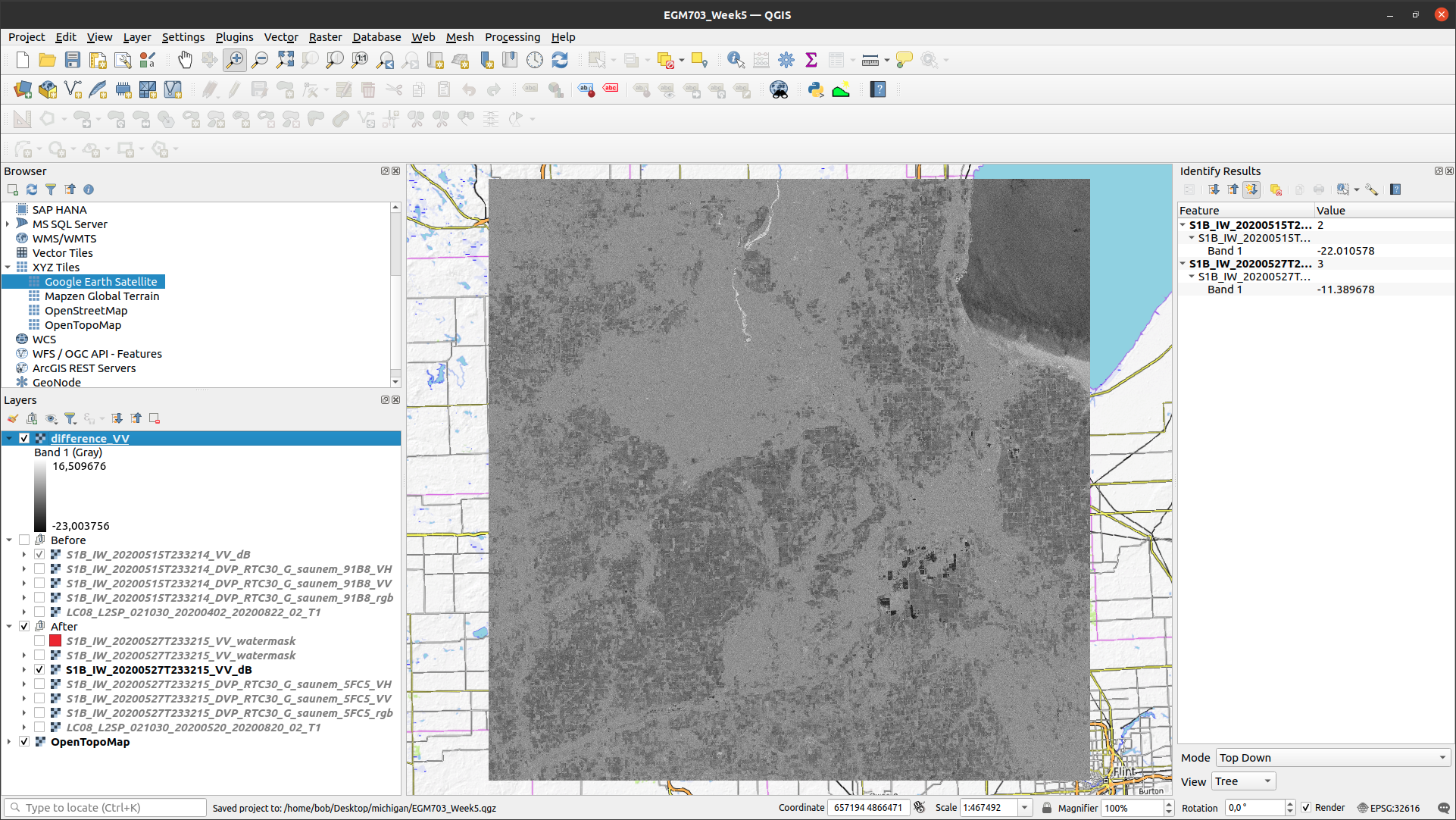
When the layer finishes calculating and loads into the Map, open the Properties for the new layer, and
click on the Symbology tab. We want to display this raster using a diverging colormap - that is, a colormap
where the two extremes diverge from a shared color in the middle.
QGIS has a number of built-in colormaps like this; I tend to use the RdYlBu map, though this is far from the only
option. Set the Min/Max values to -10 and 10, respectively, and leave Interpolation as Linear:
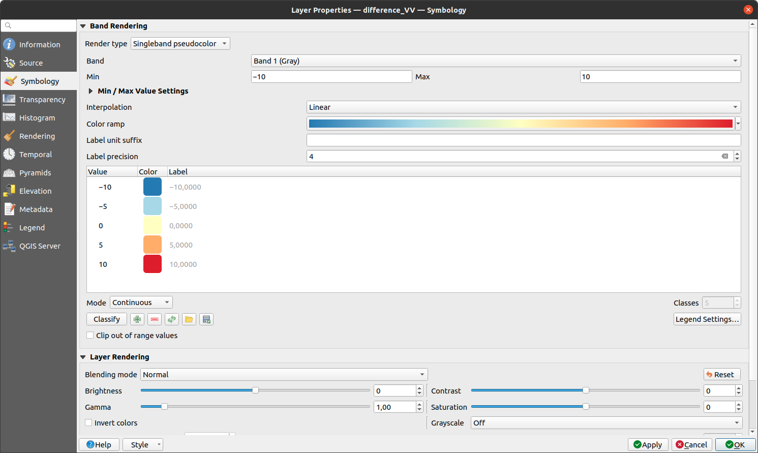
When you click OK, you should see the colors of the image change:
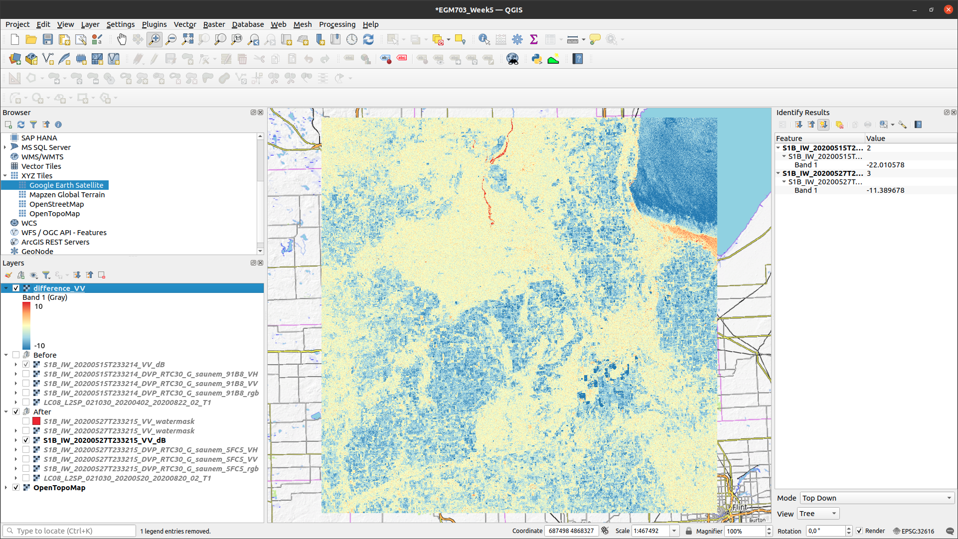
Note that most of the image is yellow or blue, indicating little change or a decrease in backscatter, respectively.
One noticeable exception is in the upper middle of the image, where a few bright red features can be seen. Zoom in
on this area:
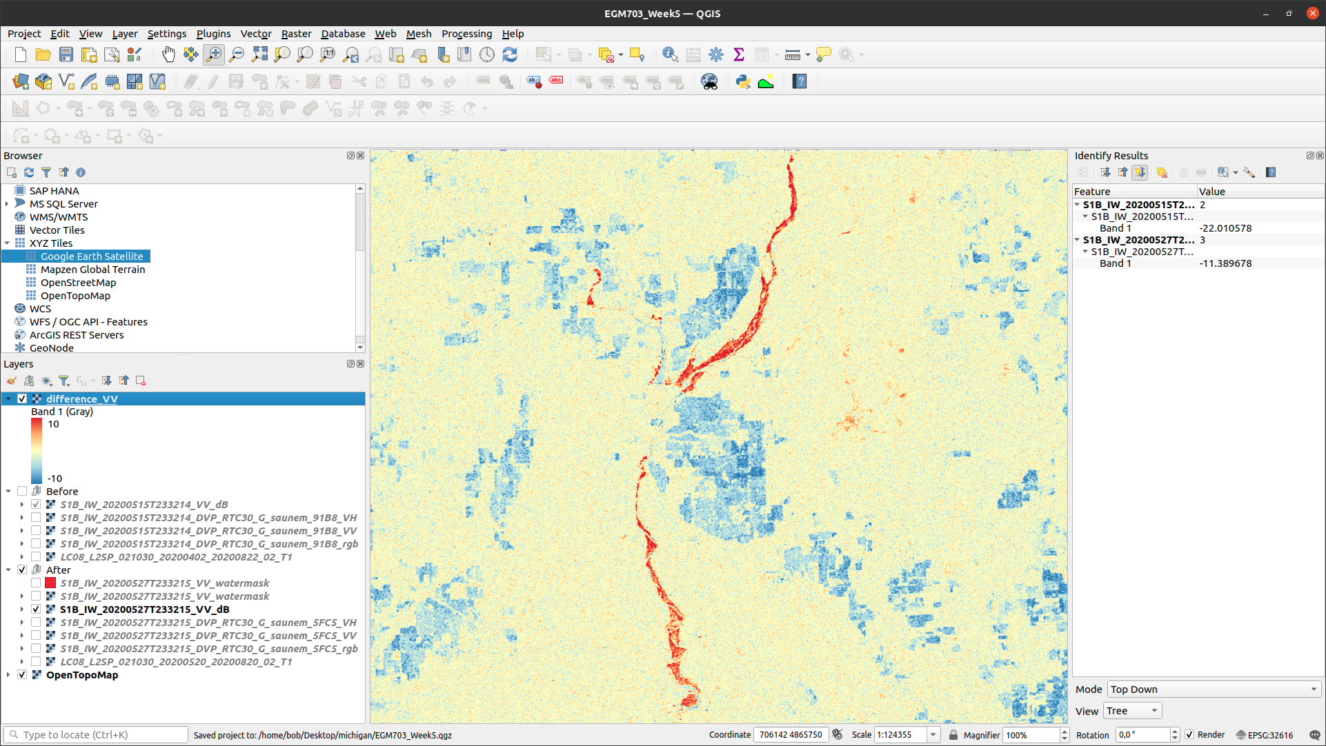
This is the former Edenville Dam, which burst on 19 May 2020 as
a result of the heavy flooding of the Tittabawassee and Tobacco Rivers.
After the dam failed, the floodwater overtopped the Sanford Dam further downstream, causing extensive flooding along the Tittabawassee River that can be seen in the 20 May Landsat image.
The red features in the difference image, then, are a result of an increase in backscatter between the two SAR images. When the dam failed and the reservoirs drained, the surface that we see is the former bottom of the lake, primarily mud. If you look at the VV or VH bands, in fact, you should see that the former lake bottom has very similar backscatter values as many of the waterlogged fields that we can see in the area.
Question
Arrange the layers so that the water mask is on top of the difference image. Do you see any consistent pattern between the areas that you mapped as water based on the backscatter threshold and the difference map? Why do you think this is?
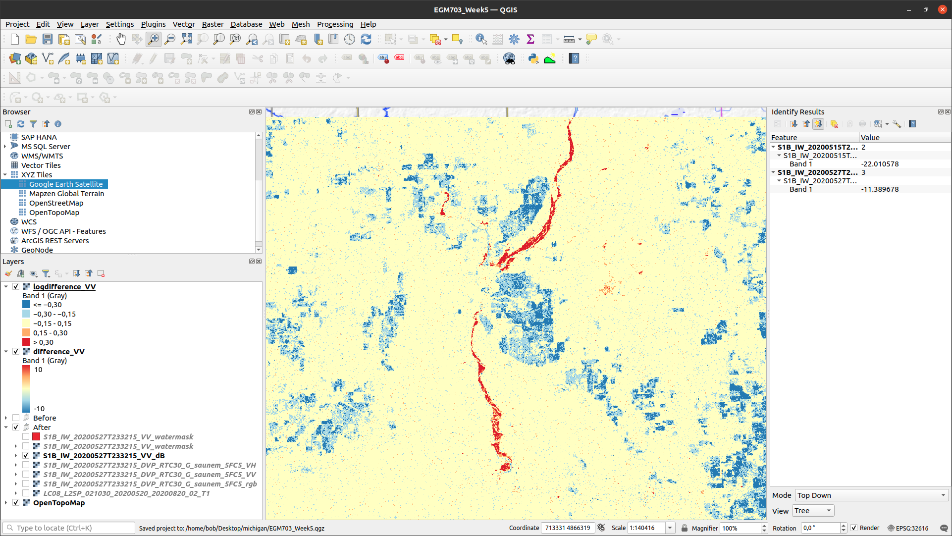
using the log difference#
When looking at the difference image, you might notice that the image appears “noisy”, with a speckled pattern to the differences.
In addition to looking at the difference in dB, we can also look at the “log difference”, or the difference of the logarithm of the amplitude. Using the log difference can actually help cut down some of this noise, and help emphasize areas where we see large changes in backscatter.
Open the Raster Calculator, and enter the following formula:
log10("S1B_IW_20200527T233215_DVP_RTC30_G_saunem_5FC5_VV@1") - log10("S1B_IW_20200515T233214_DVP_RTC30_G_saunem_91B8_VV@1")
Make sure that you are using the original amplitude bands, not the dB bands! Save the output as logdifference_VV.tif,
then press OK.
Like we did with the difference image, change the Render type to Singleband pseudocolor, and set the Min/Max
values to -0.3 and 0.3, respectively.
Next, change the Interpolation to Discrete, and use the same color ramp as before (RdYlBu - in these examples,
I have also ticked Invert color ramp so that blue is at the low end, and red is at the high end of the scale).
Finally, in the Value column, enter the values shown below:
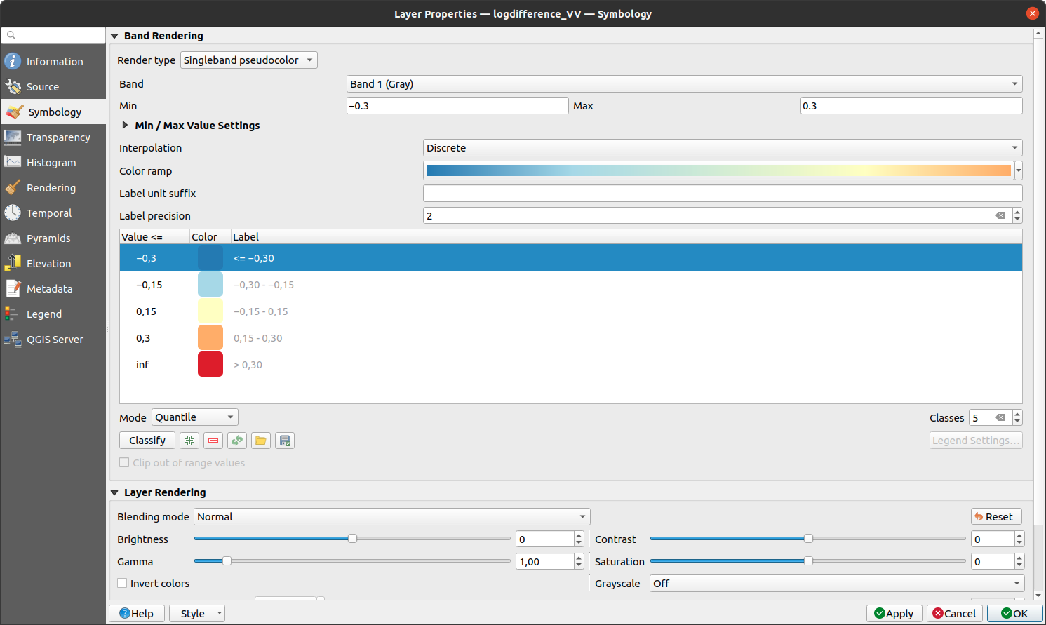
Instead of the linear interpolation that we used for the difference, this map will only use 5 colors, depending
on which interval the pixel value falls into. This is another way that we can reduce the visual noise in the image:
next steps#
In this practical, we’ve seen how we can interpret SAR images with the help of more familiar Landsat images and other data, and seen different ways that we can look at changes in SAR images, including:
Comparing RGB decompositions
Comparing co-polarized or cross-polarized images
Using both difference and log-difference images
Have a look at the areas that we’ve examined - the drained reservoirs near Edenville and Sanford, the waterlogged agricultural lands spread around the region, the flooded wetlands in the Shiawassee National Wildlife Refuge, and the industrial sites near Midland. Of all of the different methods that we’ve looked at, which method(s) do you find the most helpful for viewing differences or interpreting the images?
If you are interested in additional practice, here are some suggestions:
Create a water mask from the “Before” VV band, then difference the two vector layers to calculate the estimated change in water area (i.e., the flood extent)
Similar to how we used the dB images to map water extent, use the NDWI to create a water mask from the “Before” and “After” Landsat images, difference the resulting vector layers, and compare the results to the difference between the SAR water masks. Remember that you will need to convert the landsat bands to TOA reflectance before calculating the NDWI!
Extra credit: using a DEM and the estimated flood extents, calculate the flood depth and volume.