what is machine learning?#
Note
This is a non-interactive version of the exercise. If you want to run through the steps yourself and see the outputs, you’ll need to do one of the following:
follow the setup steps and work through the notebook on your own computer
open the workshop materials on binder and work through them online
In this exercise, we’ll get a look into some of the basics of machine learning, including:
training a model
loss and loss functions
learning rates and epochs
scaling data
To illustrate these, we’ll use a simple model that we’ve seen plenty of times before: a linear model with a single variable (feature). Using machine learning for this sort of problem is largely overkill, but it is useful to help illustrate some of the points with a familiar example.
data#
The data used in this exercise are the historic meteorological observations from the Armagh Observatory, downloaded from the UK Met Office.
To make the data slightly easier to work with, I have done the
following: - Removed the header on lines 1-5 - Replaced multiple spaces
with a single space, and replaced single spaces with a comma (,) -
Removed --- to indicate no data, leaving these fields blank -
Removed * indicating provisional/estimated values - Removed the 2023
data - Renamed the file armaghdata.csv.
If you wish to use your own data (and there are loads of stations available!), please feel free. ## importing libraries
Before getting started, we will import the libraries (packages) that we will use in the exercise:
sklearn, for fitting a linear model to our data;
pandas, for reading the data from a file;
numpy, for working with arrays;
matplotlib, for making plots.
Remember that to do this, we use the import statement, followed by
the name of the package. We can also use from to import part of a
package, and we can alias the package name using as:
%matplotlib inline
from sklearn import linear_model
import pandas as pd
import numpy as np
import matplotlib.pyplot as plt
Next, let’s read in the first dataset that we will use for the exercise,
using pd.read_csv():
data = pd.read_csv('data/armaghdata.csv') # read the data
For this exercise, we’re going to look at the relationship between
monthly hours of sun and the monthly maximum temperature. Before we
begin with linear regression, we can use the.plot.scatter() method
documentation
with our DataFrame to show a scatter plot of these two variables:
data.plot.scatter('sun', 'tmax')
From this plot, we can see that there is an approximately linear relationship between these two variables - at least, enough so that we can use it to help us ease into some of the core concepts of machine learning.
linear regression#
Remember that a linear model with a single variable has the form:
where \(\beta\) is the intercept of the line and \(\alpha\) is the slope of the line.
The terminology often used in machine learning is a little bit different. The equation for a linear model is often written as:
where \(\hat{y}\) is the predicted value/label, \(b\) is the bias, and \(w\) is the weight of the feature \(x\). Extending this to multiple features (variables), the form looks like:
Where each feature \(x_i\) has a corresponding weight \(w_i\).
For this first example, we will look at a model with a single feature
(variable): the relationship between sun and tmax. To use
scikit-learn for linear regression, we first create a
LinearRegression object
(documentation):
# instantiate a LinearRegression object
model = linear_model.LinearRegression()
Next, we can prepare our data. For fitting data with scikit-learn,
we need to make sure that we have dropped all NaN values from the
data we want to fit. We also need to reshape each array so that they
have shape \(N\times 1\) (or, for multiple linear regression,
\(N\times m\), where \(m\) is the number of explanatory
variables we are using for the fit).
To do this, we first use .dropna()
(documentation)
along with the subset argument to remove all NaN values from the
sun and tmax columns.
Then, we use the .to_numpy() method
(documentation)
to get the values of each Series as an array, before using the
.reshape() method
(documentation)
on the resulting numpy ndarray to reshape the array so that it
is the correct shape:
# drop all rows where either sun or tmax is NaN
data = data.dropna(subset=['sun', 'tmax'], how='any')

sun = data['sun'].to_numpy().reshape(-1, 1) # reshape so data are N x 1
tmax = data['tmax'].to_numpy().reshape(-1, 1) # reshape so data are N x 1
Now that we have the data prepared, we can use the .fit() method
(documentation)
of the LinearRegression object to calculate the parameters of the
linear model:
model.fit(sun, tmax) # fit the linear model to our data
The value of the weight(s) (slope) is stored in the .coef_ attribute
of the LinearRegression object, and the value of the bias
(intercept) is stored in the .intercept_ attribute:
model.coef_, model.intercept_ # show the coefficient(s) and intercept for the linear model
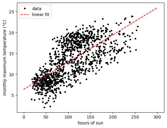
From the above, we can see the weight for the sun feature is
0.06515, and the value of the bias is 6.34858. To calculate the
predicted value of the model for new features, we can use the
.predict() method
(documentation).
And, using matplotlib, we can show the fitted model alongside the
data:
xx = np.linspace(0, 300, 5) # create an array of 5 values from 0 to 300, spaced evenly

fig, ax = plt.subplots(1, 1) # create a figure with a single axis

ax.plot(sun, tmax, 'k.', label='data') # plot tmax vs sun as black dots with a label 'data'
ax.plot(xx, model.predict(xx.reshape(-1, 1)), 'r--', label='linear fit') # plot the regression line as a red dashed line with label 'linear fit'

ax.legend() # show the legend

ax.set_xlabel('hours of sun') # set the xlabel of the axis
ax.set_ylabel('monthly maximum temperature (°C)') # set the ylabel of the axis
training and loss#
In machine learning, the difference between the predicted value/label and the measured value/label is called loss. The goal with machine learning is to find values for the model parameters (e.g., weights and biases) that minimizes the total or average loss for all examples - that is, we want the vertical distance between each of our observations and the regression line to be as small as possible, on average.
We can calculate the loss for our model by first using the
.predict() method
(documentation)
to get the predicted value for each feature value:
# use the fitted parameters to get the predicted values at the input x data
predicted = model.predict(sun)
Now, we can plot the value of loss for each input feature value, as a function of the predicted value:
# calculate loss as difference between observed, predicted values
loss = tmax - predicted

fig, ax = plt.subplots(1, 1) # create a new figure and axis

ax.axhline(y=0, xmin=loss.min(), xmax=loss.max(), color='k', linestyle='--') # plot a horizontal line at loss = 0
ax.plot(predicted, loss, 'o') # plot the loss as a function of the predicted value

ax.set_xlabel('predicted value')
ax.set_ylabel('loss')
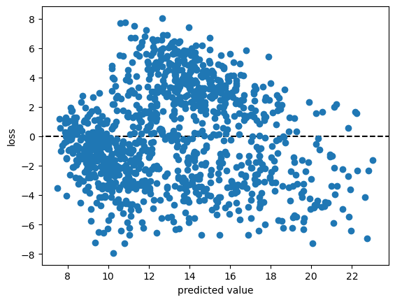
From the figure above, we can see that that the loss for our linear model ranges between -8 and 8, with most of the values falling between about -4 and 4.
In practice, finding the model parameters that minimize the total or average loss for all examples means finding the minimum values of a cost or objective function (or loss function) - that is, a function that allows us to calculate the total or average loss for all of our input data.
One commonly used loss function is known as squared error loss (or L:math:`_2` loss), which calculates the squared difference between the label and the predicted value:
The average loss for all of the input data, or the mean squared error (MSE), is calculated as:
We can calculate and print the value of this loss using the code in the cell below:
average_loss = (loss**2).mean() # calculate the mean of the squared loss
print(f'MSE: {average_loss:.4f}') # print the value of the average loss
gradient descent and learning#
The way that we go about finding the minimum value of a function is by
taking the gradient of the function and setting it to zero. The reason
that we use the squared loss, rather than something like the absolute
value, is because the derivatives of the squared loss are easy to
calculate and behave nicely (as opposed to absolute values or cubic or
quartic functions). Depending on the function, we might even be able to
find a closed form solution to the problem - that is, a way to
calculate the optimum parameter values directly. In fact, this is what
has been implemented in LinearRegression.fit(): the solution
returned by .fit() is found using an approach called Ordinary Least
Squares regression - it’s not actually a machine learning approach at
all.
When we don’t have a nice closed form solution to the minimization problem, which is very often the case, we use some kind of numerical optimization method in order to find a solution. One of the more common approaches that you might come across is something called gradient descent.
Assuming that our cost function is differentiable, we can travel in the opposite direction of the gradient at a given point (i.e., the slope of a line or a surface) in order to find a minimum value of the function.
To do this, we first need to take the partial derivatives of the cost function \(l\) with respect to our model parameters:
We then iterate over a number of epochs (steps) in order to find a solution, by calculating the value of the partial derivatives at each point and subtracting a multiple of this value from the current estimate of each parameter:
where the learning rate \(\alpha\) controls the amount by which we update the parameter values at each step. By subtracting the value of the partial derivative, we ensure that we are always moving toward a 0 value of the partial derivative.
Over the next several blocks of code, we’ll see how we can implement this before investigating how changing hyperparameters like the learning rate or the number of epochs affects the solution we are able to find.
First, we’ll define a function, update_parameters(), that calculates
the new value of \(w\) and \(b\) based on the learning rate and
partial derivatives of the loss function:
def update_parameters(xdata, ydata, weight, bias, learning_rate):
    dl_dw = (-2 * xdata * (ydata - (weight * xdata + bias))).mean() # calculate the partial derivative of l wrt w
    dl_db = (-2 * (ydata - (weight * xdata + bias))).mean() # calculate the partial derivative of l wrt b

    weight -= dl_dw * learning_rate # subtract dl/dw * learning_rate from w
    bias -= dl_db * learning_rate # subtract dl/db * learning_rate from b

    return weight, bias # return the updated values of w and b
We can also define a function, predict(), to help us calculate
\(\hat{y}\) for a given value of \(w\) and \(b\):
def predict(xdata, weight, bias):
    return weight * xdata + bias
along with the loss function, which calculates the mean squared error for the given values of \(w\) and \(b\):
def avg_loss(xdata, ydata, weight, bias):
    loss = (ydata - predict(xdata, weight, bias))**2
    return loss.mean() # return the mean of the loss
We also want to see how the average loss, weight, and bias values change, so we can define a function to plot these in a three-panel figure:
def plot_training_results(df):
    fig, axs = plt.subplots(1, 3, figsize=(10, 3)) # create a three panel figure

    axs[0].plot(df['epoch'], df['avg_loss']) # plot avg loss vs epoch in the first panel
    axs[0].set_ylabel('average loss')

    axs[1].plot(df['epoch'], df['weight']) # plot weight vs epoch in the second panel
    axs[1].set_ylabel('weight')

    axs[2].plot(df['epoch'], df['bias']) # plot bias vs epoch in the third panel
    axs[2].set_ylabel('bias')

    for ax in axs:
        ax.set_xlabel('epoch')

    fig.tight_layout() # ensure that the panels and labels don't overlap

    return ax
And finally, we can write a function, train(), to get to the “best”
values of \(w\) and \(b\).
In this example, I am saving the values to a DataFrame every 10 epochs to help cut down on the number of values. At the end, I also create a plot showing the loss value as a function of the epoch:
def train(xdata, ydata, weight, bias, learning_rate, epochs, plot=True):
    df = pd.DataFrame()

    for ee in range(epochs):
        weight, bias = update_parameters(xdata, ydata, weight, bias, learning_rate)

        if ee % 10 == 0:
            df.loc[ee, 'weight'] = weight
            df.loc[ee, 'bias'] = bias
            df.loc[ee, 'avg_loss'] = avg_loss(xdata, ydata, weight, bias)

    df.loc[ee, 'weight'] = weight
    df.loc[ee, 'bias'] = bias
    df.loc[ee, 'avg_loss'] = avg_loss(xdata, ydata, weight, bias)

    df.reset_index(names=['epoch'], inplace=True)
    # plot the value of the average loss for each epoch
    if plot:
        plot_training_results(df)

    return df
Now that we have defined the functions that we need in order to train
the model, let’s try this out. Running the cell below will train the
model for 10,000 epochs, with a very small learning rate
(\(5 \times 10^{-8}\)). At the end, we use .tail()
(documentation)
to view the parameter values and the average loss for the model at the
final step:
# train the model
output = train(sun, tmax, weight=0, bias=6.34, learning_rate=5e-8, epochs=10000)

output.tail(n=1)

We can see that after 10,000 epochs, the parameter values have gotten
close to the optimal values found using LinearRegression.fit(),
though we’re not quite there. We can also see that the average loss is
low, but not quite to the level we calculated for those optimum values.
We can also see that there’s a big difference in the range covered by
the calculated values of \(w\) and \(b\) - \(w\) ranges from
0 to 0.065, while \(b\) only ranges from 6.34 to 6.340509 - a
difference of only 0.000509.
Try changing the learning rate to a larger value - say, \(10^{-7}\) - how does this impact the shape of the loss curve? What about the value for the weight and bias?
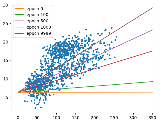
With the cell below, we can also see how the regression line changes - there are large changes in slope for the first 1000 or so epochs, before the line more or less “settles in” to the values we would expect from ordinary least squares regression:
fig, ax = plt.subplots(1, 1)

ax.plot(sun, tmax, '.')

xx = np.arange(0, 351, 50)

for ind in [0, 10, 50, 100, 1000]:
    ax.plot(xx, predict(xx, weight=output.loc[ind, 'weight'], bias=output.loc[ind, 'bias']), label='epoch {}'.format(output.loc[ind, 'epoch']))

ax.legend()
Now let’s try a slightly larger size - \(7.46 \times 10^{-5}\). Here, we see something very interesting with the values of \(w\) and \(b\) over time:
# train the model with a slightly higher learning rate
output = train(sun, tmax, weight=0, bias=6.34, learning_rate=7.46e-5, epochs=10000)

output.tail(n=1)

Rather than starting out low and gradually increasing, the weight starts out much higher before approaching the “true value”, but from above this time. Similarly, we see that the bias dips down from 6.3410 before increasing to over 6.3424 - a much larger range than what we saw with the smaller time step. Now, try increasing the learning rate from \(7.46 \times 10^{-5}\) to \(7.5 \times 10^{-5}\) - what happens?
Now let’s see what happens when we change the starting point - that is, the initial guess for \(w\) and \(b\):
# train the model
output = train(sun, tmax, weight=0, bias=0, learning_rate=1e-7, epochs=10000)

output.tail(n=1)

From this, we can see that the values of both \(w\) and \(b\) are pretty far away from the optimal values - the value for \(b\) has barely changed from the initial guess, and the value for \(w\) has converged toward a less than optimal value. Not only that, but the average loss is much higher than we calculated for the optimal values of \(w\) and \(b\).
fig, ax = plt.subplots(1, 1)

ax.plot(sun, tmax, '.')

xx = np.arange(0, 351, 50)

for ind in [0, 10, 50, 100, 1000]:
    ax.plot(xx, predict(xx, weight=output.loc[ind, 'weight'], bias=output.loc[ind, 'bias']), label='epoch {}'.format(output.loc[ind, 'epoch']))

ax.legend()
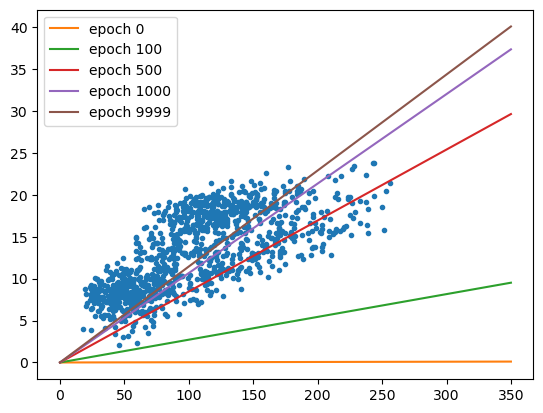
visualizing the loss surface#
To understand what’s happened here, we’ll look at something called the
loss surface - that is, a way to visualize the shape of the loss
function based on different parameter values. To begin, we’ll create a
function to calculate the loss for a range of different parameter
values, then make a contour plot of the loss surface using
.contour()
(documentation).
We’ll also make a plot that shows cross-sections of the loss surface:
def plot_loss_surface(weights, biases, xdata, ydata):
    fig, ax = plt.subplots(1, 1)

    loss_surf = []

    for b in biases:
        for w in weights:
            loss_surf.append(avg_loss(xdata, ydata, w, b)) #

    loss_surf = np.array(loss_surf).reshape(len(weights), len(biases)) # reshape so that the array is rectangular
    W, B = np.meshgrid(weights, biases) # get a grid of weight and bias values

    ax.contour(W, B, loss_surf) # plot contours of the loss surface

    return fig, ax


def plot_cross_sections(weights, biases, xdata, ydata):
    fig, axs = plt.subplots(1, 2, figsize=(8, 4))
    ax1, ax2 = axs

    losses_w = np.array([avg_loss(xdata, ydata, w, 0) for w in weights])
    losses_b = np.array([avg_loss(xdata, ydata, 0, b) for b in biases])

    ax1.plot(weights, losses_w, 'k')
    ax1.plot(0, avg_loss(xdata, ydata, 0, 0), 'ro')
    ax1.set_ylabel('average loss, $l$')
    ax1.set_xlabel('$w$')

    ax2.plot(biases, losses_b, 'k')
    ax2.plot(0, avg_loss(xdata, ydata, 0, 0), 'ro')
    ax2.set_xlabel('$b$')

    return fig, axs
Now, let’s look at the loss surface for values of \(w\) that range between -0.2 and 0.2, and values of \(b\) that range between -5 and 25:
fig, ax = plot_loss_surface(np.linspace(-0.2, 0.2, 100), # 100 values between -0.2 and 0.2
                            np.linspace(-5, 25, 100), # 100 values between -5 and 25
                            sun, tmax)

ax.plot(model.coef_, model.intercept_, 'rx', label='minimum value')
# ax.plot(output.weight.values[::10], output.bias.values[::10], 'b.', label='calculated values')
ax.plot(0, 0, 'ro', label='starting point')

ax.set_xlabel('$w$')
ax.set_ylabel('$b$')

ax.legend()
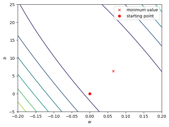
We can see that the surface is fairly lopsided - the range of \(w\) values is much, much smaller than the range of \(b\) values. Now, let’s look at a cross section of the surface through our starting point, holding both \(w\) and \(b\) constant:
fig, axs = plot_cross_sections(np.linspace(-0.2, 0.2, 100), np.linspace(-5, 25, 100), sun, tmax)
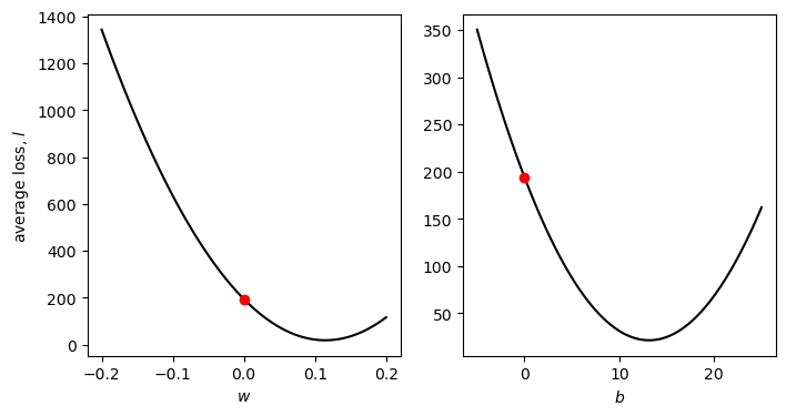
Part of the problem here is that there are big differences in the value of the partial derivatives of \(l\) with respect to \(w\) and \(b\) are very different. The value of \(\partial l/\partial w\) at \(w=0\) is -3068.82, while the value of \(\partial l/\partial b\) at \(b=0\) is -26.28 - this means that when we multiply by the learning rate, we have a much larger change for \(w\) compared to \(b\), and it means that a good learning rate for one of the parameters is not a good learning rate for the other one - this is why we see very little change in the value of \(b\) compared to \(w\).
As we saw when we increased the learning rate to \(7.5 \times 10^{-5}\), large gradient values also mean that when the learning rate is too large, we end up “jumping” back and forth across the minimum, and can even end up failing to reach a minimum value at all.
scaling#
One of the ways that we can help counteract this is by scaling our feature and label values. There are a number of ways to do this, but they typically involve subtracting the mean value and dividing by either the standard deviation (sometimes also called standardization), or by the range of the dataset (sometimes also called normalization):
First, we’ll normalize the values of sun and tmax:
sun_scaled = (sun - sun.mean()) / (sun.max() - sun.min())
tmax_scaled = (tmax - tmax.mean()) / (tmax.max() - tmax.min())
Now, let’s look at the shape of the loss surface using the scaled values:
model_s = linear_model.LinearRegression()
model_s.fit(sun_scaled, tmax_scaled) # fit the scaled data

fig, ax = plot_loss_surface(np.linspace(-1, 1, 100), # 100 values between -0.2 and 0.2
                            np.linspace(-1, 1, 100), # 100 values between -5 and 25
                            sun_scaled, tmax_scaled)

ax.plot(model_s.coef_, model_s.intercept_, 'rx', label='minimum value') # plot the parameters calculated by scaling the data
ax.plot(0, 0, 'ro', label='starting point') # plot the starting point

ax.set_xlabel('$w_s$')
ax.set_ylabel('$b_s$')

ax.legend()
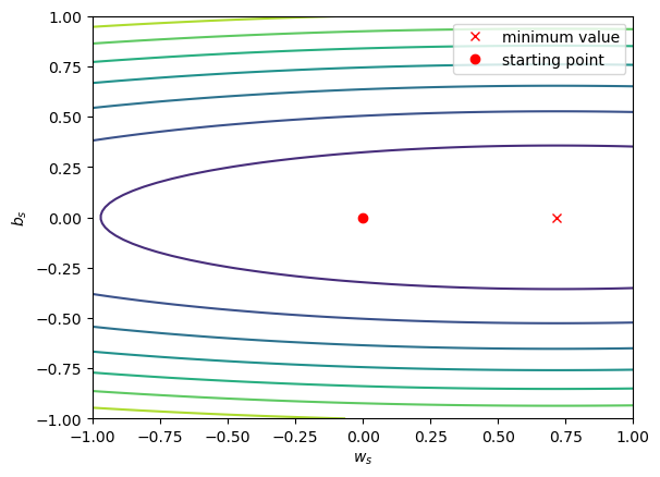
Notice that the surface is much less lopsided now - the slope of the surface in the \(b_s\) direction is greater than the slope of the surface in the \(w_s\) direction, but \(w_s\) and \(b_s\) are at least the same order of magnitude.
Looking at the cross-section of values, we can see the same:
fig, axs = plot_cross_sections(np.linspace(-1, 1, 100), np.linspace(-1, 1, 100), sun_scaled, tmax_scaled)
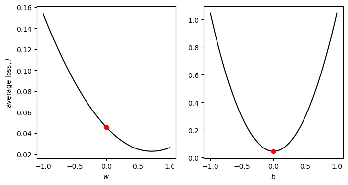
Using the scaled data, the value of \(\partial l/\partial w\) at \(w=0\) is -0.064, while the value of \(\partial l/\partial b\) at \(b=0\) is ~0 (because we have scaled and centered the data).
This has two practical effects: first, it means that we can use much larger learning rates; and second, we should see that the changes are more even at each epoch, as opposed to seeing big changes in \(w\) and almost no change in \(b\).
In order to get the values of \(w\) and \(b\) in the original units of the data, we need to convert them. Fortunately, we can do this by re-arranging the following equation so that it is in the form \(y = wx + b\):
When we do this, we should get the following values for \(w\) and \(b\):
In the function defined in the cell below, we have made a number of
changes. First, we have added the option to scale the data using the
scale argument (by default, scale=False). If we scale the data,
we make sure to record the un-scaled values of \(w\) and \(b\),
using the equations above:
def train(xdata, ydata, weight, bias, learning_rate, epochs, plot=True, scale=False):
df = pd.DataFrame()
if scale:
xx = (xdata - xdata.mean()) / (xdata.max() - xdata.min())
yy = (ydata - ydata.mean()) / (ydata.max() - ydata.min())
else:
xx = xdata
yy = ydata
for ee in range(epochs):
weight, bias = update_parameters(xx, yy, weight, bias, learning_rate)
if ee % 10 == 0:
if scale: # un-scale the values of weight and bias when we record them to the table
df.loc[ee, 'weight'] = weight * (ydata.max() - ydata.min()) / (xdata.max() - xdata.min())
df.loc[ee, 'bias'] = bias * (ydata.max() - ydata.min()) + ydata.mean() - (ydata.max() - ydata.min()) / (xdata.max() - xdata.min()) * weight * xdata.mean()
else:
df.loc[ee, 'weight'] = weight
df.loc[ee, 'bias'] = bias
df.loc[ee, 'avg_loss'] = avg_loss(xdata, ydata, df.loc[ee, 'weight'], df.loc[ee, 'bias'])
df.reset_index(names=['epoch'], inplace=True)
if plot:
plot_training_results(df)
return df
Now, let’s see how well this works by using a learning rate of 0.1, and training the model for only 1000 epochs:
output = train(sun, tmax, weight=0, bias=0, learning_rate=0.1, epochs=1000, scale=True)
output.tail(n=1)

Not bad - after only 1000 epochs, we have values for \(w\) and
\(b\) that very nearly match the values calculated using
LinearRegression.fit(). Try changing the values of learning_rate
and epochs to see how close to the “true” value you can come. How
large of a learning rate can you have before you fail to get a “good”
solution?
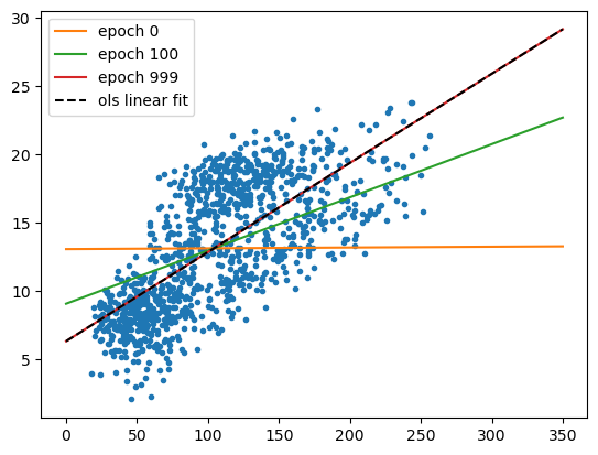
The cell below will plot the regression lines using the parameters from
a few different intermediate epochs, along with the linear fit
calculated using LinearRegression.fit() - as before, we should see
that there’s rapid improvement followed by slow improvement, but the end
result is almost indistinguishable from the “true” solution:
fig, ax = plt.subplots(1, 1)

ax.plot(sun, tmax, '.')

xx = np.arange(0, 351, 50)

for ind in [0, 10, 100]:
    ax.plot(xx, predict(xx, weight=output.loc[ind, 'weight'], bias=output.loc[ind, 'bias']), label='epoch {}'.format(output.loc[ind, 'epoch']))

ax.plot(xx, model.predict(xx.reshape(-1, 1)), 'k--', label='ols linear fit')

ax.legend()
next steps#
That’s all for this exercise. In this exercise, we have seen the basics
of how we can train a model using scikit-learn. We have also used
the example of linear regression to illustrate how training a model
works in the background, by showing how we can tune different
hyperparameters to find the optimal model parameters. We have also
seen how important it can be to scale our data when training a model -
it enables us to use larger learning rate values and spend less time
training a model; it may also make it possible for the model to converge
to a solution.
In future exercises, we will have a look at some other optimization techniques - gradient descent is only one technique out of many. There are also additional machine learning algorithms for which scaling input data is essential, and we will cover these more as we continue through the workshop.
For now, try at least one of the following exercises:
Train a model for the relationship between
tmaxandtmin, with and without scaling. How large a learning rate are you able to use, and how many epochs does it take to converge to a good solution? Does scaling make a large difference to the final result? Why or why not?Train a model for the relationship between
sunandrain, again with/without scaling. How large a learning rate are you able to use, and how many epochs does it take to converge to a good solution? Does scaling make a large difference to the final result? Why or why not?