time series analysis#
Tip
The script for this tutorial can be found via this direct link.
Alternatively, if you have already added the repository, you can open the script from the Code Editor, by
navigating to 03_change_detection/05_time_series.js under the Reader section.
The final portion of this practical will cover how we can get time series of data from images and visually inspect the results. We’ll see how we can compare time series of NDVI values for different land cover polygons, and compare the results that we see with the polygon locations in images at the beginning and end of the time series.
var ndvi_patches = ee.FeatureCollection([fastRegrowth, slowRegrowth,
  forest, oldClearCut, newClearCut]);
The next sections of code here deal with loading Landsat images and filtering based space and cloud cover, similar to what we have done in previous steps. After this section, these lines of code:
// combine tm, etm+, oli, and mss images, add an NDVI band, and sort by date.
var allNDVI = mss.map(mssNDVI).merge(tm.merge(oli).map(getNDVI))
  .select('NDVI').sort('system:time_start');
merge the MSS, TM, ETM+, and OLI image collections, calculate the NDVI for each image, and sort by acquisition date. We also pull out the first image in the series (a Landsat 1 MSS image from 1972), and the last (latest) image in the time series, and add both of these to the Map for visualization.
Finally, this block of code:
// plot a chart of the mean ndvi values, calculated using different polygons
// representing different landcover areas
var ndviChart = ui.Chart.image
  .seriesByRegion({
    imageCollection: allNDVI,
    regions: ndvi_patches, // average using the features in each ndvi patch
    reducer: ee.Reducer.mean(),
    seriesProperty: 'label', // use the label values to plot individual series
    scale: 100,
    xProperty: 'system:time_start'})
  .setOptions({
    title: 'Mean NDVI',
    hAxis: {title: 'date', titleTextStyle: {italic: false, bold: true}},
    vAxis: {title: 'ndvi value', titleTextStyle: {italic: false, bold: true}},
    curveType: 'function'})
  .setSeriesNames(['ndvi']);
print(ndviChart);
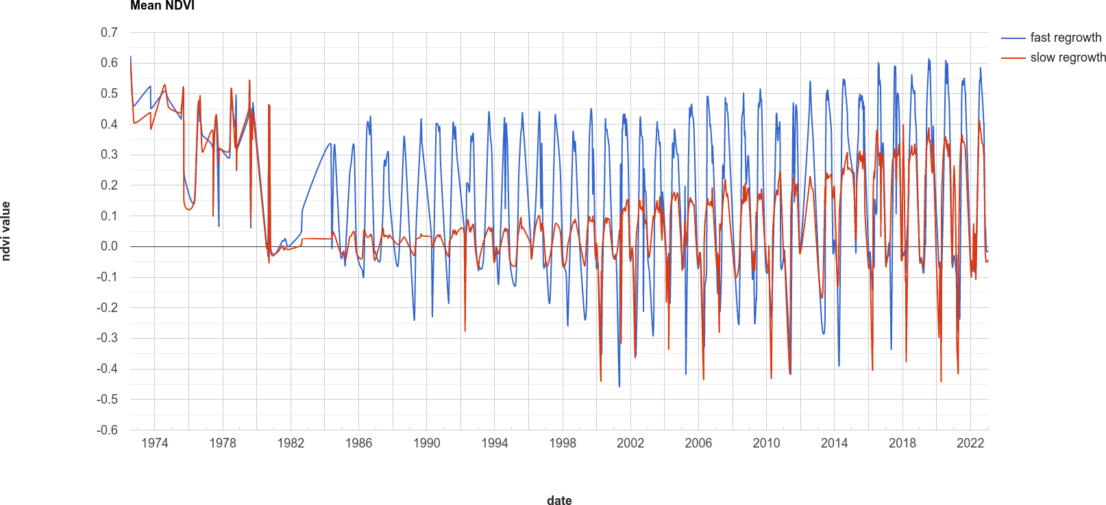
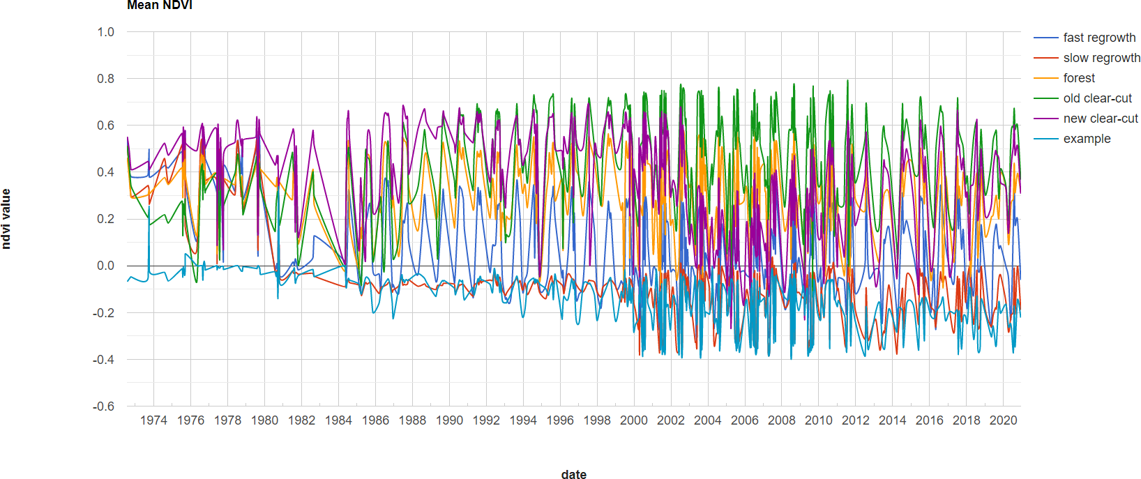
creates a chart that will plot the average values for each of the individual polygons in ndvi_patches. You can see
what this looks like below. Note that some of the apparent lack of seasonality before about 2000 is mostly a result of
the lower temporal resolution – Landsat acquisitions were often limited during this time, and so some years will only
have a few available images.
Tip
If you open the chart (click on the icon in the upper right-hand corner), you can also export the data as a CSV file for further analysis.
Next, let’s try a different combination of polygons. To do this, we’ll need to change the code at line 17:
var ndvi_patches = ee.FeatureCollection([fastRegrowth, slowRegrowth]);
Instead of looking at the fastRegrowth and slowRegrowth features, let’s look at the fastRegrowth and
oldClearCut polygons.
Note
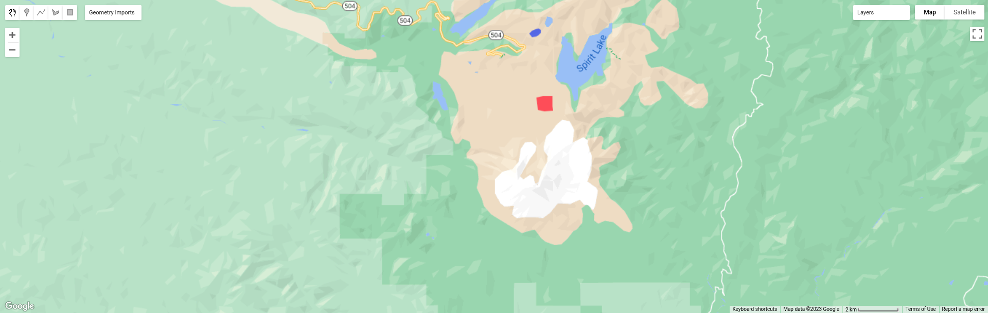
To visualize where the newClearCut polygon is, you can toggle it on from the GeometryImports menu.
To change the polygons that we use for the plot, replace slowRegrowth with oldClearCut at line 17, then
re-run the script:
var ndvi_patches = ee.FeatureCollection([fastRegrowth, oldClearCut]);
Question
Compare the
fastRegrowthNDVI towards the end of the time series with theoldClearCutNDVI near the beginning of the time series. Do you think these represent similar land cover types? Why or why not?Now, compare the
fastRegrowthlocation in theLast(latest) Landsat image, and theoldClearCutpolygon location in theFirst(oldest) Landsat image. Do you think these represent similar land cover types? Why or why not?Using the polygon location and the
Last(latest) Landsat image, what kind of land cover does theoldClearCutpolygon represent now? Why do you think this?
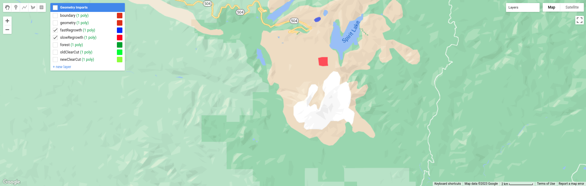
To add your own polygons, or to edit the polygons that are already included in the script, you can use the digitizing tools located in the upper left-hand corner of the map panel:
If you’re adding your own polygon, be sure to start the polygon as a new layer (click on + new layer at the
bottom of the Geometry Imports panel):
Next, start digitizing a polygon – try to make sure that the polygon represents one type of area. Remember that
you can use the Landsat images, as well as the background satellite images, to help you. From the Geometry Imports
panel, click the gear icon next to your new layer to change the properties:
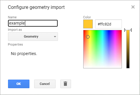
Change the name to something other than geometry (or example), then change it to Import as a
Feature, and click to add property to the feature. Call it label, and add a value for the label.
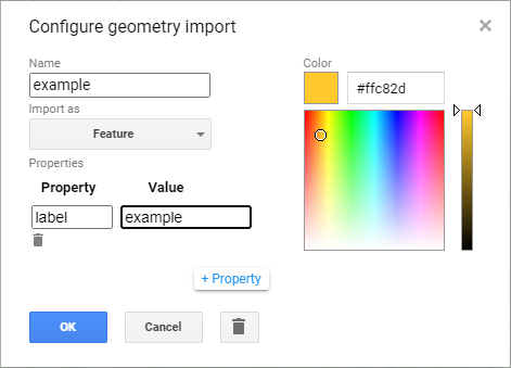
Click OK, then digitize your polygon (if you haven’t already). Note that each feature can only contain a
single polygon – to add multiple polygons, you’ll need to create multiple features. You can then update the
ndvi_patches variable (line 17) and re-run the script to update the chart:
Feel free to try different polygons, and examine the different time series plots – try using the CVA angle map to
help you decide areas to look further into.
This is the end of this Practical – next week, we’ll look into using Earth Engine to do some more advanced classification techniques, and run an accuracy analysis on the results.