training, testing, and validation#
Note
This is a non-interactive version of the exercise. If you want to run through the steps yourself and see the outputs, you’ll need to do one of the following:
follow the setup steps and work through the notebook on your own computer
open the workshop materials on binder and work through them online
In this exercise, we’ll have a look at some more fundamental concepts of machine learning, including:
standarization (similar to normalization seen previously)
splitting a dataset into training and testing (+validation) partitions
overfitting/underfitting + generalization
kernel functions and the “kernel trick”
We’ll look at all of this while also introducing support vector machine (SVM) classification, a type of learning model that seeks to classify data into one of two (or sometimes more) categories.
data#
The goal for this exercise will be to see if we can determine whether a
location is rainier or drier than average, based on other meteorological
parameters: namely, the average daily minimum temperature (tmin),
and the average monthly hours of sunshine (sun).
We’ll do this using a combination of historic meteorological observations from the UK Met Office, combined with climated averages from between 1971-2000 obtained from Met Éireann.
importing libraries#
Before getting started, we will import the libraries (packages) that we will use in the exercise:
sklearn, for preprocessing our data and doing the SVM classification;
pandas, for reading the data from a file;
numpy, for working with arrays;
matplotlib, for making plots.
Remember that to do this, we use the import statement, followed by
the name of the package. We can also use from to import part of a
package, and we can alias the package name using as:
%matplotlib inline
import pandas as pd
import numpy as np
from sklearn import linear_model, model_selection, preprocessing, svm
from sklearn.inspection import DecisionBoundaryDisplay
import matplotlib.pyplot as plt
from matplotlib.colors import ListedColormap
Next, we use pd.read_csv() to read the CSV file of the data:
data = pd.read_csv('data/annual_values.csv')
Next, let’s have a look at the data using .head():
data.head() # show the first 5 rows of data
Here, each row corresponds to a station, with features including:
tmax: average daily maximum temperature in °C;tmin: average daily minimum temperature in °C;air_frost: average annual days of air frost (only for UK stations);rain: average monthly precipitation in mm;sun: average monthly hours of sun;classification: whether the station gets more (rainy) or less (dry) precipitation than average.
Before jumping into the machine learning part of the exercise, we’ll
first use matplotlib to make a plot showing sun vs tmin,
colored by `classification. This can help show us whether or not we
actually can separate rainy/dry locations using these two features:
fig, ax = plt.subplots(1, 1) # create a figure object with a single axis

colors = {'dry': 'orangered', 'rainy': 'royalblue'} # create a dict of color

# for each value of classification, plot sun vs tmin using the colors defined above
for name, group in data.groupby('classification'):
    ax.scatter(group.tmin, group.sun, edgecolor='k', c=colors[name], label=name)

# set the axis labels
ax.set_xlabel('avg min temp (°C)')
ax.set_ylabel('avg hours of sun')

# add a legend
ax.legend()
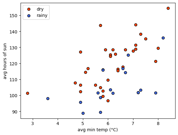
From the plot, we can see that it might be possible to draw a line
separating the two groups, but it’s made more difficult by noise: the
two groups are not nicely separated. That’s okay, because we will
discuss a few techniques to help deal with noise in our input data.
preparing the data: standardizing#
Have a look at the values of sun on the y axis (90 to 150 hours), vs
the values of tmin on the x axis (3 to 8 °C). Like we saw in the
previous exercise, having features with vastly different values can be a
problem for many machine learning algorithms. In particular, if the
variance of one feature is much larger than others, it may dominate the
objective function and cause the model to be unable to learn correctly
from the other features - similar to what we saw with the linear
regression example.
For SVM models, we want to make sure that the data are centered (i.e., the mean value is 0), with a unit variance (i.e., the variance is equal to one). This helps ensure that the model is able to use all of the features to learn from evenly.
First, we’ll create an array of feature values by indexing tmin
and sun from the DataFrame, then using .to_numpy()
(documentation)
to return an \(N\times 2\) array of values:
features = data[['tmin', 'sun']].to_numpy() # create the feature values
SVM, like most machine learning algorithms, requires that our labels are
numeric - that is, we can’t use text like dry and rainy as labels,
we need to convert these to numbers. We’ll cover more sophisticated ways
to encode text features when we cover feature engineering in the next
exercise. For now, we can use .map()
(documentation)
along with a dict to replace 'dry' with a value of -1 and
'rainy' with a value of 1, then use .to_numpy() to convert
this to a numpy array:
labels = data['classification'].map({'dry': -1, 'rainy': 1}).to_numpy() # create a vector of numeric labels
In order to standardize the features, we first create a
StandardScaler object
(documentation),
then use .fit()
(documentation)
to compute the mean and standard deviation to use for scaling.
Then, we use .transform()
(documentation)
to actually standardize, using the calculated mean and standard
deviation:
scaler = preprocessing.StandardScaler().fit(features) # calculate the mean and standard deviation using fit
scaled_features = scaler.transform(features) # apply the standardization to the feature values
Now, we should see that the mean of each vector is (very nearly) zero,
using .mean()
(documentation):
scaled_features.mean(axis=0) # mean should be very nearly zero
And, we can use .var()
(documentation)
to check that the variance of each vector is equal to 1:
scaled_features.var(axis=0) # variance should be nearly equal to one
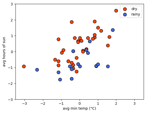
Now we can plot the scaled values of tmin and sun, colored by
the numeric labels, to see that the data should still look the same -
just scaled differently:
fig, ax = plt.subplots(1, 1)

ax.scatter(scaled_features[labels == -1, 0], scaled_features[labels == -1, 1], s=80, c='orangered', edgecolors='k', label='dry')
ax.scatter(scaled_features[labels == 1, 0], scaled_features[labels == 1, 1], s=80, c='royalblue', edgecolors='k', label='rainy')

ax.legend()

ax.set_xlabel('avg min temp (°C)')
ax.set_ylabel('avg hours of sun')

ax.set(xlim=(-3.5, 3.5), ylim=(-3, 3))
preparing the data: splitting/partitioning#
Now that we’ve standardized our features and converted our text labels into numbers, we are nearly ready to train the classifier. I say nearly ready, because there’s one last important step: partitioning our data into training, testing, and valdiation datasets.
The reason that we do this is that we want to be able to evaluate how well the model has learned. We want to avoid having the model only do well at predicting labels for examples it has already seen - we want to make sure that the model generalizes to previously unseen data, so that we know it isn’t simply regurgitating the answers to questions it has memorized.
In practice, we use the training dataset to actually build the model - this is the data that the model “learns” the parameters for. The validation dataset is what we use to help determine which learning algorithm to use, and to find the best values of model hyperparameters, and the testing dataset is how we assess the model performance once we are sure we have found the optimal model hyperparameters. The training dataset is typically the largest of the three, while the testing and validation datasets are typically the same size. How big each partition is depends on the size of the dataset - a common rule of thumb is to use 70% of the data for training and 15% each for testing and validation; with extremely large datasets, the split might be more extreme.
We can use model_selection.train_test_split()
(documentation)
to actually do the split - note that in order to get three partitions
(training, testing, and validation), we need to run this split twice -
first to get the training partition, then again to get the testing and
validation partitions:
# use 70% of the data for training, 15% for testing, 15% for validation
X_train, X_, y_train, y_ = model_selection.train_test_split(scaled_features, labels, test_size=0.3)
X_test, X_val, y_test, y_val = model_selection.train_test_split(X_, y_, test_size=0.5)
Because we have a small dataset (\(n=49\)), we’re only going to split into training and testing partitions, because we want to make sure that we have enough observations in our dataset to get a good picture of the model performance.
# use 70% of the data for training, 15% for testing, 15% for validation
X_train, X_test, y_train, y_test = model_selection.train_test_split(scaled_features, labels, test_size=0.3, random_state=42)
Note that by specifying the random_state argument, we ensure that
the split will be the same each time we run this (even on other
computers). In practice, we may want to have a truly random split each
time we run the data - in this case, we would omit this argument.
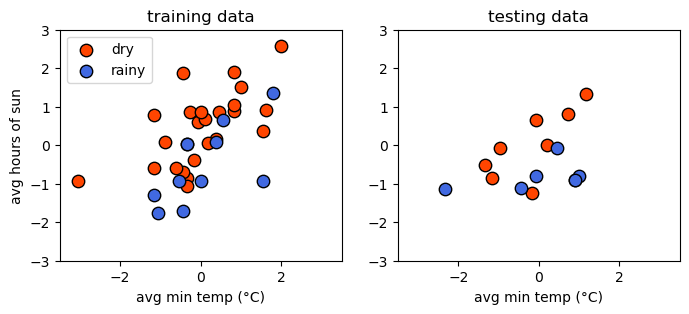
Now, we can plot the two datasets side-by-side to compare them. Hopefully, they should look fairly similar - if not, we may have a more challenging time training and evaluating our model:
fig, axs = plt.subplots(1, 2, figsize=(8, 3))

for ind, XY in enumerate(zip([X_train, X_test], [y_train, y_test])):
    X_, y_ = XY
    axs[ind].scatter(X_[y_ == -1, 0], X_[y_ == -1, 1], s=80, c='orangered', edgecolors='k', label='dry')
    axs[ind].scatter(X_[y_ == 1, 0], X_[y_ == 1, 1], s=80, c='royalblue', edgecolors='k', label='rainy')

    axs[ind].set_xlabel('avg min temp (°C)')

axs[0].set_ylabel('avg hours of sun')
axs[0].set_title('training data')

axs[0].legend()

axs[1].set_title('testing data')

for ax in axs:
    ax.set(xlim=(-3.5, 3.5), ylim=(-3, 3))
support vector machine#
Now that we have partitioned our dataset, we’re ready to train our model. In this exercise, we’ll explore using support vector machine (SVM) classification. In its basic form, SVM is trying to find parameters \(\mathbf{w}\) and \(b\) such that:
where \(\mathbf{w}\) and \(\mathbf{x}_i\) are vectors with dimension equal to the number of features in our dataset, and \(y_i\) is the label for the feature vector \(\mathbf{x}_i\).
Alternatively, we can write the constraints like this:
Another way of saying all of this is that we’re trying to find a hyperplane, also called the decision boundary, that separates two classes in feature space by the largest margin (distance between the closest examples of each class) possible. To do this, we need to minimize the Euclidean norm of \(\mathbf{w}\), \(\lVert\mathbf{w}\rVert\):
Because the distance between the two hyperplanes defined by \(\mathbf{wx}_i - b = \pm 1\) is \(2 / \lVert\mathbf{w}\rVert\), by minimizing \(\lVert\mathbf{w}\rVert\), we get the maximum distance between the two planes. We’ll stick to two dimensions for now because it’s easier to visualize - in this case, what we’re trying to find is a line that separates the two classes.
hinge loss#
As we can see above, there is no line that will cleanly separate these two classes - in this case, we use something called the hinge loss function:
Values that are on the “correct” side of the decision boundary have a loss of 0; values that are on the “wrong” side have a loss that is proportional to the distance from the decision boundary. In this case, the cost function looks like:
where \(C\) is a positive hyperparameter that determines the tradeoff between increasing the size of the decision boundary and ensuring that each feature \(\mathbf{x}_i\) is on the correct side of the decision boundary. Increasing the value of \(C\) means that we place less emphasis on misclassification; decreasing the value of \(C\) means that we have a smaller margin size. We will come back to this more in later exercises, when we talk about something called regularization.
using scikit-learn#
To do this using scikit-learn, we need to first create an object of
the class corresponding to our machine learning algorithm - in this
case, we’re using support vector classification, so we use svm.SVC
(documentation).
In the documentation, you can see that one of the input arguments to
svm.SVC() is C - the “regularization parameter” discussed in the
previous paragraphs. For now, we will stick with the default value of
1.0, but in later exercises we will experiment with changing this.
As we will explore more later, we can also specify what kind of
kernel to use for the classifier - to start, we’ll use the “classic”
version, where the decision boundary is linear:
linear_clf = svm.SVC(kernel='linear') # create an SVC object with a linear kernel
Just like with LinearRegression(), we use the .fit() method
(documentation)
to train the model using our training data:
linear_clf.fit(X_train, y_train) # train the classifier using the training data
And that’s it. To view the decision boundary, we can write the following
function, which uses .decision_function()
(documentation)
along with a grid of feature values to create a mesh that displays the
location of the decision boundary:
def plot_decision_surface(X, y, X_test, clf):
    cmap = ListedColormap(["orangered","royalblue"], name='from_list', N=None)

    fig, ax = plt.subplots(1, 1)

    # plot the input data
    ax.scatter(X[y == -1, 0], X[y == -1, 1], c='orangered', zorder=10, edgecolor='k', s=20, label='dry')
    ax.scatter(X[y == 1, 0], X[y == 1, 1], c='royalblue', zorder=10, edgecolor='k', s=20, label='rainy')

    ax.scatter(X_test[:, 0], X_test[:, 1], c='none', zorder=8, edgecolor='k', s=80, label='testing data')
    # create a grid of feature value points to show the decision boundary
    XX, YY = np.mgrid[-3.5:3.5:200j, -3:3:200j]
    Z = clf.decision_function(np.c_[XX.ravel(), YY.ravel()])
    Z = Z.reshape(XX.shape)

    # show the decision boundary
    ax.pcolormesh(XX, YY, Z > 0, cmap=cmap)

    # show the contours
    ax.contour(XX, YY, Z, colors=['k', 'k', 'k'], linestyles=['--', '-', '--'], levels=[-0.5, 0, 0.5])

    ax.set(xlim=(-3.5, 3.5), ylim=(-3, 3))

    ax.legend(loc='upper left')

    return fig, ax
When we run this function, we can see how the classifier has done:
fig, ax = plot_decision_surface(scaled_features, labels, X_test, linear_clf)
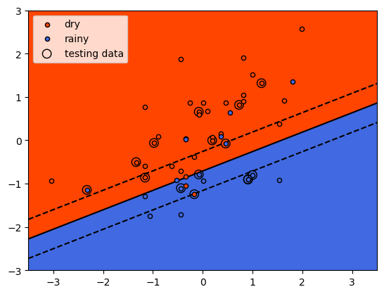
As we identified when we first plotted the data, it is difficult to
fully separate these two classes by a straight line - there’s some
overlap between them. What we do see with the training data (small
individual circles) is that the majority of the points lie on the
correct side of the line, even if there are a number of “rainy” points
that would be classified as dry using the classifier, and a few “dry”
points that would be classified as rainy.
checking the results#
We’ll cover formal ways to assess model performance more in the next
exercise, but for now we can look at the mean accuracy using
.score()
(documentation)
- this is the proportion of labels that the model correctly predicted.
For our training data, we can see that the proportion is fairly high,
though not perfect - around 83%:
linear_clf.score(X_train, y_train) # get the mean accuracy for the training data
We can also test the score using our test data - here, we can see that it’s a bit lower at 80%:
linear_clf.score(X_test, y_test) # get the mean accuracy for the testing data
generalization#
Ideally, we would like to see our model perform about the same on both the training data and the testing/validation data. When this is the case, as it is here, it’s a good indication that our model generalizes well - that it’s not simply regurgitating “answers” that it memorized during the training process.
In machine learning, we are ultimately more interested in minimizing the loss on unseen or new data than we are in minimizing the loss on our training data, because it’s the unseen data that our model will be used to help classify. If our model fails to generalize, it will be far less useful in practice.
This leads us to two other concepts: underfitting and overfitting. A model that underfits doesn’t do a very good job predicting the labels of the training data. This can happen for a variety of reasons, but the most common are that the model is too simple for the data, or the features that we are using are poor predictors for our labels. In the first case, we might need to consider a more complicated model; in the second case, we may need to add features that have a more meaningful relationship (“higher predictive power”) with the label.
A model that overfits typically does a very good job of predicting using the training data, but a very poor job when it sees data that it has not been trained on. As with underfitting, this can happen for a variety of reasons. The most common reasons are that the model is too complex for the data, or that we have too many features and not enough training examples. In the first case, we would need to consider a simpler model; in the second, we need to reduce the number of features, or increase the number of training examples that we have.
As we continue through the rest of this workshop, I will try to highlight examples of problems where the model is overfit or underfit, and illustrate potential solutions to these problems.
the “kernel trick”#
Very often with real datasets, we will be unable to find a “clean” split between classes - we will either have noise in our input data, or we will have some kind of inherent non-linearity in our data. We have already seen an example of how SVM can be used in the first case, by introducing a tradeoff between the margin size and the “cost” of misclassification. This doesn’t normally suffice when we have inherent non-linearity in our data, but there is an alternative solution: very often, we can transform our original space into a higher-dimensional space where there is a “nice” linear separation between classes.
The problem with this is that it can be very costly to find an appropriate transformation - we don’t know what this transformation looks like beforehand, which means we would need to try many such transformations and train our classifier in each of them.
Fortunately, we don’t actually have to do this in practice - instead, we can use something known as the kernel trick. By using something known as a kernel function (or just a kernel), we can efficiently and implicitly transform our input features into a higher-dimensional space.
We will not go into the mathematical details of how this all works here - instead, we will look at some examples of different kernel functions, and see how this impacts the classifier training.
radial basis function kernel#
One of the most common kernel functions in practice is the radial
basis function (RBF) kernel - indeed, this is actually the default
kernel for svm.SVC. The RBF kernel has the form:
where \(\lVert\mathbf{x}_1 - \mathbf{x}_2\rVert^2\) is the squared
Euclidean distance between two vectors \(\mathbf{x}_1\) and
\(\mathbf{x}_2\). Varying the value of the hyperparameter
\(\gamma\) (gamma) helps determine whether the decision boundary
in the original space is curved or smooth by changing the influence of
each training sample on the decision boundary.
In the example below, we first use svm.SVC to create a new
classifier object, using the kernel argument to specify an RBF
kernel. We’ll use the default value of gamma='scale', which means
that the value of gamma is calculated as \(1 / N\sigma_X\),
where \(N\) is the number of features and \(\sigma_X\) is the
variance of the input features:
rbf_clf = svm.SVC(kernel='rbf') # create a new classifier object with an RBF kernel
As before, we train the classifier using .fit() and our training
dataset:
rbf_clf.fit(X_train, y_train) # train the classifier with the training data
And now, we can use plot_decision_surface() to show the decision
boundary along with the training and testing data:
fig, ax = plot_decision_surface(scaled_features, labels, X_test, rbf_clf)
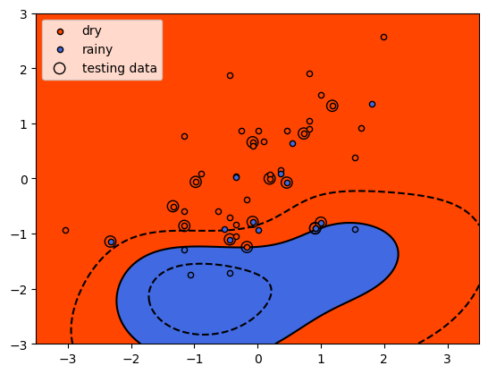
Here, we see that the shape of the decision boundary is very different
to the linear model. We can also see that while the results look fairly
good for the training data, there are more testing data that are on the
“wrong” side of the decision boundary.
To check this, we can look at the mean accuracy of the training data
using .score():
rbf_clf.score(X_train, y_train)
and for the testing data:
rbf_clf.score(X_test, y_test)
So, we have a small improvement in the mean accuracy for the training data (0.833 vs 0.829), but it has come with a large decrease in the mean accuracy for the testing data: 0.533 vs 0.8. This is strong indication that our model has overfit the training data: the performance on “new” data (the testing data) is much worse than what we saw in training, indicating that the model has learned the peculiarities of the training data.
With additional training data, we might be able to improve performance in both training and testing; for now, though, we’ll leave this and look at a different kernel example.
polynomial kernels#
The next kernel we will look at is the polynomial kernel, which has the form:
where \(d\) is the degree (degree) of the polynomial,
\(\gamma\) (gamma) controls how much each training sample
influences the shape of the decision boundary and \(r\) is the bias
term (coef0) that shifts the value of the polynomial up or down. By
default with svm.SVC, gamma is calculated as
\(1 / N\sigma_X\); degree equals 3 (i.e., a cubic polynomial);
and coef0 equals 0.
As before, we’ll use the default values to begin, but feel free to vary the different hyperparameters to see if you are able to improve the model performance.
poly_clf = svm.SVC(kernel='poly') # create a new classifier object with a third-degree polynomial kernel
As before, we train the classifier using .fit() and our training
dataset:
poly_clf.fit(X_train, y_train) # train the classifier with the training data
And now, we can use plot_decision_surface() to show the decision
boundary along with the training and testing data:
fig, ax = plot_decision_surface(scaled_features, labels, X_test, poly_clf)
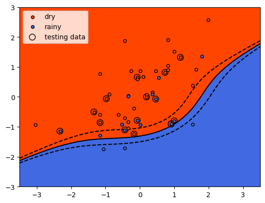
Here, we see that the shape of the decision boundary is more similar to
the linear model than what we saw with the RBF kernel. We can also see
that while the results look fairly good for the training data, there are
a lot more testing data that are on the “wrong” side of the decision
boundary.
Now, let’s look at the mean accuracy of the training data using
.score():
poly_clf.score(X_train, y_train) # calculate the mean accuracy of the training data
The results here are slightly worse than the accuracy we obtained with both the linear and RBF kernels, though not by much. The testing data:
poly_clf.score(X_test, y_test) # calculate the mean accuracy of the testing data
show a similar result as the RBF kernel - the model has overfit the training data, and as a result, the accuracy using the testing data is quite poor.
the sigmoid kernel#
The final kernel function that we will look at is the sigmoid kernel function, which has the form:
where \(\tanh\) is the hyperbolic tangent
function.
As with the polynomial kernel, \(\gamma\) (gamma) controls how
much each training sample influences the shape of the decision boundary
and \(r\) is the bias term (coef0) that shifts the data up or
down.
As before, we will use the default values of gamma and coef0,
but feel free to experiment with different values later on:
sig_clf = svm.SVC(kernel='sigmoid') # create a new classifier object with a sigmoid kernel
Next, train the classifier using .fit():
sig_clf.fit(X_train, y_train) # train the classifier with the training data
and use plot_decision_surface() to show the shape of the decision
boundary along with the training and testing data:
fig, ax = plot_decision_surface(scaled_features, labels, X_test, sig_clf)
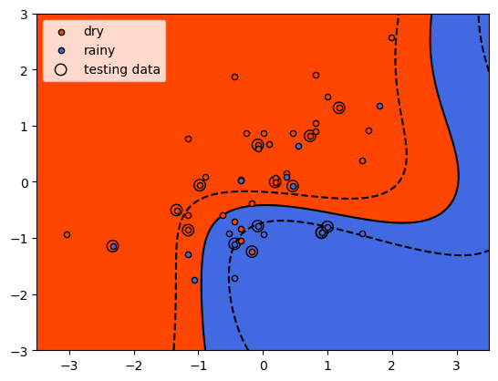
With the sigmoid kernel, it looks like we have a number of points on
the “wrong” side of the decision boundary for both classes, indicating
that the training score will likely be lower than the other examples. We
can verify this using .score() and the training data:
sig_clf.score(X_train, y_train) # calculate the mean accuracy of the training data
and for the testing data:
sig_clf.score(X_test, y_test) # calculate the mean accuracy of the testing data
Here we see something interesting - the model had a higher mean accuracy on the testing data than the training data, indicating that it generalized better than the other models, even if the training results were noticeably worse than the other models (i.e., it underfit the training data). After all of this, we can see that the original SVM formulation, with a linear decision boundary, has performed the best with our data, both in terms of training and testing. It turns out that despite their simplicity, linear models can be a very good choice for generalizing - especially when we don’t have a strong reason to assume that our model needs to be more complex.
next steps#
That’s all for this exercise. For additional practice, try at least one of the suggestions below
Try varying the different hyperparameters for at least one of the kernel functions (
rbf,poly, orsigmoid) introduced above. Are you able to improve the training accuracy, as well as the testing accuracy?Instead of using
tmaxas an input feature, try usingtmax- does this improve, or worsen, the results? Why do you think this might be?Try adding dimensionality by using
tmin,tmax, andsunas input features. How does this change the results? Does it depend on the kernel function used?Try different combinations of
tmaxandtmin(e.g.,tmax-tmin,tmax+tmin, etc.). Are there kernel functions for which this is better or worse?