plotting data using ggplot2#
Note
This is a non-interactive version of the exercise. If you want to run through the steps yourself and see the outputs, you’ll need to do one of the following:
follow the setup steps and work through the notebook on your own computer
open the workshop materials on binder and work through them online
open an R console or RStudio, copy the lines of code here, and paste them into the console to run them
In this exercsise, we’re going to investigate how temperature has changed over time, using monthly observations from the Armagh Observatory. By the end of this exercise, you will:
be able to load additional libraries in R
load data from a file
add variables to a table
create date objects from character strings
recode values in a table
select data from a table using logical expressions
create scatter plots (with smoothing lines)
create histograms (+ smoothed histograms)
save plots to a file
data#
The data used in this exercise are the historic meteorological observations from the Armagh Observatory, downloaded from the UK Met Office.
To make the data slightly easier to work with, I have done the following:
Removed the header on lines 1-5
Replaced multiple spaces with a single space, and replaced single spaces with a comma (
,)Removed
---to indicate no data, leaving these fields blankRemoved
*indicating provisional/estimated valuesRemoved the 2023 data
Renamed the file
armaghdata.csv.
If you wish to use your own data (and there are loads of stations available!), please feel free. For the best experience, you will likely need to repeat the steps indicated above.
loading libraries#
Before getting started, we need to load the libraries we will use in the exercise. We will be using three libraries:
readr, for reading the data from a file;
ggplot2, for plotting the data;
and dplyr, for transforming/manipulating (read: “analyzing” or “working with”, not “fabricating”!) the data.
To do this, we use the library() function
(documentation),
followed by the name of the package:
library(readr) # this loads the functions we'll use to load the data
library(ggplot2) # this loads the functions, etc. needed for us to plot
library(dplyr) # this loads the functions, etc. needed for us to work with the data
Note the message that pops up once you run this cell:
Attaching package: ‘dplyr’


The following objects are masked from ‘package:stats’:

    filter, lag


The following objects are masked from ‘package:base’:

    intersect, setdiff, setequal, union
When we load the dplyr package, a number of the functions provided
by that package have the same name as functions in other packages. This
means that when we call, for example, filter(), it will use the
function provided by dplyr, rather than the one provided by
stats. If we still want to use the function provided by stats,
we have to explicitly tell R this, by using the full name,
stats::filter().
loading the data#
Now, we are finally ready to load the data file, using read_csv()
(documentation),
a function provided by the readr package:
armagh <- read_csv('data/armaghdata.csv')
When we load the file using read_csv(), it shows us a summary of the
data: the number of rows and columns, the delimiter used (,,
since it’s a comma-separated variable file), and the type of each of the
columns, along with the column names.
To view a summary of the data, we’ll use the built-in print()
function. Because this object is not actually a data.frame, it’s a
tibble (documentation), we only
see the first 10 rows this way:
print(armagh)
From this, we can see that there are 7 columns (and 2040 rows) in the tibble:
yyyy, a double representing the year of the observationmm, a double representing the month of the observationtmax, a double representing the maximum observed temperature in the month (in °C)tmax, a double representing the minimum observed temperature in the month (in °C)af, a double representing the days of air frost in the monthrain, a double representing the total precipitation in the month (in mm)sun, a double representing the total number of hours of sunlight in the month
We can also see that only the rain variable has values back to 1853
- missing values are indicated by NA, which means “Not Available” -
i.e., missing.
adding variables to the table#
Before moving on, let’s see how we can add additional variables to the table, starting with the date. This will make it easier for us to plot and analyze the time series of observations.
combining strings#
To do this, we can first use the paste()
(documentation)
function, which concatenates strings or characters together. We’ll use
armagh$yyyy and armagh$mm for the year and month, respectively,
and we’ll arbitrarily choose the first of the month:
paste(armagh$yyyy, armagh$mm, "1", sep="/")
For the first row (yyyy=1853, mm=1), the string representation will be
1853/1/1 for 1 January 1853; the second row will be 1853/2/1 for
1 February 1853, and so on:
paste(armagh$yyyy, armagh$mm, "1", sep="/")
a note about dates#
But, we don’t actually want to represent these as strings. Instead, we want them to be represented as a date object so that they display properly when we plot them, and because we may want to do calculations using the date/time.
For this, we use the built-in as.Date()
(documentation)
function. The arguments to this function that we will use are:
x, the object that you want to convert to a date representativeformat, the way that the dates in the object are formatted (for more on this, see the strptime function)
From above, our dates are formatted as follows:
year with century (represented as
%Y)month as decimal number (represented as
%m)day as decimal number (represented as
%d)
We used / to separate the year, month, and day, which means that the
format we have is %Y/%m/%d. To add this to the table, we can assign
the output of as.Date to a new column, date, using
armagh$date:
# assign the output of as.Date to a new column, date, in the armagh object:
armagh$date <- as.Date(paste(armagh$yyyy, armagh$mm, "1", sep="/"), format="%Y/%m/%d")

print(armagh) # show the output
From the output above, you can see that we have added a new column to
the table (date), which has the type date.
calculating a new variable#
One thing we might be interested in doing is aggregating our
observations by meteorological season, rather than just by month or
year. To help us with this, we can calculate a new variable, season,
and assign it values based on whether the month is part of the
meteorological spring (March, April, May), summer (June, July, August),
autumn (September, October, November), or winter (December, January,
February).
Another way to look at this is by thinking of these as
if ... then ... else statements:
if month is 1, 2, or 12, then
seasonis “winter”if month is 3, 4, or 5, then
seasonis “spring”if month is 6, 7, or 8, then
seasonis “summer”if month is 9, 10, or 11, then
seasonis “autumn”
First, let’s remember how we can select rows from a table using a
conditional statement. For example, if we want to select all rows
where the value in the mm column is 1, 2, or 12, we could write:
armagh[armagh$mm < 3 | armagh$mm == 12, ]
As you can see, this selects a total of 510 rows from the table,
wherever the value in the mm column is 1 or 2 (< 3), or 12.
Here, we’ve used the | (“pipe” or “logical or”) operator to combine
two conditional statements: it returns TRUE wherever
armagh$mm < 3 OR wherever armagh$mm == 12. However, we can
also use the %in% operator to write this a bit more compactly, by
first creating a vector with the values that we want. We then use
the %in% operator, which returns TRUE anywhere a value of
armagh$mm is equal to a value in the comparison vector:
armagh[armagh$mm %in% c(1, 2, 12), ] # select from the table based on whether values are in the vector c(1, 2, 12)
We could then write 4 separate statements to assign values in the table:
armagh[armagh$mm %in% c(1, 2, 12), 'season'] <- 'winter'
armagh[armagh$mm %in% 3:5, 'season'] <- 'spring'
… and so on.
Instead, we’ll look at an easier way to accomplish the same thing, using
case_when()
(documentation).
This allows us to combine the multiple if...else statements into a
single function call:
armagh$season <- case_when(
    armagh$mm %in% c(1, 2, 12) ~ 'winter', # if month is 1, 2, or 12, set it to winter
    armagh$mm %in% 3:5 ~ 'spring', # if month is 3, 4, 5, set it to spring
    armagh$mm %in% 6:8 ~ 'summer', # if month is 6, 7, 8, set it to summer
    armagh$mm %in% 9:11 ~ 'autumn', # if month is 9, 10, 11, set it to autumn
)

print(armagh) # show the updated table
We’ll come back to selecting rows in the table later, when we want to select a single season to look at. For now, we’ll move on to plotting our data.
plotting data#
To plot data, we’ll use ggplot2, a popular and versatile system for
making graphics. It uses the grammar of graphics (the gg in
ggplot2), which is a single coherent system for building and
describing graphs.
example: scatter plot#
In this exercise, we will look at a number of different example plots
using our data, starting with a simple scatter plot, and introducing the
different building blocks of ggplot2.
We begin with the function ggplot()
(documentation),
which creates a plot object. We want to use the armagh data that we
have worked with so far, so we can call ggplot like this:
ggplot(data=armagh)

We have not yet told ggplot how to visualize the data, so the object
is currently a blank canvas. In order to visualize our data, we need to
add some layers.
To do this, we first need tell ggplot how these variables are
mapped to the visual properties (“aesthetics”) of the plot,
using the mapping argument, and the aes() function
(documentation).
Because we want the plot to show how the monthly mean maximum
temperature has changed over time, we want the date variable to
display on the x axis, and the tmax variable to display on the
y axis:
ggplot(data=armagh,
       mapping=aes(x=date, y=tmax))
When we add the mappings, you can see that the axes labels have been added (tmax and date) and the axes limits have been set based on the dataset, but we still haven’t displayed the data. This is because we have to add a geom (geometry): the actual geometrical object that plots the data.
Some examples of different geoms are:
geom_line()- for line plotsgeom_point()- for scatter plotsgeom_bar()- for bar chartsgeom_boxplot()- for boxplots
… and so on. For a complete list of available geoms, check the reference list.
We’ll look at a few more of these examples later, but since we’re
starting with a scatter plot (geom_point()), we’ll add that to our
plot using the + operator:
ggplot(data=armagh,
       mapping=aes(x=date, y=tmax)) +
    geom_point()
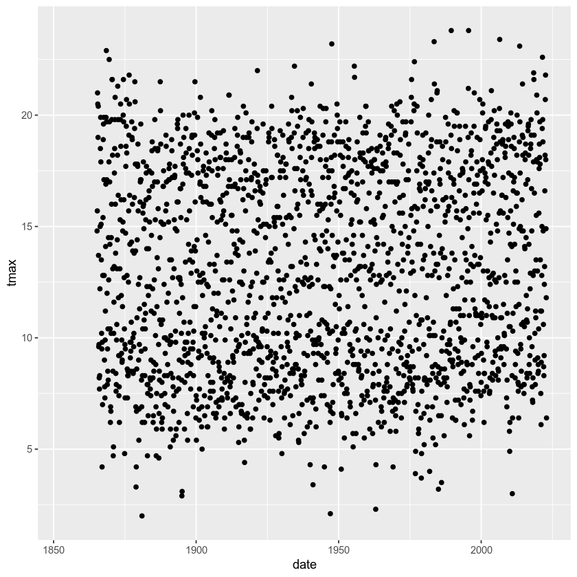
And voilà! A (very) simple scatterplot, showing the value of tmax
over time.
Over the rest of the exercise, we will see how we can continue to customize this, by adding colors, customizing the labels, changing the font sizes, and so on.
example: basic histogram#
Now, let’s look at another type of plot: a histogram.
Note that as far as R is concerned, this:
ggplot(data=armagh, mapping=aes(x=date, y=tmax))
Is the same as this:
ggplot(armagh, aes(x=date, y=tmax))
That is, the data and mapping arguments can be specified by
keyword, or by position (data first, then mapping). To
help keep this clear, we’ll continue using the keyword arguments for
ggplot(), but you will most likely see examples online (or even in
this workshop) where the positional arguments are used instead.
To create a histogram, we need to specify the x variable - we’re
still looking at tmax, so we’ll specify that here. Because we’re
trying to plot a histogram, we add geom_histogram() to this:
ggplot(data=armagh, mapping=aes(x=tmax)) +
  geom_histogram()
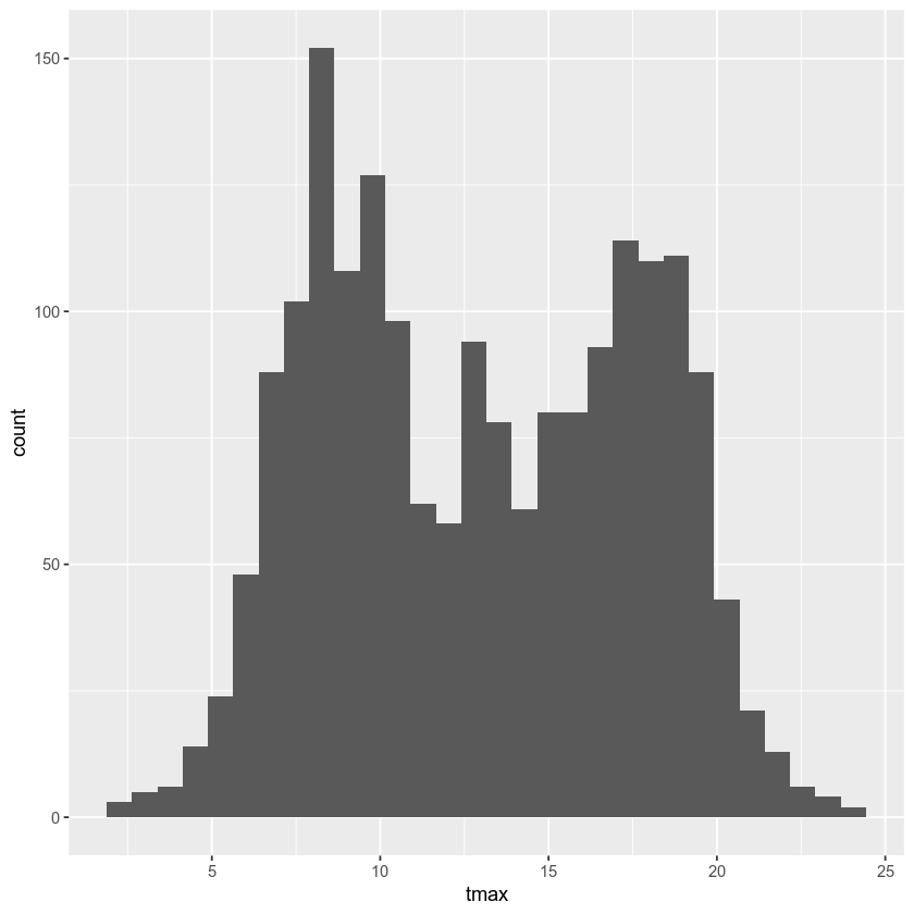
Note the message displayed here:
`stat_bin()` using `bins = 30`. Pick better value with `binwidth`.
When we add the histogram geom, we can also specify the
binwidth, which sets the size of the histogram bins in the same
units as the variable (in this case, °C), or the number of bins (the
default value is 30).
Go ahead and change the cell above so that the plot uses a binwidth
of 1 - how much does this change the plot?
In the plot above, you can see how tmax is distributed, with several
apparent peaks around 8°C, 14°C, and 18°C. Presumably, these would be
peaks that roughly correspond to winter, spring/autumn, and summer,
respectively - let’s change the plot slightly so that we can see if this
is correct.
To do this, we can use the color keyword argument to aes(). Note
that any of the aesthetic mappings that we include in the original
ggplot() call (at the global level) will be passed down to the
geom layers in the plot. We can also use mappings at the local
level, defining them for each individual layer.
Note also that this argument only tells ggplot what variable to use
for grouping and coloring the data - we can’t use this to, say, change
all of the bars from gray to blue (for that, we use the fill keyword
argument to the geom we are using):
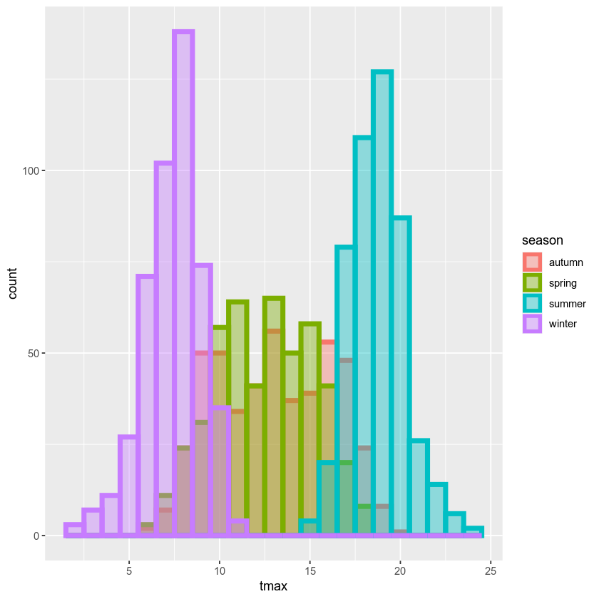
ggplot(data=armagh, mapping=aes(x=tmax, color=season)) + # define the color mapping at the global level
    geom_histogram(binwidth=1, linewidth=2, fill='white') # add a histogram with bins of width 1, thick lines, and white bars
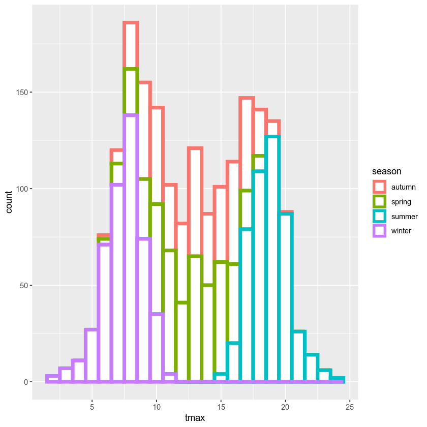
With this plot, we can see how the total distribution of the dataset is made up of each group - as we had suspected, the peaks on either side primarily correspond to winter (the purple color) and summer (cyan), while the peak in the middle is a combination of spring (green) and autumn (salmon).
While this nicely shows us the breakdown for the distribution of the
entire dataset, and especially for summer and winter, it’s a little bit
harder to see the distribution for spring and autumn, since they’re
stacked on top of the other seasons. If we want to show each
distribution individually, we can use the position argument. By
default,this is set to 'stack', but if we change it to
'identity', the bars are overlapping (note also that I have used the
alpha argument to make the bars transparent):
ggplot(data=armagh, mapping=aes(x=tmax, color=season, fill=season)) + # define the color and fill mapping at the global level
  geom_histogram(binwidth=1, linewidth=2, alpha=0.4, position='identity') # add a histogram with bins of width 1, thick lines, and white bars
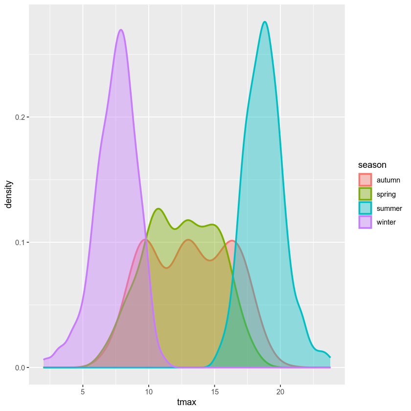
example: density plot#
We can also plot the density distribution of the data, a smoothed
version of the histogram, using geom_density()
(documentation):
ggplot(data=armagh, mapping=aes(x=tmax, color=season, fill=season)) + # create a plot with tmax on the x-axis, colored by season
  geom_density(alpha=0.4, linewidth=1) # add a density plot with transparency of 0.4 and lines of width 1
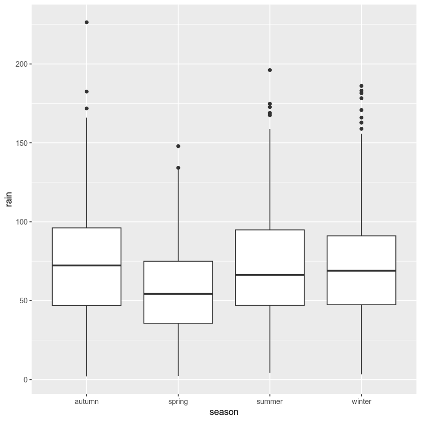
example: box plots#
To make a box plot, we use geom_boxplot():
ggplot(data=armagh, mapping=aes(x=season, y=rain)) +
  geom_boxplot()
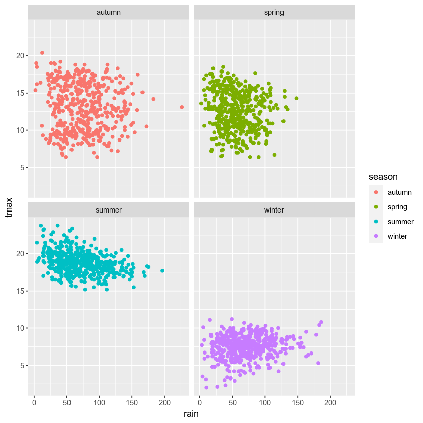
facet wrapping#
We might also want to plot our data using different subplots, or
facets. For example, we can create a scatter plot of tmax vs
rain, colored by season:
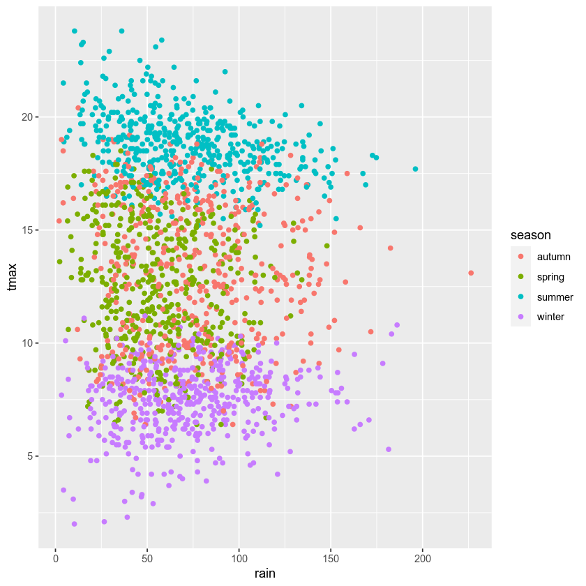
ggplot(data=armagh, mapping=aes(x=rain, y=tmax, color=season)) + # plot tmax vs rain, colored by season
    geom_point() # plot a point cloud

But, this makes it difficult to see the scatter for each season. To
split this into a single subplot for each season, we use
facet_wrap()
(documentation):
ggplot(data=armagh, mapping=aes(x=rain, y=tmax, color=season)) + # plot tmax vs rain, colored by season
    geom_point() + # plot a point cloud
    facet_wrap(~season) # use facet_wrap to make a subplot for each season
cleaning up and saving the plot to a file#
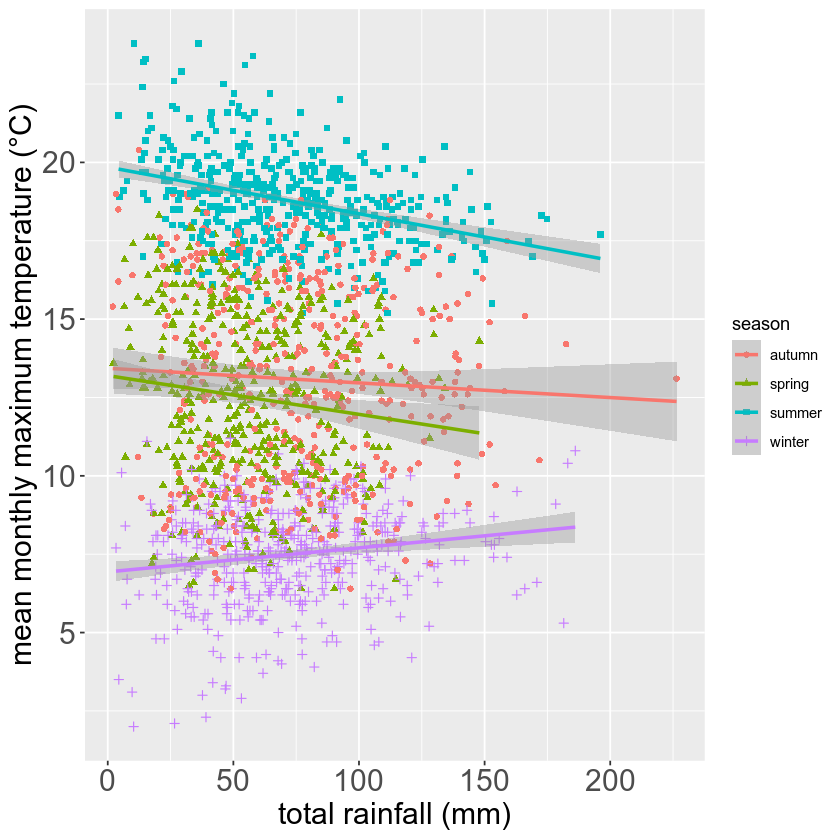
In the final example, we’ll make a plot showing the relationship between
rain and tmax, colored by the season. We’ll also see how we
can change the axes labels, and increase font sizes, to help make our
plot ready for including in a manuscript or presentation.
First, let’s make the initial scatter plot:
ggplot(data=armagh, mapping=aes(x=rain, y=tmax, color=season)) + # create a plot of tmax vs rain
    geom_point() # make a scatter plot
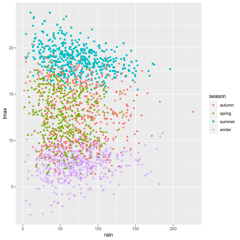
Most of the time, though, we don’t just want to rely on color for
differentiating between groups - different people perceive color
differently, or someone might view our plots printed onto
black-and-white paper. By using the shape argument to aes(), as
well as color, we can be more sure that our plot can be
understandable:
ggplot(data=armagh, mapping=aes(x=rain, y=tmax)) + # create a plot of tmax vs rain, with no color mapping at the global level
    geom_point(mapping=aes(color=season, shape=season)) # make a scatter plot with different colors and shapes
Up to now, we’ve just been showing the output of ggplot() directly
by running each cell. In a script, however, this wouldn’t work - we want
to assign the output to a new object, which we can then use in the
script (including, ultimately, by saving the plot to a file).
We do this exactly the same way as we have previously, using the <-
operator:
rain_tmax_plot <- ggplot(data=armagh, aes(x=rain, y=tmax)) + # create a plot of tmax vs rain
    geom_point(mapping=aes(color=season, shape=season)) # make a scatter plot with different colors and shapes
rain_tmax_plot # show the plot

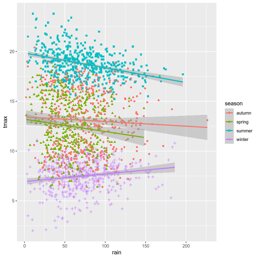
Now that we have saved the output as an object, annual_plot, we
can add to this in exactly the same way as we have before. For example,
if we now want to add the linear fit, we can use geom_smooth()
(documentation),
with method set to lm (for linear model).
Here, we’re using the mapping argument at the local level to make
sure that we have one line for each season:
rain_tmax_plot <- rain_tmax_plot +
                geom_smooth(mapping=aes(color=season), method = 'lm') # add a linear fit to the data
rain_tmax_plot # show the plot again
Next, we can change the axes labels using xlab() (for the x
axis) and ylab() (for the y axis), respectively
(documentation):
rain_tmax_plot <- rain_tmax_plot +
                    xlab('total rainfall (mm)') +
                    ylab('mean monthly maximum temperature (°C)')
rain_tmax_plot
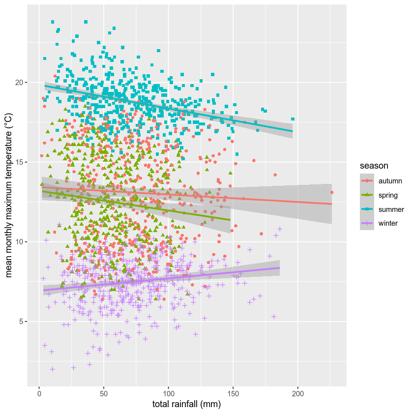
We’re almost there, but we have one more step - we need to change the size of the text so that it’s more easily readable.
To modify this aspect of our plot, we use the theme() function
(documentation).
There are many different ways to customize our plots in this way - we
can have different colors for the x and y labels, we can change fonts,
we can use different font sizes for the tick labels and the axis labels,
and so on.
Rather than go too deep into the weeds, though, we’ll set the tick
labels (axis.text) and the axis labels (axis.title), and we’ll
set them to a font size of 18:
rain_tmax_plot <- rain_tmax_plot +
    theme(
        axis.text=element_text(size=18),
        axis.title=element_text(size=18)
    )

rain_tmax_plot # show the plot again
Finally, we’ll use ggsave()
(documentation)
to save the plot to a file:
ggsave('rain_tmax_plot.png', plot=rain_tmax_plot) # save the plot to a file
exercise and next steps#
That’s all for this exercise. To practice your skills, create a script that does the following:
loads the packages that you will need at the beginning of the script
adds a season variable
adds a variable to divide the data into three 50 year periods: 1871-1920, 1921-1970, and 1971-2020
selects only those observations between 1871 and 2020 (inclusive)
creates a figure to plot the density distribution of tmin for each period in its own panel, colored by season (using both color and fill)
creates a figure to plot the density distribution of tmin for each period in the same panel, colored by the period (using both color and fill)
sets appropriate labels and font sizes for the axis text
saves each plot to its own file. For the three-panel figure, change the width and height of the plot so that the plot is more rectangular, and each panel is approximately square (check the documentation to see how)