plotting data using seaborn#
Note
This is a non-interactive version of the exercise. If you want to run through the steps yourself and see the outputs, you’ll need to do one of the following:
follow the setup steps and work through the notebook on your own computer
open the workshop materials on binder and work through them online
open a python console, copy the lines of code here, and paste them into the console to run them
In this exercsise, we’re going to investigate how temperature has changed over time, using monthly observations from the Armagh Observatory. By the end of this exercise, you will:
load data from a file
add variables to a table
create date objects from character strings
recode values in a table
select data from a table using logical expressions
create scatter plots (with smoothing lines)
create histograms (+ smoothed histograms)
save plots to a file
data#
The data used in this exercise are the historic meteorological observations from the Armagh Observatory, downloaded from the UK Met Office.
To make the data slightly easier to work with, I have done the
following: - Removed the header on lines 1-5 - Replaced multiple spaces
with a single space, and replaced single spaces with a comma (,) -
Removed --- to indicate no data, leaving these fields blank -
Removed * indicating provisional/estimated values - Removed the 2023
data - Renamed the file armaghdata.csv.
If you wish to use your own data (and there are loads of stations
available!), please feel free. I have also included a script,
convert_metoffice.py (in the scripts/ folder), that will do
these steps automatically. All you need to do is run the following from
a terminal:
convert_metoffice.py {station}data.txt
This will create a new file, {station}data.csv, that has converted +
cleaned the data into a CSV format that can easily be read by
pandas.
importing libraries#
Before getting started, we will import the libraries (packages) that we will use in the exercise:
To do this, we use the import statement, followed by the name of the
package. Remember that we can also alias the package name using
as:
import pandas as pd # import pandas, but alias it as pd
import seaborn as sns # import seaborn, but alias it as sns
loading the data#
Now, we’re ready to load the data file, using pd.read_csv()
(documentation):
armagh = pd.read_csv('data/armaghdata.csv')
pandas has a number of functions for reading data from files,
depending on the format - another common one you might use is
pd.read_excel()
(documentation).
Note that in order to read Excel files, you will need to install
openpyxl (link) using
conda.
To view a summary of the DataFrame, we can use the .head()
method
(documentation):
armagh.head(n=10) # show the first 10 rows of the dataframe
We can also see that only the rain variable has values back to 1853
- missing values are indicated by NaN, which means “Not a Number” -
i.e., missing.
adding variables to the table#
Before moving on, we’ll see how we can add additional variables to the table, starting with the date. This will make it easier for us to plot and analyze the time series of observations.
We want this column to be represented as a datetime object so that
it displays properly when we plot it, and because we may want to do
calculations using the date/time. When working with DataFrame
objects, the easiest way to do this is using pd.to_datetime()
(documentation).
The argument that we will use for this function is a dict object,
with key/value pairs corresponding to year, month, and day.
Because we don’t have a day column in the DataFrame, we will
just default to a value of 1:
pd.to_datetime({'year': armagh['yyyy'], 'month': armagh['mm'], 'day': 1}) # format datetime objects using the yyyy and mm columns
Now, we can add this to the DataFrame as a column called date:
armagh['date'] = pd.to_datetime({'year': armagh['yyyy'], 'month': armagh['mm'], 'day': 1}) # add the datetime series to the dataframe with the name 'date'

armagh.head(n=10) # show the first 10 rows of the table
we can also check the data type of the new column - we should see that
it is datetime64[ns], corresponding to a 64-bit datetime object
with units of nanoseconds:
armagh.dtypes # see the data type of each column
calculating a new column#
One thing we might be interested in doing is aggregating our
observations by meteorological season, rather than just by month or
year. To help us with this, we can calculate a new variable, season,
and assign it values based on whether the month is part of the
meteorological spring (March, April, May), summer (June, July, August),
autumn (September, October, November), or winter (December, January,
February).
Another way to look at this is by thinking of these as
if ... then ... else statements:
if month is 1, 2, or 12, then
seasonis “winter”if month is 3, 4, or 5, then
seasonis “spring”if month is 6, 7, or 8, then
seasonis “summer”if month is 9, 10, or 11, then
seasonis “autumn”
First, let’s remember how we can select rows from a table using a
conditional statement. For example, if we want to select all rows
where the value in the mm column is 1, 2, or 12, we could write:
armagh.loc[(armagh['mm'] < 3) | (armagh['mm'] == 12)] # select rows where month is < 3 or == 12
As you can see, this selects a total of 510 rows from the table,
wherever the value in the mm column is 1 or 2 (< 3), or 12.
Here, we’ve used the | (“pipe” or “logical or”) operator to combine
two conditional statements: it returns True wherever
armagh['mm'] < 3 or wherever armagh['mm'] == 12.
However, we can also use the in operator to write this a bit more
compactly, using the .isin() method
(documentation)
and a list (or other sequence) of the values to compare:
armagh.loc[armagh['mm'].isin([1, 2, 12])] # select from the table based on whether values are in [1, 2, 12]
We can then write 4 separate statements to assign these values to the DataFrame:
armagh['season'] = '' # initialize an empty string column
armagh.loc[armagh['mm'].isin([1, 2, 12]), 'season'] = 'winter' # if month is 1, 2, or 12, set season to winter
armagh.loc[armagh['mm'].isin(range(3, 6)), 'season'] = 'spring' # if month is 3, 4, or 5, set season to spring
armagh.loc[armagh['mm'].isin(range(6, 9)), 'season'] = 'summer' # if month is 6, 7, or 8, set season to summer
armagh.loc[armagh['mm'].isin(range(9, 12)), 'season'] = 'autumn' # if month is 9, 10, or 11, set season to autumn

armagh.head(n=12) # show the first year of data, to check that we have set the values properly
plotting data#
To plot data, we’ll use seaborn, a popular package for plotting data
that integrates well with pandas DataFrame objects.
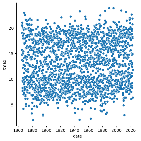
example: scatter plot#
In this exercise, we will look at a number of different example plots
using our data, starting with a simple scatter plot using
sns.scatterplot()
(documentation).
We can pass our DataFrame to sns.scatterplot() using the
data argument, and specify which columns from the DataFrame to
plot along the x and y axes. The following will plot tmax
(monthly maximum temperature) vs date - in other words, a time
series of monthly maximum temperature:
sns.scatterplot(data=armagh, x="date", y="tmax") # create a simple scatter plot of tmax vs date, using the armagh dataframe
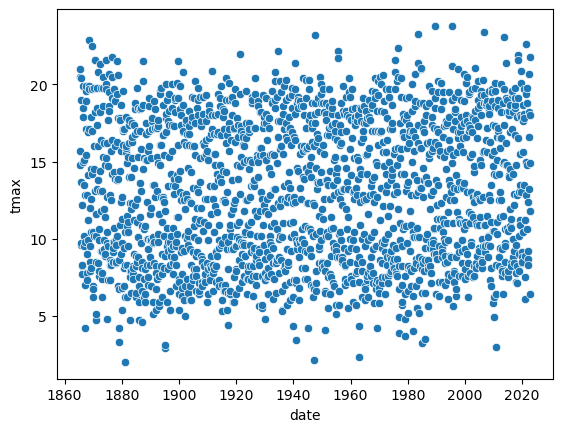
Note the output of the cell above, above the actual plot:
<Axes: xlabel='date', ylabel='tmax'>
The scatterplot function creates an Axes object
(documentation)
- effectively, this is the container into which we put our plot. Our
Axes object exists within a different kind of object - a Figure
(documentation).
Over the rest of this exercise, we’ll look at how we can continue to
customize plots, by adding colors, customizing labels, changing font
sizes, and so on. As we do so, we’ll make use of these objects and their
methods/attributes. As we do so, we’ll also discuss some important
differences between axes-level and figure-level functions in
seaborn.
example: basic histogram#
First, though, let’s look at another type of plot: a histogram. To
create a histogram using sns.histplot()
(documentation),
we need to specify the x variable. We’ll continue using tmax, so
this will be a histogram of the values of tmax:
sns.histplot(data=armagh, x='tmax') # plot a histogram of tmax, using the armagh dataframe
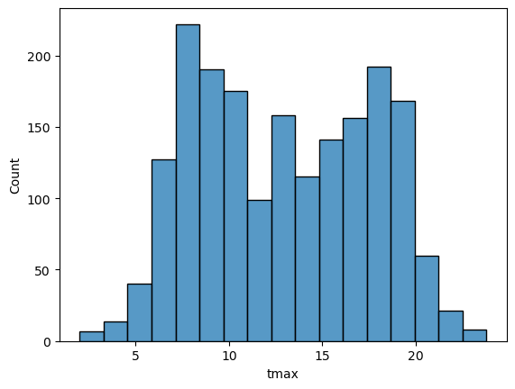
By default, seaborn calculates the bin width (and therefore number
of bins) based on the sample size and variance of the variable. We can
also specify the number of bins to use (using the bins argument),
the width of the bins to use (using the binwidth argument), or even
the edges of the bins (by passing a sequence of bin edges using the
bins argument).
Here’, let’s see how the plot changes by specifying using 30 bins:
sns.histplot(data=armagh, x='tmax', bins=30) # plot a histogram of tmax, using the armagh dataframe and 30 bins
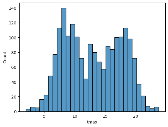
In the plot above, you can see how tmax is distributed, with several
apparent peaks around 8°C, 14°C, and 18°C. Presumably, these would be
peaks that roughly correspond to winter, spring/autumn, and summer,
respectively - let’s change the plot slightly so that we can see if this
is correct.
To do this, we can use the hue keyword argument to
sns.histplot(), which will group the values based on the variable
passed (in this case, season):
sns.histplot(data=armagh, x="tmax", hue="season", bins=30) # show the distribution of tmax, broken down by season
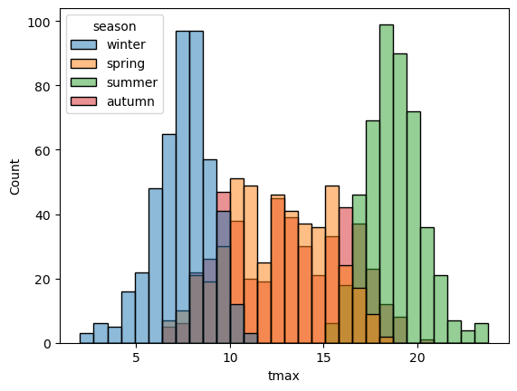
With this plot, we can see how the total distribution of the dataset is made up of each group - as we had suspected, the peaks on either side primarily correspond to winter (blue) and summer (green), while the peak in the middle is a combination of spring (orange) and autumn (red).
With different groups, we can also specify how to display the groups
using the multiple keyword argument. The value of multiple must
be one of the following:
'layer'- the default, which plots each bin in place using transparency'dodge'- shifts and narrows each bin so that they don’t overlap'stack'- stacks bins on top of each other'fill'- stacks bins on top of each other, with each category/bin adding up to 1.
In the cell below, add an argument to histplot to show the
histograms stacked on top of each other:
sns.histplot(data=armagh, x="tmax", hue="season", bins=30) # remember to add the right keyword argument!

example: density plot#
We can also plot the density distribution of the data, a smoothed
version of the histogram, using sns.kdeplot()
(documentation):
sns.kdeplot(data=armagh, x='tmax', hue='season', fill=True) # plot the density distribution of the data, colored by season, filled in
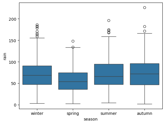
example: box plots#
To make a box plot, we can use sns.boxplot()
(documentation):
sns.boxplot(data=armagh, x='season', y='rain') # create a vertical box plot of rain, grouped by season
To swap the orientation of the boxes, we can change the x and y
mapping:
sns.boxplot(data=armagh, x='rain', y='season') # create a horizontal box plot of rain, grouped by season
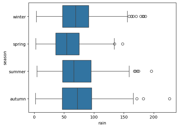
figure-level vs axes-level functions#
seaborn has a number of different functions that accomplish the same
thing in different ways. So far, we have seen a few different examples
of functions that create plots (e.g., scatterplot, histplot,
boxplot, etc.). The output of these functions, as we have noted
above, is an Axes object. Inside of a script, these functions will
draw the plot within the “currently active” Axes object, or inside
of whatever Axes object you pass to the function using the ax
argument.
Rather than using these axes-level functions, we can also use
figure-level plots, which create their own Figure object before
drawing the plot. To see a simple example of this, let’s draw a scatter
plot using sns.relplot()
(documentation):
sns.relplot(data=armagh, kind='scatter', x='date', y='tmax') # use relplot to show a scatterplot of tmax vs date
You should notice that the plot looks exactly the same as the scatter
plot we created using sns.scatterplot(). But, the actual output of
the function is different - this time, it’s:
<seaborn.axisgrid.FacetGrid at 0x25c20984490>
(note that your output will differ slightly). This time, it’s a
FacetGrid
(documentation),
rather than an Axes - a multi-plot grid that can be used to show
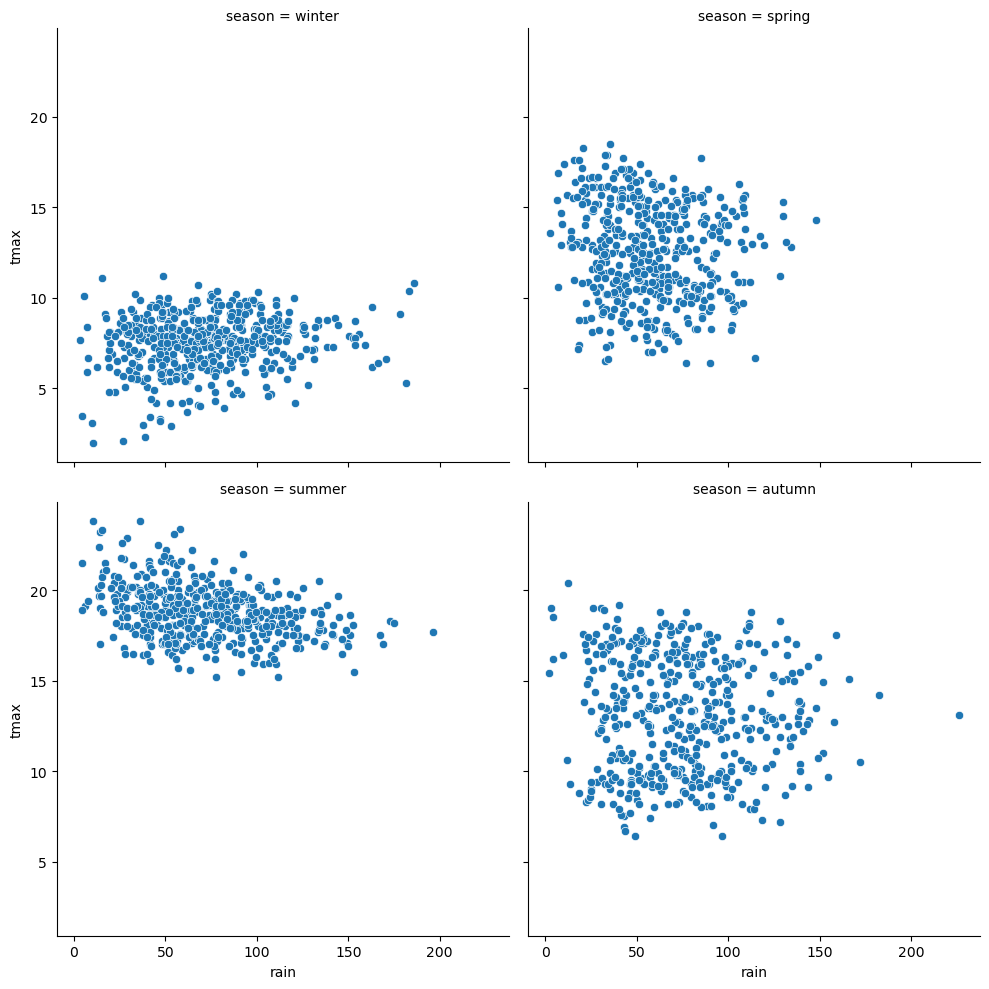
conditional relationships. To see how this works in a more complicated
case, let’s plot the relationship between rain and tmax, and use
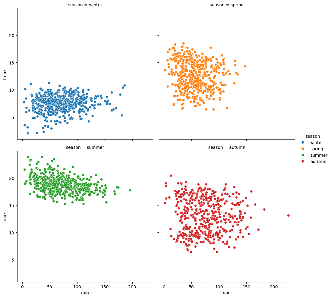
the col argument to create a separate panel for each season:
sns.relplot(data=armagh, kind='scatter', x='rain', y='tmax', col='season', col_wrap=2) # create a 2x2 grid of panels, one for each value of season
we can also use the hue argument to assign a color based on a
variable. Note that this will also place a Legend outside of the
plot, explaining what each color/symbol combination means:
sns.relplot(data=armagh, kind='scatter', x='rain', y='tmax', col='season', col_wrap=2, hue='season') # create a 2x2 grid of panels, one for each value of season
seaborn plot types are organized into three different “modules”,
based on what type of data they are meant to show:
relplot, for plotting relationships between variables [axes-level:scatterplot,lineplot]displot, for plotting distributions [axes-level:histplot,kdeplot,ecdfplot,rugplot]catplot, for plotting categorical data [axes-level:stripplot,swarmplot,boxplot,violinplot,pointplot,barplot]
For each type of plot we want to make, we can use either the
figure-level or the axes-level functions, depending on what we are
doing. For creating a figure with multiple subplots (for example, to
show a separate subplot for each value of a categorical variable), it is
easiest to use the figure-level function, rather than the axes-level
function. For more information about the differences between
figure-level and axes-level functions in seaborn, see this official
guide.
customizing the plot#
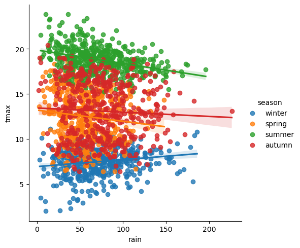
In the final example, we’ll make a plot showing the relationship between
rain and tmax, colored by the season, and plot regression
lines for each season.
We’ll also see how we can change the axes labels, and increase font sizes, to help make our plot ready for including in a manuscript or presentation.
To plot the linear relationship between rain and tmax for each
season, we can use sns.lmplot()
(documentation)
- this will plot the scatter plot, plus the regression lines:
sns.lmplot(data=armagh, x='rain', y='tmax', hue='season')

Up to now, we’ve just been showing the output of the different plotting calls directly by running each cell. In a script, however, this wouldn’t work - we want to assign the output to a new object, which we can then use in the script (including, ultimately, by saving the plot to a file).
We do this exactly the same way as we have previously, using the =
operator:
rain_tmax_plot = sns.lmplot(data=armagh, x='rain', y='tmax', hue='season')
Now, we can use this object to change the properties of the axes.
seaborn is built on top of another package,
matplotlib, and many of
the objects created by seaborn either are matplotlib objects, or
they inherit a number of attributes from the matplotlib classes they
are built on.
For example, the rain_tmax_plot object we have created is a
seaborn.axisgrid.FacetGrid:
type(rain_tmax_plot) # show the type of rain_tmax_plot
This class has an attribute, ax, which is a
matplotlib.axes.Axes
(documentation):
type(rain_tmax_plot.ax) # show the type of rain_tmax_plot.ax
To change the properties of the axes, then, we can use the relevant
Axes methods. For example, .set_xlabel()
(documentation)
and .set_ylabel()
(documentation)
will change the text and properties of the x and y axis labels,
respectively, and we can use the fontsize argument to set the size
of the text:
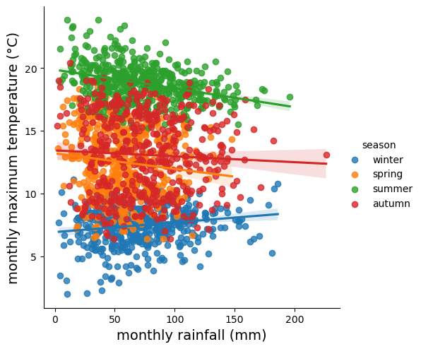
rain_tmax_plot.ax.set_xlabel('monthly rainfall (mm)', fontsize=14) # set the x axis label
rain_tmax_plot.ax.set_ylabel('monthly maximum temperature (°C)', fontsize=14) # set the y axis label

rain_tmax_plot.fig # show the figure again
We can also use .set_xticks()
(documentation)
and .set_yticks()
(documentation)
to change the location, text, and properties of the ticks on the x and y
axis, respectively:
rain_tmax_plot.ax.set_xticks(range(0, 250, 50), labels=range(0, 250, 50), fontsize=12) # change the xtick label font size
rain_tmax_plot.ax.set_yticks(range(5, 25, 5), labels=range(5, 25, 5), fontsize=12) # change the xtick label font size

rain_tmax_plot.fig # show the figure again

saving the figure to a file#
As you can see from the previous few cells, we have been using
rain_tmax_plot.fig to show the updates to the figure. As you might
have guessed, this is a matplotlib.figure.Figure object
(documentation)
- effectively, the canvas where seaborn draws the plot:
type(rain_tmax_plot.fig) # show the type of rain_tmax_plot.fig
To save our figure to a file, we can use .savefig()
(documentation)
as an SVG (scalable vector graphics) file:
rain_tmax_plot.fig.savefig('rain_tmax_plot.svg', bbox_inches='tight') # save the figure cropped close to the axes
exercise and next steps#
That’s all for this exercise. To practice your skills, create a script that does the following:
loads the packages that you will need at the beginning of the script
adds a season variable
adds a variable to divide the data into three 50 year periods: 1871-1920, 1921-1970, and 1971-2020
selects only those observations between 1871 and 2020 (inclusive)
creates a figure to plot the density distribution of tmin for each period in its own panel, colored by season (using both color and fill)
creates a figure to plot the density distribution of tmin for each period in the same panel, colored by the period (using both color and fill)
sets appropriate labels and font sizes for the axis text
saves each plot to its own file.